All posts by Mota Italic

CAPITAL: Berliner Buchstaben

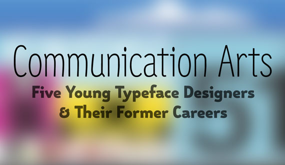
This exhibition exists to celebrate the diversity of Berlin’s surprisingly large type community. We have paired the typefaces of 27 Berlin-based type designers with the work of 27 local illustrators / designers / artists. This relatively small collection features the work of a wide variety of individuals—from life-long designers to recent graduates and from design ‘celebrities’ to students. Most participants are employed full time as type/graphic designers or illustrators, but for some, their work represented here is more of a passionate side project. Through these images, one can easily appreciate the diversity of the local design scene and get a taste of the current visual gestalt.

This exhibition was on display May 19th – July 22nd, 2011

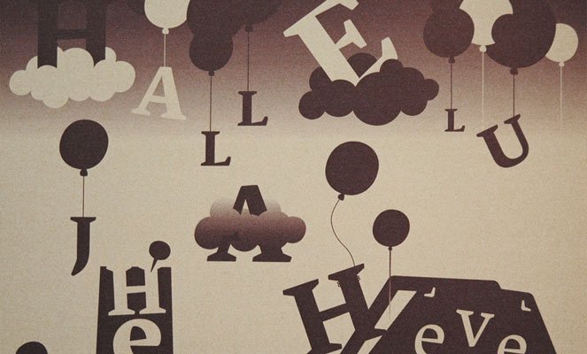
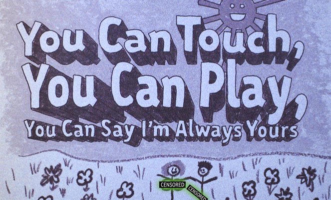
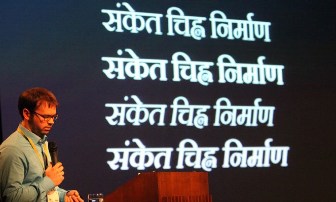
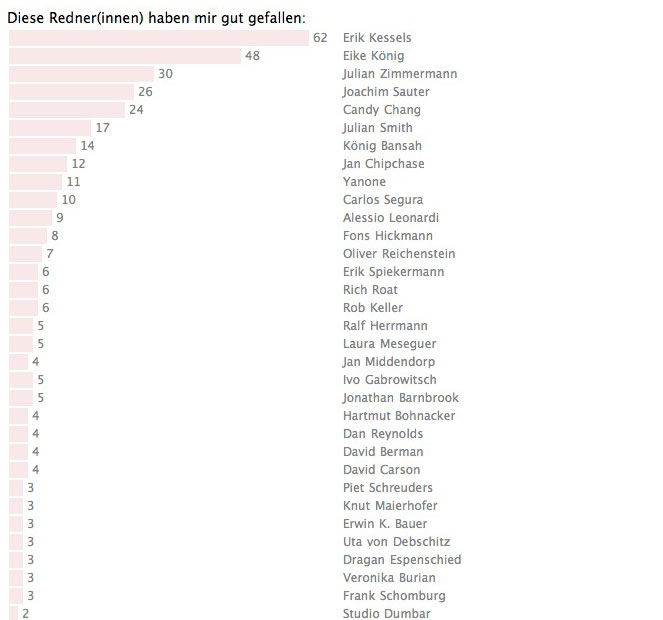
This exhibition was made possible by the generous type designers and illustrators that agreed to take part. The type designers had the task to first choose and send in a sample of one of their typefaces. From the incredible variety of submissions, we selected one letter from each design to pass along to the illustrators. The illustrators/ designers/ artists had complete freedom to interpret the letter as (s)he felt fit. Each used unique techniques to produce their smart, funny, ironic, conceptual, or purely aesthetic interpretation.

Type Designers:

Alessio Leonardi
Andrea Tinnes
Anton Koovit
Bernd Möllenstädt
Dan Reynolds
Elena Albertoni
Erik Spiekermann
Fritz Grögel
Georg Seifert
Gesine Todt
Hannes von Döhren
Jan Fromm
Jens Kutilek
Julia Sysmäläinen
Jürgen Huber
Luc(as) de Groot
Ludwig Übele
Martin Wenzel
Melle Diete
Ole Schäfer
Ralph du Carrois
Rob Keller
Roman Wilhelm
Sveinn Davíðsson
Ulrike Wilhelm
Verena Gerlach
Viktor Nübel

Illustrators:

alvvino
Apfel Zet
Auge Lorenz
Charlotte Driessen
Christine Gertsch
Christopher Breu
Claudia Silbermann
Cristóbal Schmal
Delia Keller
Dennis Michaelis
Emilia Forstreuter
Felix Bork
Ferdinand Ulrich
HORT
Kaune & Hardwig
Kerstin Hille
Klaus Rähm
Laura Dreßler
Laura Serra
Mark Frömberg
Nadine Roßa
Raban Ruddigkeit
Siggi Eggertsson
Slawek Michalt
Sonja Stange
Stepan Ueding
Stephan Müller

Next week: Gallery Opening

CAPITAL-opening

We are pleased to announce the imminent opening of our new studio/gallery/shop next week! Our new residence in Prenzlauer Berg, Berlin, gives us a unique space to curate and host a number of type-related exhibitions.

Our first show, CAPITAL: Berliner Buchstaben, features the work of 27 Berlin–based type designers as interpreted by 27 local illustrators/designers/artists. This exhibition celebrates not only some of the many talented creatives in Berlin, but also provides a snapshot of the current typographic and visual gestalt found here.

We would like to invite you to join us for our opening night festivities next Wednesday, May 18, from 18:00 – just before the start of Typo Berlin! Stop by, see the show, have some wine, meet many dozens of type designers and illustrators, and catch up with old friends!

The store and gallery will officially open Thursday May 19th.

You can find more information about the show here.

UPDATE:

Missed the opening party? Check out some pics from the evening to imagine you were here!

New Release: Vesper Hebrew

sayhellotovesperhebrew

We are thrilled to announce the release of Vesper Hebrew today! This new, five font family is the result of a very memorable collaboration with the renowned Israeli type designer and artist Oded Ezer. His impeccable craftsmanship on these designs is both beautiful on its own and also the perfect compliment for Vesper’s Latin counterpart. We are grateful for all of Oded’s hard work and excited to finally share these thoroughly modern typefaces with you!

Vesper Hebrew is available now exclusively through Mota Italic. That being said, these typefaces are also available though Oded Ezer’s foundry under the name “רץ” (Rutz). The fonts have been renamed especially for the Hebrew-speaking community, Rutz meaning “running text,” to help emphasize that this is a workhorse text type family.

For a bit more about the design process and how the project evolved, here are a few words from Oded Ezer:

The first half of the 20th century was quite revolutionary in terms of Hebrew type design. The list of significant serif text typefaces created in those years starts with Frank-Rühl, that was cut around 1908, goes on to the birth of Francheska Baruch’s Shoken in the mid 1940’s, through the creation of the 50’s trio – Koren, in 1957, Hadassah in 1958, David in 1959 – and, in 1965, Narkiss Linotype family. From around that time till now, no significant Hebrew serif text typeface was introduced.

It was quite surprising for me to discover this fact. This can also explain my motivation to find a true contemporary solution for a new text typeface. For quite a long time I was researching 500, 800 and 1,000 years old Hebrew manuscripts, trying different calligraphic approaches, and trying, unsuccessfully, to find an answer to the question: What is the good way to design a classic yet contemporary typeface at the same time?

One day I have stumbled upon Rob Keller’s “The Making of Vesper” article on “I Love Typography”. I have found this font beautiful, but more important – very readable, and with strong character. I felt that this guy’s typeface, designed as his MA graduation project at Reading University, might have some clues as for my own search for the perfect Hebrew serif text typeface. So I wrote to him asking if he would be interested in a Hebrew version to his font, and he happily replied – Yes. We later had the chance to meet in Brno, and I was delighted to find out that he is as great as his font. What excited me most about it was the typical “Hebrew” cutting of this font, whose style reminded me very much the style of the classic Hadassah typeface, but, in a softer and more delicate way. I immediately had the idea to use it’s serif as a starting point for the Hebrew version, and from there, my task became clear to me: To design a flowing, easy to read Hebrew typeface.

Matching the Latin Vesper, Rutz, which means “running” in Hebrew (Same as in “running text”), includes 5 different weights – Light, Regular, Medium, Bold and Heavy. This is actually the first Hebrew serif text font family that contains 5 weights. The classic Frank-Rühl, for instance, contains only two weighs – Regular and Bold. Compared with the slightly bolder Frank-Rühl Regular, Rutz/Vesper Hebrew Regular has a lighter color when arranged as text blocks.

So, here is the results of my adventures with creating a new Hebrew serif text font: Vesper Hebrew Light, Vesper Hebrew Regular, Vesper Hebrew Medium, Vesper Hebrew Bold, and Vesper Hebrew Heavy.

– Oded Ezer

vesperhebrewsample

A Redesign for Year One

Mota Italic website before and after

Motaitalic.com has just received a new outfit for its first birthday!

We have changed every page in some way (not including adding the new top menu and footer) – some are more radically different than others. Behavior uniformity of buttons, links, dropdowns, etc. has been improved as well as the reworking of the CSS to render better on more systems. The font pages have been considerably expanded to show more samples, details, and information about the designs. We still have additional improvements and enhancements in the works, with some major new features coming out in the next couple months.

We’d like to take a moment to say thank you to everyone who has supported us during our first year! It has passed quickly and we have accomplished a great deal. We’ve been occupied with several long-term projects (many of which are close to completion!); so please stay tuned because we have a lot of new things to share soon!

Finally, it’s a bit late, but we’d also like to thank our Design Nomad friend, Dav(id) Hubner, who was with us last July. He was a big help back when we were kicking off the site’s redesign and a great guy to share the month with. Happy travels Design Nomad!

Communication Arts Sept/Oct 2010

communication-arts

Monotype Imaging’s “Director of Words and Letters,” Allan Haley, wrote a piece for Communication Arts magazine with the theme “Five Young Typeface Designers and Their Former Careers.” Rob was honored to be included among four other very talented, “young” designers: Hannes von Döhren, Berton Hasebe, Cristóbal Henestrosa, and Julia Sysmäläinen.

Amazingly, three out of the five designers reside in Berlin. It’s a small design community, and this emphasizes how Berlin really is the Type Capital of the World. There are more type designers per sq/km in Berlin than anywhere else…

So, be sure to have a look at Communication Arts’ September/October 2010 Design Annual 51 to learn a bit about these five type designers and some of their latest work.

Schrift in Form 2

schriftinform

Tanja Huckenbeck and Peter Reichard of TYPOSITION invited Rob to take part in the Schrift in Form 2 exhibition in Offenbach, Germany. The show featured thirty-five type designers from all over the world and some of their new work. The show’s theme was “Schriftgenuss” meaning “Type Indulgence”. The typefaces illustrated one of the designer’s favorite recipes—and some of them were to be cooked up by a local restaurant for one of the show’s events.

Schrift in Form 2

September 7-19, 2010

Klingspor Museum

Herrnstraße 80, 63065 Offenbach am Main

[Update]

Incase you missed the exhibition, as we did, you can check out a few images of the show and events through TYPOSITION’s Facebook gallery and Frank Grießhammer’s Flickr set.

schriftinformposter

TypoLyrics: The Sound of Fonts

typolyrics

Edited by the makers of Slanted, TypoLyrics presents 175 songs typeset with new typefaces. This book is purely visual, typographic pornography; it also happens to feature three of our typefaces. Each page was made by a different designer or studio and consequently demonstrates a wide variety of quality. They run the entire gambit from extremely intelligent, well executed designs to overly literal interpretations and first-year-design-student-calibre work. It is certainly a nice reference when looking for some typographic inspiration or some new fonts though.

Each musical genre is paired with a different typeface style. The serif designs represent the “Classical” section of the book. Vesper sets the lyrics of Händel’s “Hallelujah” and was illustrated by the Berlin-based studio Nepomuk.

typolyrics-vesper

One of our unpublished typeface “Unicase Monospace” (misprinted in the book under the name ‘Unicase’) portrays the Techno song “United States of Love” by Westbam & the Love Committee – and was designed by Sonja.

typolyrics-unimono

Finally, Rob created a crayon-rendering of Gemma that sets some lyrics from Aqua’s ’90’s Pop hit “Barbie Girl.” For the uncensored version you’ll have to check out the book!

typolyrics-gemma

The Spring Conferences

map
(Image via Alexander Blumhoff)

(Image via Alexander Blumhoff)

The first was TypoBerlin; incidentally also Rob’s first conference presentation ever. Beginner’s luck on his side, his talk entitled “I ♥ India (and Why You Should Too)” went well with an engaged audience and a good deal of positive feedback afterwards. Rob went into the presentation with the goal of not being voted “Least Favorite Speaker” in Typo’s annual post conference survey. We’re happy to report that not only did he not receive a single vote as “Least Favorite” but he tied for 14th best talk (out of more than 60 presentations)(and tied with with Erik Spiekermann and Rich Roat). So thank you to those who enjoyed the talk and voted for Rob!

typo-results-2010

Next up was the 4th installation of the ICTVC (International Conference on Typography and Visual Communication) in Nicosia, Cyprus. There, Rob gave a very quick, 30 minute history of type technology. The focus was on how different tools and techniques affected type design and typesetting.

Two days later was the inaugural TypeTalks symposium in Brno, Czech Republic. This wonderfully organized one day event was jam-packed with great presentations by Florian Hardwig, Michael Hochleitner, Tomáš Brousil, Dan Reynolds, Dan Rhatigan, Veronika Burian. Rob gave a similar talk as his from Cyprus; a look at some major type technologies and their lasting impact on type design. Seriously, this symposium was one of the nicest events we’ve attended; and it was certainly the cheapest (only €15 for the day including drinks and snacks!). You must attend the next if at all possible.

Thank you to all the organizers for the invitations to present! Hope to join you again next time!

Let’s meet up at Typo Berlin!

Typo Berlin 2010

What we’ve been looking forward to all year is finally upon us: Typo Berlin! Sonja and I are hanging out there all weekend, so hopefully we can meet up sometime. My talk “I ♥ India (& why you should too),” comes in late Saturday afternoon so be sure to stick around and keep that time-slot free!

And when you see us be sure to ask us about snagging postcard #00 from an upcoming project! We only have a limited number there, so act fast! (We’ll post more about this in a few days, but for now the Typo attendees get first dibs.)

Font Aid IV

Font Aid 4

In the wake of the tragic earthquake in Haiti, the Society of Typographic Aficionados (SOTA) has organized the Font Aid IV benefit. Dubbed “Coming Together,” this project brought together and inspired almost 400 designers to draw ampersands to this charity font. The result is a massive collection of ampersands (485) which you get for the unbelievably low price of $20. All the proceeds go directly to Doctors Without Borders to help with their relief efforts in Haiti.

For our part, we donated these three &’s. The first one is something we threw together for this project. It’s a little difficult to display here because it is only 1 unit thick; ideally, it should be rendered much larger. The second design is from an upcoming family, but it will probably change more along the way before it’s done. The final ampersand is a modified version from Mota Pixel.

So if you haven’t already, it would absolutely be worth your while to drop a Jackson (~€15, ~£13, ~CA$21, ~Rs922, ~R$36, ~RUB600)* for a good cause while picking up 485 sweet &’s for your collection. Font Aid IV is available through all these fine resellers: VeerFontShop, and MyFonts.

*Order reflects the most common visitor’s currencies

The Making of Vesper

The Making of Vesper

Our first major type family, Vesper, is a design three years in the making. Started in 2006 at the University of Reading, it has evolved and expanded from scattered/naïve ideas into a versatile text family. Now you can see some behind-the-scenes design process that made it what it is today and some hints of where it is going. Read all about the project over at I Love Typography.

Sale: 10% off – All Year!

As a thank you to all our early newsletter subscribers, we have a special offer: 10% off all purchases for the rest of 2009!

Sign up for our newsletter by the end of October (31st 2009) and we will automatically deduct 10% off all of your orders for the rest of the year*. This promotion is also combinable with any other sales or deals we may be offering during this time.

Simply click on the envelope icon at the bottom left of the screen and enter your e-mail address to register. You are also able to manage your subscription through your account page.

If so inclined, you can read our full privacy policy here. In short, we won’t spam you or give away your info.

Grand Opening Week Sale

As a special thanks to our infinitely patient colleagues as well as to our new friends, we are holding a short, but significant, Grand Opening Sale.

For the first three days (October 6, 7, 8, & 9) we are offering Vesper for 30% off! This includes all versions and configurations: packages and single fonts, and Pro, WEB, and Basic character sets. Deal good until midnight Friday (Berlin time).

In addition, if you sign up for the newsletter you will automatically get an another 10% off.*

Want to try out some fonts before committing to the entire family? No problem. You can always buy a few single fonts, or fonts with the basic character set, then upgrade to the packages or Pro character set later!

*Stay subscribed to the newsletter and you will get 10% off all other purchases for the rest of the year!

Welcome to Mota Italic

welcome-to-mota-italic

We would like to welcome you to Mota Italic!

After many many months of work the site is up and running, the first two font families are ready for their debut, and we have some special deals to get things rolling.

After checking out Vesper and playing with it in TypeShow, be sure to download our free family Mota Pixel. You can also take advantage of our 40% off sale for the first 2 days and get 10% off the rest of the year. Simply sign up for the newsletter by the end of October to get the discount for the remained of 2009.

Feel free to contact us with any questions, comments, or just to say hi.