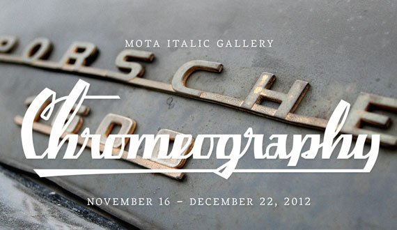
Curated by Stephen Coles, this exhibition celebrates the metallic emblems that gave names and life to vintage automobiles, domestic appliances, and other consumer objects. Hundreds of photographs (as well as some real, physical examples) take visitors on a nostalgic trip through the trends and eccentricities of this ubiquitous but unsung lettering, from the first electrified homes to the streets of mid-century America.
Learn and see more from the collection’s website at Chromeography.
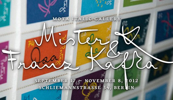
When one thinks of the novel “The Trial” by Frank Kafka, gloominess and pessimism quickly come to mind. But a look into Kafka’s wonderfully handwritten notebooks shows there is also another side to this writer: an ironic, absurd, humorous and light side full of wisdom.
And just as impressive as his texts is Kafka’s powerful handwriting style, which ranges from relaxed, calligraphic to energetic, impatient and almost unreadable.
The exhibition focusses on all of this in a colorfully ‘kafkaesque’ way – with a mix of typographic installations, objects, prints, posters, textiles, books (Mendelsund series by Schocken).
At the same time, the show tells the “Real Travels of Mister K” – a journey in which Kafka’s handwriting moves through time, space, and different physical and energetic states to finally arrive as the digitized script typeface FF Mister K by Julia Sysmäläinen.
The book Too Long to Tweet accompanies the exhibition.
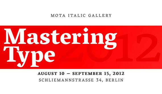
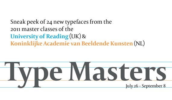
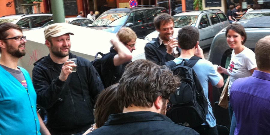
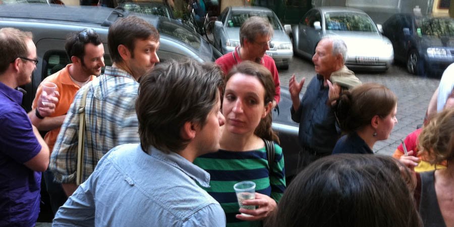
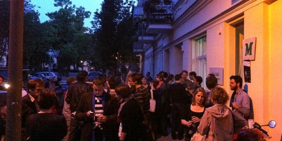
For the second year, we present the typefaces of the 2012 masters students of the Koninklijke Academie van Beeldende Kunsten (NL) and the University of Reading. This joint sneak peek from Europe’s two rival schools provides an early view of their unique new designs.
August 10th – September 15th, 2012
Opening party: Friday August 10th
Allonghata – It is not the construction which matters but the contrast: a typefamily consisting of a flourishing text as well as a lively script version.
Christine Gertsch grew up in Switzerland where her interest in graphic design started. She studied communication design in Basel, Québec, Berlin, and Kolding. Travelling the world with open eyes and ears, she is aiming to connect type design with her interest in languages.
Angata is an attempt to square the circle, or rather to semi-serif the sans. Ultra-legible, it combines a contemporary look with comfortable reading features.
Sociologist turned type designer, Julie Janet Chauffier lives and works in London. She cultivates a holistic vision of the typographic world. Her type design draws inspiration from her multi-disciplinary curiosity.
Blanco – A face for extended reading, it works by itself and as a companion to Mote, by Hrvoje Živčić. They share grey value, family, size and fit.
At 19, Dave Foster graduated with a Bachelor in Visual Communication from Swinburne University. For 5 years he worked as a freelancer with many studios in Sydney and recently began teaching typography part-time. In 2011, he won the Design NSW Travelling Scholarship which allowed him to turn his passion for letters, normally restricted to lunch breaks and evenings, into something more productive by attending Type and Media.
Brasilica is a text typeface developed for bilingual publications in Portuguese and Brazilian indigenous languages.
Rafael Dietzsch is a type designer and typographer based in Brasília, Brazil. Before attending the MATD program, he studied graphic design at the University of Brasília, where he also worked as a lecturer and researcher. In the last 10 years, he has been designing identities, publications and album covers. Since 2010 his is a partner of Vila Cultural, a design and architecture studio based in his hometown.
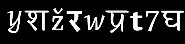
Cawnpore is a Devanagari-Latin typeface family for small sizes and complex hierarchies, with an experimental Devanagari Cursive style.
Pooja Saxena is a typeface and graphic designer from India, with a passion for language and history. She is currently an intern at Apple Inc.
Dato is a type family with two Italics for Serif & Sans. It is designed to work best in corporate design, brand communication and editorial.
Before attending Type & Media, Daniel Perraudin studied Information Design in Stuttgart and Graz. In 2007 he graduated and worked at KMS Team in the areas of Corporate Design and Typography. His first typeface, Parka, was released by The Font Bureau in 2010. Currently he works as a freelance designer, specializing in type- and graphic design as well as signage & orientation systems (with Gourdin & Müller).
Dr Jekyll & Miss Hyde is a multi-script typeface for magazines and children’s books. It was designed to work as text as well as display face when used as heading.
Elena Papassissa is an Italian designer with a love for type and typography. She obtained a Master’s degree in Communication and Design for Publishing and a Bachelor in Graphic Design and Visual Communication at ISIA Urbino, Italy. In Urbino she attended workshops with Paula Scher, Karel Martens, Maureen Mooren, Armand Mevis, and Peter Bilak. She is currently attending the MA in Typeface Design at Reading University.
Emelia is a friendly typeface family for hierarchical typesetting, supporting the Latin and Tibetan scripts.
Sandra Adler is a graphic designer based near Frankfurt, Germany. After graduating in communication design in 2007, she gained experience in design studios around Frankfurt. Since then, she worked for several museums and specialized in typography. A workshop with Veronika Burian raised her interest in typeface design and encouraged her to attend the MATD programme at the University of Reading.
Leda – Text family consisting of a broken, a serif and an italic style, based on my calligraphic lettering; they share proportions, color and fit.
Aliz Krisztina Borsa is a packaging designer from Hungary. She graduated with an MA from the University of West Hungary, Institute of Applied Arts (AMI), Sopron, in 2010. She also studied painting in Helnæs (DK) and typography at MOME, Budapest (HU). Before studying at KABK, Aliz worked as junior designer on Subjective Atlas of Hungary with Annelys de Vet at new media lab Kitchen Budapest.
Lehiya is a Devanagari text typeface which is designed for extended reading in Hindi and Marathi. With a compact, squarish look, it is inspired primarily by the calligraphic style of old Jain manuscripts.
Pradnya Naik is a designer from Mumbai, India. After graduating from Sir J. J. Institute of Applied Art, Mumbai in 2009 she started working with WhiteCrow Designs. While developing fonts for two Indian languages like Urdu and Gujarati she discovered her interest in type design. Her work is mostly influenced by various Indic scripts. She has been involved with Aksharaya as a contributor and archivist, as well as with the research and development of multiscript typography for various Indic scripts.
Lumen is the world’s first typeface for Burmese, Thai and Latin. It is designed for lexicography, editorial and literary uses.
Ben Mitchell is a Brighton-based graphic designer specialising in type design and typography. He has worked in teaching, marketing, publishing and design. In his spare time, he has designed ten typefaces, some of which are to be published in the coming months. Lumen has definitely been his most ambitious project.
Martha is a soft and clear typeface family designed for complex hierarchies in science magazines and books in Latin, Greek & Cyrillic.
Lisa Schultz is a graphic designer and typographer based in Vienna, Austria. She studied graphic design and advertising at the University of Applied Arts Vienna and worked in a small graphic design studio alongside. In 2011 she graduated with distinction and came to Reading straight away to study Typeface Design.
Mila is a typeface for children’s books. Its shapes and forms are inspired by combining handwriting styles with calligraphic traditions.
Kalapi Gajjar is a Typeface designer specialising in the history and practice of Indian letterforms. He has a keen interest in the varied production techniques surrounding Indian scripts. In the other half of his regular day (if he has any time left at all), he is a postal-artist, an amateur cook (also specialising in Indian food, surprise!), and an obscure-object collector.
Minima – A typeface which reinterprets the classical family structure. It finds new shapes by exploring a hybrid construction between sans and serif.
Originally from Barcelona, Noe Blanco is a graphic designer and type designer currently living in Amsterdam. She holds a BA in Graphic Design from BAU, School of Design and a MA in Advanced Typography at Eina, Escola de Disseny i Art, where her interest in type design began and where she created her first typeface. Since 2008, she has been working as a graphic designer for different studios in Barcelona.
Mote is a utilitarian sans-serif typeface mainly for reading sizes in print, influenced by neutral gothic and grotesk designs. It’s a companion to Blanco, a serifed typeface by Dave Foster.
Hrvoje Živčić is a graphic designer from Zagreb, Croatia where he graduated with an MA from the School of Design. Before Type and Media he worked together with Dario Dević as a freelance duo mainly in print design for various cultural clients from Croatia.
Naila & Rocco are a sassy, tasty, dynamic and versatile type-duo (sans and serif) for big and small sizes primarily for use in editorial and corporate design.
Miguel Reyes is a graphic designer and type designer from Puebla, Mexico. He graduated with a BA as a graphic designer from Benemérita Universidad Autónoma de Puebla and he holds a MA in Type Design from CEGestalt, School of Design. Before Type and Media some of his typefaces where selected in the Biennial of Tipos Latinos in Latin America. He has worked in different studios in México and in Typerepublic (Barcelona).
Nari – A serif typeface family in Latin and Gujarati is designed for multi-script textsetting within exhibition literature and publications.
Dot Georgoulas is a multi-disciplinary designer from Melbourne, Australia. She has a wealth of experience in communication design, art-direction, exhibition design, environmental graphic design and teaching. After the MATD, Dot will specialize in typeface design and typography. Through teaching, she aims to inspire others with her enthusiasm for design.
Overlook – A type system intended for cinema magazines consisting of a neo-grotesque sans serif, and a text typeface developed in four grades.
Michele Patané is an Italian type and graphic designer graduated at Politecnico di Milano. Since 2005 he collaborates with other studios and type designers developing and designing custom typefaces; since 2008 has been involved in teaching at Politecnico di Milano, IED Milano and Accademia di Belle Arti in Brescia. He’s living in the UK since August 2011 where he came to attend the MA in Typeface design at the University or Reading.
Pilot – Condensed typeface with a distinctive character and a slightly nostalgic flavor. Six styles provide a rich variety for any kind of display use.
Aleksandra Samulenkova studied art and design at the Latvian Art Academy, where she graduated with a BA, and at the Kunsthochschule Weissensee in Berlin. She is a multidisciplinary designer and artist. After the Type and Media program she will return to Berlin to continue her work at LucasFonts.
Serendip – Designed to compose the canonical texts of Theravāda Buddhism, supporting Pāli language, transliterated in Latin and Sinhala scripts.
Before attending the MATD in Reading, Rafael Saraiva worked as editorial designer and illustrator in Brazil. In his spare time enjoys nurturing his passion for letterforms by practising calligraphy and lettering.
Sila, meaning link in arabic is an optimized font for the web. It comes in both Arabic and Latin scripts and in 5 weights: thin, light, regular, bold & heavy.
Azza Alameddine graduated with a BA in visual communication from Paris in 2007 and after having worked 2 years in design agencies, she decided to work as a freelancer to art direct her own projects. Her area of expertise is branding where she loves to design logos using custom lettering.
Sultan is firmly placed between readability and character. It’s great for display use, yet readable enough for a wide array of designs.
Sveinbjörn Pálsson studied graphic design at the Iceland Academy of The Arts in Reykjavík. He has had a varied career in design, with work in magazine design, interaction design, art direction, tomb-stone lettering, custom type design and other fields. After graduation he plans to make some typefaces.
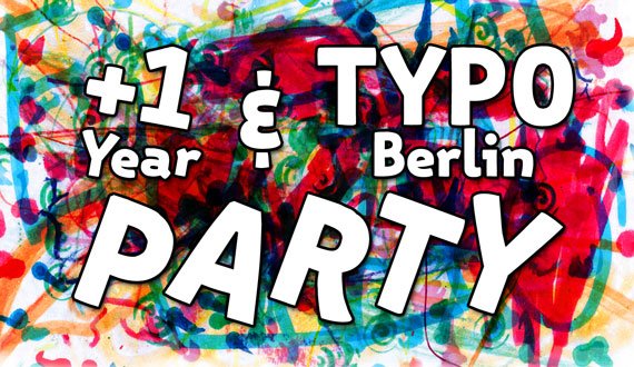
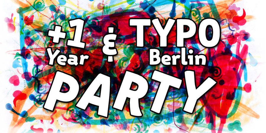
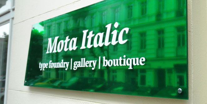
Mota Italic opened its physical gallery and storefront the day before TYPO Berlin 2011 and the dual opening party and TYPO pre-party was one of Berlin’s typographic highlights of the year. This time around we are celebrating not only our space’s first birthday/anniversary but also (again) Berlin’s biggest and best conference – TYPO Berlin.
The party will be here next Wednesday, May 16th starting at 6pm and going till late. It’ll be the perfect start to the giant TYPO weekend! Be sure to get here early and have some drinks with us!
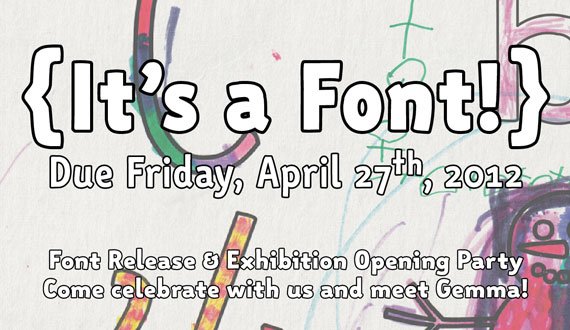
You are cordially invited to {It’s a Font!}: An Exhibition and Font Release Party for our latest type family »Gemma«.
{It’s a Font!} will be on display at Mota Italic from April 24th – May 26th.
Our neighborhood, Prenzlauer Berg, once a hotspot for demonstrations and alternative lifestyles in East Berlin, has now became a still-hip-yet-quietly-affluent family-safe area. It appears at first glance that most women on this street are pregnant or with a stroller, or both. Baby care specialists, pregnant yoga, birthing classes, pediatric doctors, baby clothes stores, maternity clothes stores, toy shops, and kindergartens have saturated the market. (For more on this see Spiegel, Time, & The New York Times)
Embracing these facts, we’ve collaborated with the schools, daycares, and families to have the children of Prenzlberg help us with this exhibition.
Part product launch, part community outreach, {It’s a Font!} showcases our latest type family Gemma along with the creativity and crayon skills of the neighborhood’s children. In the tradition of coloring books, we printed out character samples of Gemma and distributed them to the parents and schools to have the children decorate. The results are nearly 400 colorful, creative, funny, or simply well-done interpretations of how one can approach the task of adding some color to a normally black and white character.
We’d like to say thank you to the schools and families in Prenzlberg, without whom this display would not have been possible.
Thanks to digital cameras, smart phones, nearly unlimited storage space, and online social sharing, it is easier than ever to capture, collect, and share images. Particularly exciting is the now relatively mainstream pursuit of photographing interesting found type and lettering. Whether it is encountered in one’s neighborhood or stumbled upon while traveling, there is seemingly no end to unique letters to be collected. This phenomenon is illustrated through dozens of blogs dedicated to found letters, to Flickr’s countless tagged images of type, and by sites like we love typography – currently with 12,000+ curated images.
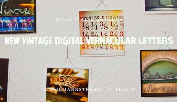
New Vintage Digital Vernacular Letters is modestly comprised of just under 600 images* from 120 participants from all over the world. These photos depict the letters as shiny and new, dilapidated and old, incredibly beautiful, incredibly ugly, mundane, idiosyncratic, everyday, unimaginable, local, and exotic. The images were shot in more than 40 countries and the variety of letterforms indicates just how special letters and typography can be. If you weren’t already taking notice of the vernacular type all around you, you will begin to after taking in this collection.
A huge thank you to all who submitted images! This would not have been possible without your participation and interest.
*A small note on the selection process: less than half the offered images were selected. The gallery space is relatively small, and there was simply not room for everyone’s photos.
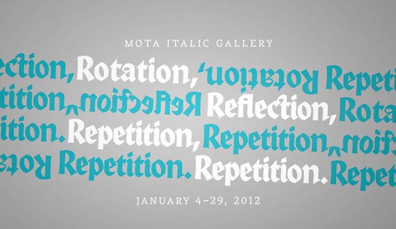
Our first exhibition of the year starts off appropriately at the beginning with some of the basic concepts of visual design. Using the foundational ideas of rotation, reflection, and repetition, the exhibited project creates complex & beautiful patterns and textures using a selection of blackletter typefaces.
Presented in this show are 44 typographic patterns created by students in the Visual Communications program at the Universität der Künste Berlin. The participants of Simone von Eldik’s typography seminar (assisted by Tanja Kapahnke), inspired by Judith Schalansky’s book »Fraktur mon Amour«, created patterns from glyph fragments or letter combinations from four typefaces that had been theoretically examined in class: Textura »Weiss Gotisch« (Emil Rudolf Weiß | Bauersche Gießerei 1936 | Petra Heidorn 2004), Rotunda »Alpine« (Dieter Steffmann 2000), Bastarda »Bastarda K« (Manfred Klein 2004), and Fraktur »Leibniz« (ca. 1750 | Genzsch & Heyse 1912 | Petra Heidorn 2003). In contrast with the ever-present stereotype of blackletters as being symbols for Germanism and patriotism, a multitude of patterns with surprisingly modern, contemporary aesthetics emerged.
The works were created by Anita Ackermann, Melanie Bossert, Anna Cairns, Dora Ferency, Malin Gewinner, Marcus Gruber, Ana Halina Ringleb, Claudius Hog, Miriam Kadel, Isabel Kronenberger, Lucas Küng, Hans Lichtenwagner, Till Lukat, Sophie Lundström Halbert, Mona Peters, Carlotta Richter, Giulia Schelm, Timo Schmitt, Romy Strasser, Balazs Surjan, Rene Thoms, Vincent Tollens, and Ryuhong Yoon.
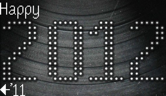
2011 was a great (and busy) time for us at Mota Italic. We appreciate all of your support making it an unforgettable year! Here is a quick recap of some highlights in case you missed the news the first time around.
In May, we opened a boutique and gallery space in Prenzlauer Berg. It has been slowly and steadily growing thanks to Berlin’s awesome design/type community, countless visitors, and all of our friends online!
The shop when we opened in May.
The shop as of December!
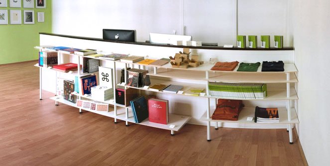
Every week, new books and merchandise are coming into the boutique. We recently began adding the books to our online shop, in case you aren’t able to make it to our space in person. Keep checking back, as there are still many more products to upload.
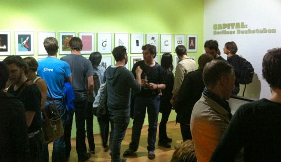
The first was “CAPITAL: Berliner Buchstaben” featuring 27 Berlin-based type designers’ letters illustrated by 27 Berlin-based artists/illustrators/designers.
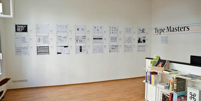
“Type Masters” was our second exhibition and the first preview of the typefaces of this year’s graduating master classes of the MATD program from Reading, England and the t]m program in The Hague, the Netherlands
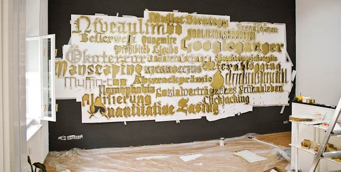
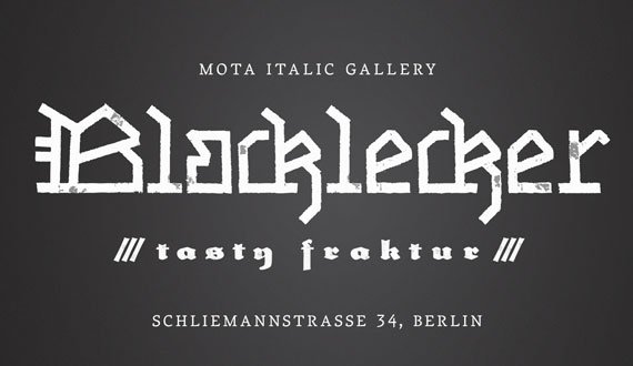
For the final show of the year, we made an installation called “Blacklecker: tasty fraktur” featuring 22 of the most significant new blackletter typefaces of the last 21 years.
We have a lot of plans for 2012 and are really looking forward to it! Get ready for some new fonts, updates to Vesper and Mota Pixel, new exhibitions, and many more books and products to come this year.
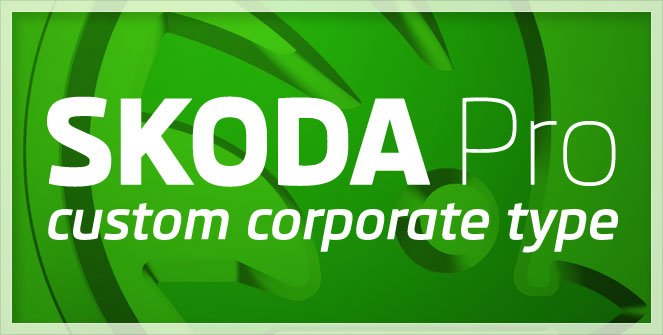
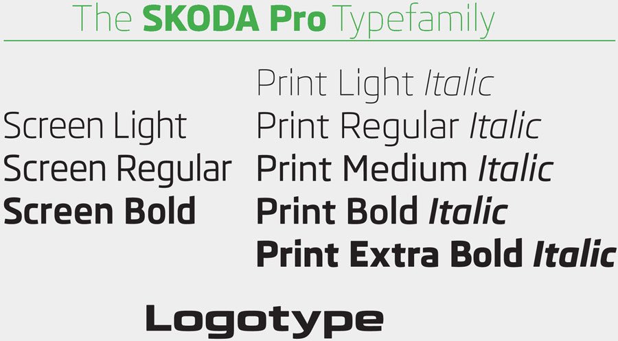
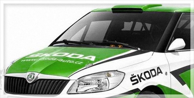
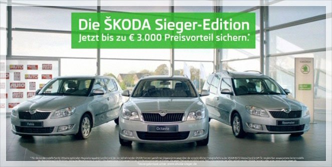
Earlier this year Škoda Auto unveiled their completely revamped corporate identity. We were fortunate to play a small role in this rebranding by providing a set of custom typefaces for use in several different key areas. The two year process allowed us to work with not only the Czech Republic’s premier auto company, but also two incredible German design firms, an international ad agency, and a number of other creative individuals from all over the globe.
The initial brief called for three fonts to be used in the cars’ digital displays (instrument control panels, navigation system, radios, etc). The designs would be light, regular, and bold with some rather specific technical requirements: they were to be used in a wide range of pixel sizes, they needed to be optimized for several different rendering methods, and there were significant width restrictions. Keeping these specifications in mind – and factoring in the client’s aesthetic desires: sans serif, squarish, clean, legible, modern, and high-tech – we had some tight parameters in which to begin designing.
While in the middle of creating the screen fonts, there was talk of the upcoming corporate redesign. By this point, our new fonts were progressing nicely, so the decision was made to expand the family for wider use – this would become their primary corporate type family. Before, there had been at least 4 or 5 different families used for various applications, but now was the chance to unify their design style company-wide.
We modified the screen versions to optimize them more for print. Beginning with the regular weight, we lowered the x-height, lengthened the ascenders and descenders, added some details that wouldn’t show up on screen, increased the weight a bit, adjusted individual characters’ widths (no longer having the restrictions imposed by the screen software), completely re-spaced everything, and added kerning. The family was then expanded to include thin and extra bold styles giving it a total of five weights. Finally, matching italics for all were created. These refined print fonts form a key component to the new visual identity of all Škoda’s printed material; by now you should be able to see them in use by most of Škoda dealers/affiliates around the world.
Finally, the smallest – but most immediately recognizable – component to the project was the logotype (only the letters; the symbol was designed by Syndicate). The five simple letters “Š K O D A” underwent more minute revisions and almost took more time than any of the other steps. They started as wider, bolder, more squared versions of the heavy print typeface; but, over the numerous iterations they crept further and further away from the original source. The logotype is now something of its own entity, but still feels like an appropriate part of the family.
My favorite sightings of the new type was the logo being plastered all over the Tour de France :)
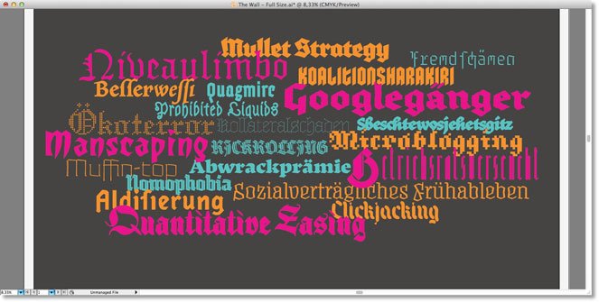
Here are a few images and comments about the concept, design, and setup of our installation “Blacklecker: tasty fraktur” (November 5 – December 23, 2011).
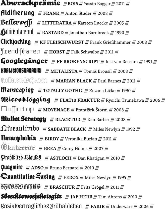
The basic concept for the exhibition was to show some of the greatest/most influential/most popular/our favorite modern blackletter designs. There have been quite a lot of new blackletter typefaces coming out in the last years, so the selection was difficult. The selected designs were released between 1990 and 2011 plus a couple that are unfinished and not yet commercially available.
Our general guidelines while curating these designs necessitated taking queues or inspiration from traditional blackletter styles, but to interpret them in new and contemporary ways. So whether the designs were influenced by 90’s grunge, pixels and the digital environment, or trying to blend blackletter and Latin types, they have all expanded the previous boundaries of pre-digital blackletter styles. The second round of selection involved choosing an appropriately wide variety of styles: different weights, widths, inspiration sources, amounts of ‘blackletterness’, text vs. display use, etc.
There are (only) 22 typefaces represented in this installation, although ideally, many more could have also been included. Regardless, through this small cross-section of designs, it is clear that the blackletter genre is continually advancing with technology and designer’s tastes and there is still room for more.
After selecting the typefaces and words (more on the word choices below), the layout was made on the computer. The color coding represents the letters’ sizes, distance from the wall, and age of the fonts. The layout is somewhat of a Blackletter Big Bang – the oldest fonts are the largest, more to the outside, and the letters are physically furthest from the wall (as in 3D; more on this also below). The newest fonts are smaller, more central, and closer to the wall.
Pink = 1990-1999; Orange = 2000-2009; Blue = 2010–still unreleased
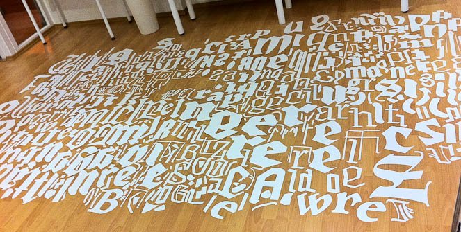
The letters were laser-cut out of a thick, white card stock. Our obsessive-compulsive intern, Sláva Jevčinová , laid them all out on the floor to help sort the mess back into words.
Then the paper negatives were also sorted.
Slávka painstakingly recombined all the sheets to create one giant stencil.
The final stencil.
We then cut the stencil into several large pieces to attach to the wall.
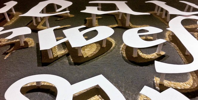
Beginning to spray paint the counterless letters gold.
Done.
And done.
Gold on dark gray.
It took three people about two days to mount all the paper letters to the wall.
Mounting the letters was incredibly time-consuming due to the 3D aspect. Each word has its own length of foam posts that were cut by hand. There are more than 300 letters averaging 5-10 posts per letter x 2 hand-cut squares of tape per post. This doesn’t include the additional ≈ a million ‘pixels’ in the word “Ökoterror”.
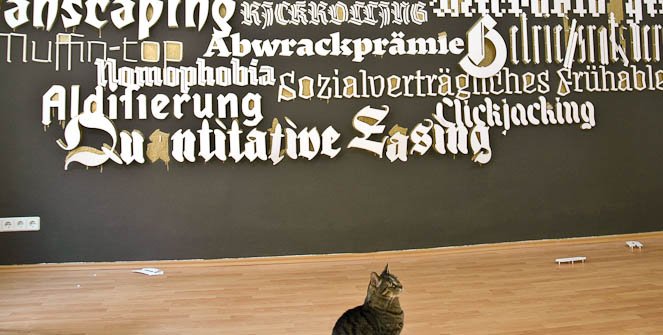
The final piece.
Not all tapes are created equal. We used a few different varieties, but ran out of the best one mid-way through the hanging. For the first several weeks, letters were jumping off the wall. This was the scene the morning after the opening party – by far the worst day. After repairs with a stronger tape (and in some cases additional foam posts), the letters were securely in place for the remainder of the show.
One last comment regarding the selection of words. Being ‘modern’ blackletter designs, we chose appropriately ‘modern’ words and concepts. They were split 50/50 in German and English to accommodate most of our audience. The German words are all official ‘words of the year’ from the 90’s through now – these were voted on each year and they represented popular linguistic trends and buzzwords for that year. The English words are similar; they were either hot topics of the year or were newly included to various dictionaries. In both the English and German, the words range from entertaining to highly political. The words were matched to the typefaces for a variety of reasons: sometimes they were appropriate to the type designer (based on their personality/beliefs), to the intent of the typeface, to the typeface’s style, or simply because the word shows off particularly nice letters from that typeface.
Thank you again to all the designers who sent in their designs. And thanks also to our awesome intern Slávka; without whom the show would have never been up on time!
For the final show of the year, we present Blacklecker: tasty fraktur. This exhibition is our biggest and best installation so far; you really must come visit if you are anywhere near Berlin! It’s up now and will run until we close for the end of the year holidays – until 18:00 on December 23rd.
We’d like to thank all the participating designers for sending in their 22 awesome blackletter inspired typefaces.
This installation is comprised of 22 unique, modern typefaces that interpret the blackletter style in new and exciting ways. Through these designs, common stereotypes and connotations often associated with traditional blackletter types are severed, allowing this genre to advance with the times and serve new and interesting roles in contemporary design.
The show runs from November 5th – December 23rd, 2011.
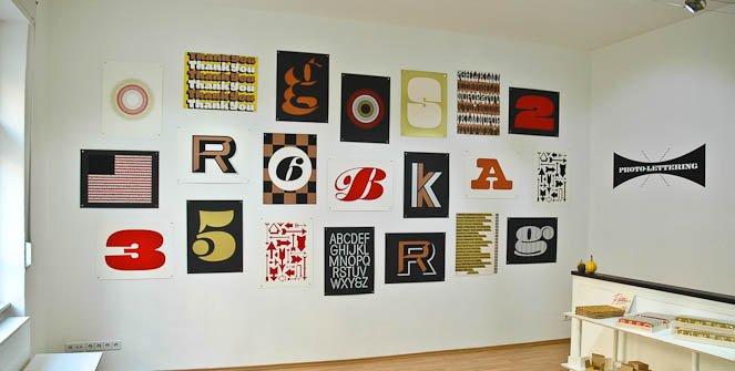
Come one, come all and marvel at the magnificent creations of House Industries‘ Photo-Lettering collection. These anal-retentively produced prints, by master screen printer David Dodde, are a true wonder to behold in person. 22 beautiful designs illustrate the pinnacle of what is possible when the right people combine fantastic letters, clever ideas, and luminous inks with the perfect paper.
Limited quantities of the prints are also available for purchase.
But come quick, several have already sold out!
The show runs from October 4th – October 29th, 2011.
Rich Kegler is currently embarked on a grande European tour to screen his wonderful film Making Faces. He’ll be in Berlin next week and we’re celebrating with a special typoholic evening! Thursday September 8th come to The Downstairs Kino in Prenzlauer Berg to see the film, meet Rich, and hang with Berlin’s hippest type nerds.
What:
Making Faces Film Berlin Premier (One night only!) (OV English)
+ a free drink compliments of FontShop & FontFont!
There are only 30 seats per show, so come early to get a spot. The theater is also a bar and restaurant; a great place for dinner and hanging out before/after!
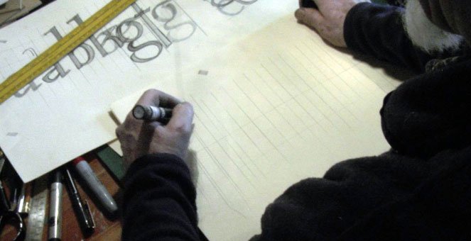
‘Making Faces: Metal Type in the 21st Century’ a documentary film
‘Making Faces’ is a fascinating design documentary by Richard Kegler that captures the personality and work process of the late Canadian graphic artist and type designer Jim Rimmer (1931-2010).
Making Faces focuses on one man’s dedication to his craft and relays the details of creating a metal typeface, while also conveying this passion to anyone who values the “hand-made” in today’s world of convenience. Jim Rimmer’s good humor and intelligent description of his process make it an enjoyable viewing experience for those who are even vaguely interested in how things are made.
In 2008, P22 type foundry commissioned Jim Rimmer to create a new type design, RTF Stern, that became the first-ever simultaneous release of a digital font and hand-set metal font. Rimmer was one of only a few who possessed the skills needed to create a metal font.
Shot in High Definition, this film documents the creation of a new typeface from the preliminary sketches through the cutting and casting of a single letter. The film offers a unique opportunity to share Jim’s knowledge with the world.
Clearly anyone interested in type design, letterpress printing and graphic processes would see Making Faces as something inspiring and essential, as there are few films focusing on these topics.
–Richard Kegler is founder and lead designer of P22 type foundry. He is also currently director of the WNY Book Arts Center at Buffalo NY. Kegler has a Masters degree from the Department of Media Study and the University at Buffalo
Antithesis – Push to the limit, reduce to the maximum. Colors of light, pulses of sound. All goes to one. Interpolation is so ’90s.
Born in Dresden, Germany. Yanone started to design type in his first university years at the Bauhaus-University in Weimar, leading to the release of his first typeface Kaffeesatz in 2004. Internships took him to SYNTAX in Amman, Jordan and FontShop International in Berlin and he finished university with his Arabic/Latin typeface Amman for the rebranding of Jordan’s capital which was released in 2009 by the FontFont library.
Arlecchino has playful and quick gestural qualities that translate to very different but cohesive styles, in both Latin and Greek scripts.
Luisa Baeta started her infatuation with design in Brazil with a BA and substantial work in studios and as a freelance book designer. She continued her studies in London, where she now lives and works, with a Postgraduate Diploma at the London College of Communication and finally an MA in Type Design at the University of Reading, in which she is currently finishing her final project and walking around lots of ducks.
Artigo is a typeface designed for lifestyle magazines. The design of all scripts explores a connection between handwriting and typography.
Joana Correia da Silva is a Portuguese designer and architect with a love for the written word. After studying architecture she studied Graphic Design where she found a bigger interest in Type Design. This year, she attended the MATD course at Reading. The goal was to emerge immerse herself in the vast world of Type Design and Typography. Reading was the perfect place for that!
Bois is a Roman Antiqua with Gothic influences. Didelle is an in-development sans serif, inspired by Peignot, Didot, and swiss grotesques.
Yassin Baggar is a freelance graphic and type designer, based in Berlin. He recently graduated from the TypeMedia Master at the Royal Academy of Art (KABK), The Hague.
Cassiope is destinated to set theatre plays. Delicate and small, it is intentionally dark yet the counters are open to ensure legibility.
Marion Delsuc was born in France in 1987. She studied graphic design for four years before coming to Reading to attend the Master of Typeface Design. She decided to undertake the design of a new bookface for theatre. This was the opportunity to work from traditional inspiration, yet the liveliness of theatre was also matching the need for expressiveness that Marion was interested in when she started to work on her design.
Cassise is a contemporary interpretation of early 19th century type designs. Its distinctive styles are based on a similar skeleton to form one unified typeface family.
Malte Herok’s interest in type design was sparked during his studies of Communication Design at the HTW Berlin from where he graduated in 2010, having spent several semesters in the type design classes of Jürgen Huber, Luc(as) de Groot and Fred Smeijers. In 2011, he graduated from the t]m Master program at the Kabk in Den Haag. Malte is currently working as a graphic and type designer in his hometown Berlin.
“Chic” is a type system that explores different styles featured in a woman’s wardrobe.
Marina Chaccur is a Brazilian graphic designer and teacher, graduated at Fundação Armando Alvares Penteado – FAAP, and with an MA from the London College of Communication. For the past years she has been involved in conferences, lectures, workshops and exhibitions in Brazil and abroad. Currently she works as a freelance designer and also ATypI board member.
Civilian is a typeface family developed specifically for use on web interfaces. The design combines the pixel grid with personable details.
Colin M. Ford has been designing websites since the Dot Com boom, when he was about 12 years old. At 21, he was introduced to the world of typeface design by the punk rock design duo Post Typography while studying at the Maryland Institute College of Art and has since never put down the pen tool. These days he has found his niche exploring the intersections between the worlds of the web and of typeface design.
Clint is a multi-script typeface that is designed to perform well in poems, lyrics, dramatic texts, short stories, screenplays & fairy tales.
After a year studying Civil Engineering in the Netherlands, Bianca Berning enjoyed the Communication Design course at the Hochschule Niederrhein (including a semester at the Kunsthøgskolen i Bergen in Norway) where she discovered the intriguing world of detailed typography and type design. She worked as a freelance graphic designer during her studies and before attending the MATD at the University of Reading.
Colette is a transitional type family with extremely sharp detailing, including both functional text and expressive display styles.
Lauri Toikka is a Finnish graphic designer. Originally from Helsinki, Lauri studied in Lahti Institute of Design and graduated in spring 2010. After Type]Media Lauri will move to Berlin to start a graphic design studio/type foundry with his classmate Florian Schick.
Eczar was designed with an intent to bring liveliness and vigour to academic books with a focus on Devanagari-Latin multi-script typography.
Vaibhav Singh is a student of type design. He studied architecture and visual communication before joining the MA in type design at the Department of Typography and Graphic Communication, at the University of Reading in 2010.
Emrys is an extremely versatile, prominently modulated sans-serif type family for multiple scripts.
Ben Jones is a British typeface designer. After spending his formative years in Switzerland, Ben returned to England to study Typography at the University of Reading before establishing Protimient, an independent web, print and type design enterprise that has since turned its focus solely to the production of original typeface designs.
Ernest / Ernie / Ernesto – A modest transitional text cut for continuous reading, a caption cut made for small sizes with simplified letterforms and a display-caps-only cut with playful alternates.
Linda Hintz studied at HfG Schwäbisch Gmünd, internships took her exploring classical graphic design at Atelier Anton Stankowski and signage systems at Intégral Ruedi Baur et Associés. Since graduation in 2007 she worked professionally designing books, magazines, catalogues, businesscards, exhibitions, posters, pictograms and all kind of other things for both big and small clients. A course with Luc[as] de Groot led her to Den Haag to find out more about type.
Eskorte is a seriously reliable corporate typeface family. Diversity in style allows uniqueness while simultaneously covering legibility.
Before attending the MATD program Elena Schneider studied Graphic Design in Wiesbaden and Dortmund and eventually finished with a diploma in 2008. She has been working as a freelance graphic designer since 2004. Together with two of her peers Elena founded RADAU – a studio for design in Dortmund in 2008.
Foxhill – A typeface especially designed to work in small sizes such as bilingual religious texts. Latin & Greek are designed to work harmonious together. It includes polytonic Greek, used in historical texts, literary texts & poetry.
Hanna Donker is a (typo)graphic designer currently living and working in the United Kingdom. After graduating at the ArtEZ Arnhem academy in 2008 in The Netherlands she worked for two years as a freelance graphic designer. Besides this she taught first year graphic design students the course Typography at MIADA art academy in Chongqing, China. Before studying the MA Typeface Design at the University in Reading she participated in the Typography Summer School in London, UK.
Lemona is a typeface for literature, an experiment exploring conventions in weight distribution and proportions of old-style typography.
Born 24 years ago in Bogotá, Colombia. Julián Moncada studied graphic design, and as of today he is part of the MA in Typeface Design at the University of Reading and looking forward to draw, write and teach about letters.
Mag Grotesk – A Grotesque type family, with 15 styles from Bold Extended to Thin Condensed, including 2 Italics. The idea was to create an expressive type family which provides strong contrast between all styles.
Florian Schick studied graphic design at the University of Applied Sciences and Arts in Hannover and the Royal Academy of Arts (KABK), Den Haag, from which he graduated with distinction in 2010. Since 2006 he has been working as a freelance designer and founded his type foundry Schickfonts in 2008. In fall 2011 he will start a design studio in Berlin with his classmate Lauri Toikka.
Marco is a superfamily typeface designed for multilingual publications. It contains Roman and Sans in Latin, Greek, Cyrillic, and Mongolian.
Toshi Omagari was born in Fukuoka, Japan. After he graduated from the Musashino Art University in Tokyo at which he learned typography and graphic design, he went to the MA Typeface design Course at the University of Reading. One of his typeface Tangerine is available from Google fonts.
Modern 7 is an interpretation of the style introduced by the Didot dynasty, intended for—but not restricted to—literary prose.
Adrien Vasquez graduated from the ESAD Valence (FR) in June 2010. His diploma project was centred on the design of a family of typefaces, while the submitted dissertation was a personal point of view on contemporary attitudes and practices in graphic and type design(s). Adrien is currently finishing the MA Typeface Design at the Department of Typography and Graphic Communication, University of Reading (UK).
Naej is legible, fun and inviting with a touch of elegance. Organic rather than mechanical,this typeface displays a humanist axis, modulated stroke and open forms.
Born in the island of Barbados, Blondina Elms Pastel is an independent designer, typographer, lecturer/tutor and type designer. Her atelier, Elms, conceptualizes and produces two-and-three dimensional projects in all visual communication areas. Blondina obtained her Diplome National d’Art et Technique DNAT—avec les félicitations du jury—in 1999 from l’Insitut régional d’art visuel de la Martinique and is presently completing a Master in Typeface design at the University of Reading.
Quintet script looks double-stroke but consists of a single stroke and has the same letter widths to be used as a layer font.
Kunihiko Okano graduated from Kyoto City University of Arts in 1995. After working as a packaging designer for about a decade, he started his design office Shotype Design in 2008 and has been providing Latin parts to Japanese type foundries.
Designed for Korean and Latin multi-script magazine situations, Saja offers two text weights—one dark and one light for regional preference.
Passionate about Asian language and culture, Aaron Bell earned a bachelors degree in Asian Studies, with a minor in Japanese. After graduation, he worked for two years as a web developer and studied graphic design with a focus on typography. He is currently a postgraduate student at the University of Reading in the MA in Typeface Design program, focusing on Latin and Korean multi-script design.
Superhero is a experimental type family featuring 6 styles. It is purely in the display realm, with various superpowers for each of the weights.
Sun Jung Hwang is a graphic designer originally from South Korea. Currently she lives and works in Rotterdam as independent graphic designer. She graduated BA in graphic design at KABK, the Hague, in 2006. Before coming back to KABK for her study, she has worked in the fields of graphic design and advertising. Sun is fascinated by complex things in life. Complex layers and colors are her best friend.
Taiga is a small type family designed especially for fiction books, poetry or multiple languages.
Emma Laiho studied in Aalto University School of Art and Design in Helsinki but caught the type fever during her exchange studies at the KABK. Couple years later it was time to return to Netherlands for Type and Media. Her graphic design work has been concentrated on editorial and book design, so it is logical her main focus in type design so far has been learning the intricacies of text type.
Capitolium, designed by Gerard Unger for Rome and the jubilee of the Roman Catholic Church in 2000, carries the city’s two-thousand-year-old tradition of public lettering into the twenty-first century.