

Sketches
Chikki started as random sketches made during a presentation at a type conference several years back. I have been consumed with the idea of drawing a Devanagari display typeface for a long time now and this no-curve design was an exciting starting point. I imagined it could be quite versatile – it could work for both funky graphics and also for setting more text. In May 2018 I started to digitize and rework the sketches.
Digitizing the Devanagari
I usually begin drawing the Light and Black weights for the Devanagari simultaneously. When drawing Devanagari, it is important to make decisions about stroke contrast in extreme weights at the start of a design because some characters can get really dark. I start with a few simple shapes and some complex akhand conjuncts to figure out proportions early on. It is also useful to draw letters with different characteristics — angles, loops, knots, connections, etc.
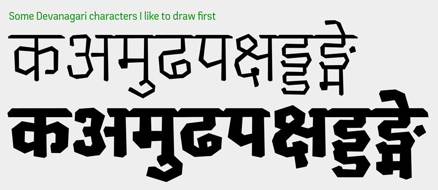
Even though Chikki is not made with a traditional reed pen, I wanted to add subtle classic features of the Devanagari script to the stroke contrast and axis. By doing this, I could establish a visual grammar and expanded the character set to the 877 Devanagari characters that the typeface has.
Drawing the Latin Letters
The Latin was drawn much later, to compliment the nearly-completed Devanagari. This is my first extended Latin design, and even though Latin is the script I use the most in my design practice, drawing the letterforms was quite challenging.
I started with drawing base Latin glyphs and our intern, Salomi Desai, helped with making the accents, punctuation, and symbols. But for a long time I wasn’t entirely happy with the overall feel of the Latin. It seemed to be missing cohesiveness and the punch that the Devanagari delivered.
Having another set of eyes look at a typeface is always nice, so I decided it was time to seek some help. I am extremely grateful to David Jonathan Ross and Inga Plönnigs for being ever so generous for giving me critical feedback and providing fresh perspectives on the design. Thanks to their suggestions, I’m very happy with how Chikki Latin has turned out!

Once I was more content with the look of the Latin, we began expanding the characters to include wider language support. Rob revisited the accents and added a whole lot of new glyphs — ten sets of numerals, case sensitive alternates and language specific punctuation, to name a few. After much testing and many iterations, the typeface was finally ready to be set out in the world.
The very last step was generating Chikki as a variable font (Mota Italic’s first variable font!). If you don’t know about this new format yet, John Hudson wrote a pretty comprehensive article that I recommend checking out. You can test Chikki Variable on Nick Sherman’s great site v-fonts.com. Nick pointed out to us (I haven’t checked this thoroughly) that Chikki is the first commercially available Devanagari variable font! So go check out all the cool features of this typeface and license it here!

A Note on the Naming
I find naming fonts very tedious, it’s one of my least favorite parts of the type design process. My last typeface Maku, was relatively easy to name, the design is a stylized version of my own handwriting… it was called Maku because that is the name my mom would call me by when I was younger.
So with Chikki, I was looking for a name that reflected the “crispness” of the typeface. One random evening while I was sitting and working on the fonts, probably hungry and thinking of food, I thought of Chikki! Chikki is a hard, crunchy Indian sweet, that when you bite into makes these sharp edges that remind me of the nibbled-off corners of the typeface. And just like that it fell in place!