22nd December, 2010 by Mota Italic
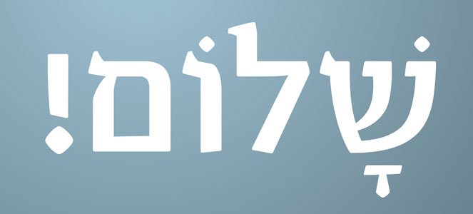
We are thrilled to announce the release of Vesper Hebrew today! This new, five font family is the result of a very memorable collaboration with the renowned Israeli type designer and artist Oded Ezer. His impeccable craftsmanship on these designs is both beautiful on its own and also the perfect compliment for Vesper’s Latin counterpart. We are grateful for all of Oded’s hard work and excited to finally share these thoroughly modern typefaces with you!
Vesper Hebrew is available now exclusively through Mota Italic. That being said, these typefaces are also available though Oded Ezer’s foundry under the name “רץ” (Rutz). The fonts have been renamed especially for the Hebrew-speaking community, Rutz meaning “running text,” to help emphasize that this is a workhorse text type family.
For a bit more about the design process and how the project evolved, here are a few words from Oded Ezer:
The first half of the 20th century was quite revolutionary in terms of Hebrew type design. The list of significant serif text typefaces created in those years starts with Frank-Rühl, that was cut around 1908, goes on to the birth of Francheska Baruch’s Shoken in the mid 1940’s, through the creation of the 50’s trio – Koren, in 1957, Hadassah in 1958, David in 1959 – and, in 1965, Narkiss Linotype family. From around that time till now, no significant Hebrew serif text typeface was introduced.
It was quite surprising for me to discover this fact. This can also explain my motivation to find a true contemporary solution for a new text typeface. For quite a long time I was researching 500, 800 and 1,000 years old Hebrew manuscripts, trying different calligraphic approaches, and trying, unsuccessfully, to find an answer to the question: What is the good way to design a classic yet contemporary typeface at the same time?
One day I have stumbled upon Rob Keller’s “The Making of Vesper” article on “I Love Typography”. I have found this font beautiful, but more important – very readable, and with strong character. I felt that this guy’s typeface, designed as his MA graduation project at Reading University, might have some clues as for my own search for the perfect Hebrew serif text typeface. So I wrote to him asking if he would be interested in a Hebrew version to his font, and he happily replied – Yes. We later had the chance to meet in Brno, and I was delighted to find out that he is as great as his font. What excited me most about it was the typical “Hebrew” cutting of this font, whose style reminded me very much the style of the classic Hadassah typeface, but, in a softer and more delicate way. I immediately had the idea to use it’s serif as a starting point for the Hebrew version, and from there, my task became clear to me: To design a flowing, easy to read Hebrew typeface.
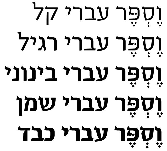
Matching the Latin Vesper, Rutz, which means “running” in Hebrew (Same as in “running text”), includes 5 different weights – Light, Regular, Medium, Bold and Heavy. This is actually the first Hebrew serif text font family that contains 5 weights. The classic Frank-Rühl, for instance, contains only two weighs – Regular and Bold. Compared with the slightly bolder Frank-Rühl Regular, Rutz/Vesper Hebrew Regular has a lighter color when arranged as text blocks.
So, here is the results of my adventures with creating a new Hebrew serif text font: Vesper Hebrew Light, Vesper Hebrew Regular, Vesper Hebrew Medium, Vesper Hebrew Bold, and Vesper Hebrew Heavy.
– Oded Ezer
- News
See more posts filed under: