20th April, 2022 by Kimya Gandhi

Wishes do come true
In 2018 I heard David Jonathan Ross (DJR) give an acceptance speech for receiving a well deserved Prix Charles Peignot. I have always been a fan of David’s work and his presentation only made me more inspired by his exemplary design journey and work ethic. I have had the good fortune of meeting him over the years at various design conferences and I’d be lying if I didn’t secretly hope to collaborate with him someday. Cut to 2021, when on a lazy evening I got an email from DJR saying he would like me to draw a Devanagari companion to Fit, I didn’t have to think twice before saying YES! I love the design of Fit and its use of the variable font technology is just fit-ting (yeah I will use the fit pun more than once in this article, brace yourself) and so began my journey of drawing Fit Devanagari…
Why Fit Devanagari?
As someone who grew up in India and studied in a rather conservative schooling system, I was a rather shy and conformist person. Even during some early design years, I heard the phrase ‘but this isn’t how it is done’ and I wasn’t always encouraged to ask why? Later on in the course of my Masters’ studies, I met Prof. Kirti Trivedi and he opened up a whole new world of design thinking and process. Since then, I have always tried to understand and find value in my work—when I say ‘value’ it can be design exploration or solving a problem. So when I started thinking about Fit Devanagari, the question wasn’t “why?” it was “why not?”

Over the years I have enjoyed drawing innovative display typefaces that use current font technologies for the Devanagari script. When the opportunity to design a companion to Fit presented itself, needless to say how excited I was to take on this adventure! The Fit family is designed to fit just about any text into just about any space—the extreme masters push the limits of legibility but open up a space for experimentation at a massive scale!
Understanding the scope of the project
As much I enjoyed the idea of creating a fixed counter geometric Devanagari, the fact that it was to be a companion to an existing Latin typeface meant that I needed to understand the design and see if it could naturally ‘fit’ Devanagari into the visual aesthetic before I committed to the project. When designing complimenting multi-script typefaces is it imperative that both scripts be celebrated and none look derivative or the latter ‘Latinised’. There are ways to ensure this and I wanted to draw some consonants and conjuncts to see if this would be possible. After working with the shapes for a while, I decided it was working nicely, so I dove in deeper to create Fit Devanagari.

Okay if you stuck around to read this long, I will finally get into sharing some insights on the technical process of drawing Fit Devanagari. Fit Latin is designed with straight vertical lines primarily with curves on opposite sides of the rounded letters maintaining a strict even counter space within each other. When starting to draw some of the base Devanagari characters, I began by defining the grid. The Devanagari pen angle is traditionally exactly opposite to that of Latin, and so the placement of the curves on the Devanagari letters is switched.

The masters, as I mentioned earlier, are quite extreme—beginning with the impossibly narrow Skyline style, each character grows by 3600% (on average) to reach the gargantuan Ultra Extended! The process from here was straightforward, adding more and more glyphs starting with basic consonants.

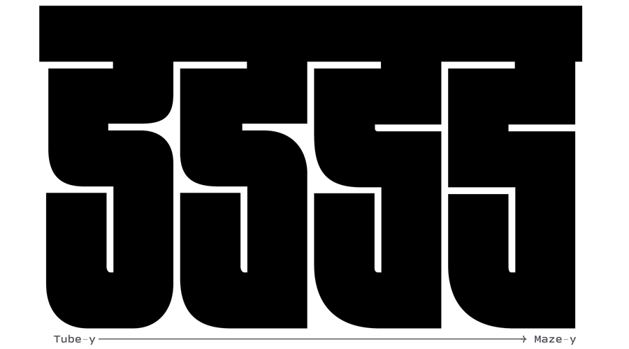
Curve or corner?
Some of my initial character explorations had a lot more curves than the Latin, which made the Devanagari look more tube-y than maze-y which stood out as different from the Latin. DJR and I met regularly, and many of our early conversations revolved around the question ‘can this be a corner?’

It was super interesting to be on this journey of exploring familiar Devanagari letterforms with David who was looking at them purely as shapes. We were able to find solutions together that may have taken me longer on my own—that’s the best thing about collaborations!
Every possible solution
The construction rules of Fit were easy to apply to some simple characters while in other cases it was quite challenging. I spent days trying to figure the best possible outcome for some characters—the idea was to get the most legible solution that doesn’t go too far from the Fit style.

This process also involved looking at existing shapes of the same letter in the wild—old books, type specimens, old movie posters. This research helped me come up with some non-standard forms that turned out to work very well with Fit’s aesthetic. I am thankful to Noopur Datye, who gave her generous feedback on some of these conflicting letterforms.


Enter: Diagonals
The letterforms from Fit Latin are devoid of diagonal strokes, there are a couple of characters in the Armenian designed by Gor Jihanian that use diagonals in them. However, in Devanagari, I envisioned many characters that would need to have diagonals, especially the rakar forms. I also tried some top matras that were initially made of straight lines, but to make them simpler and accommodate other matras above the shirorekha, they were made diagonals.


Conjuncts
Conjuncts are an integral part of the Devanagari script. A complex single conjunct embodies semantic, physical, and phonetic integrity and these are my favourite characters to draw! Initially the repertoire of conjuncts was somewhat of a challenge but with persistence and discussions, Fit Devanagari now has over two hundred conjuncts! I don’t quite imagine someone to typeset Sanskrit text in Fit, but look how fun they look?

Where can I use it?
The design of Fit encourages you to explore variable fonts and create fun typography for almost any use imaginable! Okay maybe not branding for a bank—but it can do lots more—just let your imagination run wild! You can see many examples of where the Fit family has already been used, which includes bags, posters, packaging, branding, book covers and so much more. The vernacular typography in India is not always very experimental but my hope is that Fit Devanagari will encourage younger designers to use the Devanagari script in new and fun ways!
I am excited to see some funky Devanagari layouts being created with Fit Devanagari, why should Latin have all the fun?
Final thoughts
I may say this more than once in this text, but that is because I admire DJR and have enjoyed working with him on this project so much! His involvement in the project has been keen, consistent and empathetic—couldn’t have asked for a better collaboration. If you stuck by and read through this whole post, thank you for your attention! Go ahead to play around with Fit Devanagari and tell your friends about it or better yet; license it!


- News
See more posts filed under: