Škoda Auto’s new identity (and custom typefaces)

SKODA-Pro-custom-type-family


Earlier this year Škoda Auto unveiled their completely revamped corporate identity. We were fortunate to play a small role in this rebranding by providing a set of custom typefaces for use in several different key areas. The two year process allowed us to work with not only the Czech Republic’s premier auto company, but also two incredible German design firms, an international ad agency, and a number of other creative individuals from all over the globe.


SKODA-Pro-screenfonts


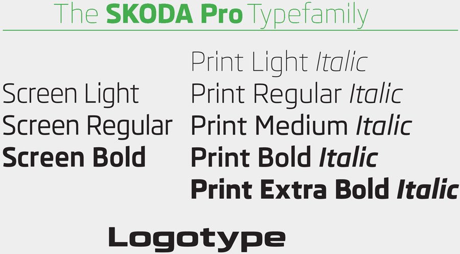
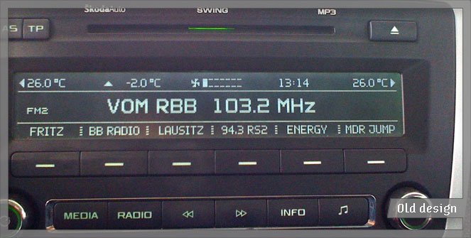
The initial brief called for three fonts to be used in the cars’ digital displays (instrument control panels, navigation system, radios, etc). The designs would be light, regular, and bold with some rather specific technical requirements: they were to be used in a wide range of pixel sizes, they needed to be optimized for several different rendering methods, and there were significant width restrictions. Keeping these specifications in mind – and factoring in the client’s aesthetic desires: sans serif, squarish, clean, legible, modern, and high-tech – we had some tight parameters in which to begin designing.


SKODA-old-logo
SKODA-old-display-mid
SKODA-old-car-emblems


While in the middle of creating the screen fonts, there was talk of the upcoming corporate redesign. By this point, our new fonts were progressing nicely, so the decision was made to expand the family for wider use – this would become their primary corporate type family. Before, there had been at least 4 or 5 different families used for various applications, but now was the chance to unify their design style company-wide.

SKODA-Pro-print_vs_screen

We modified the screen versions to optimize them more for print. Beginning with the regular weight, we lowered the x-height, lengthened the ascenders and descenders, added some details that wouldn’t show up on screen, increased the weight a bit, adjusted individual characters’ widths (no longer having the restrictions imposed by the screen software), completely re-spaced everything, and added kerning. The family was then expanded to include thin and extra bold styles giving it a total of five weights. Finally, matching italics for all were created. These refined print fonts form a key component to the new visual identity of all Škoda’s printed material; by now you should be able to see them in use by most of Škoda dealers/affiliates around the world.


SKODA-custom-type-specimen


SKODA-billboard
SKODA-fabia
SKODA-commercial


SKODA-logo

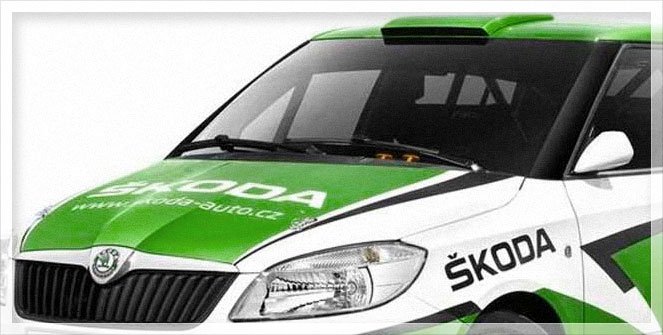
Finally, the smallest – but most immediately recognizable – component to the project was the logotype (only the letters; the symbol was designed by Syndicate). The five simple letters “Š K O D A” underwent more minute revisions and almost took more time than any of the other steps. They started as wider, bolder, more squared versions of the heavy print typeface; but, over the numerous iterations they crept further and further away from the original source. The logotype is now something of its own entity, but still feels like an appropriate part of the family.


SKODA-Pro-logotype


My favorite sightings of the new type was the logo being plastered all over the Tour de France :)

tdf1
tdf2
tdf3

Blacklecker: Behind the Scenes

Here are a few images and comments about the concept, design, and setup of our installation “Blacklecker: tasty fraktur” (November 5 – December 23, 2011).

The basic concept for the exhibition was to show some of the greatest/most influential/most popular/our favorite modern blackletter designs. There have been quite a lot of new blackletter typefaces coming out in the last years, so the selection was difficult. The selected designs were released between 1990 and 2011 plus a couple that are unfinished and not yet commercially available.

Our general guidelines while curating these designs necessitated taking queues or inspiration from traditional blackletter styles, but to interpret them in new and contemporary ways. So whether the designs were influenced by 90’s grunge, pixels and the digital environment, or trying to blend blackletter and Latin types, they have all expanded the previous boundaries of pre-digital blackletter styles. The second round of selection involved choosing an appropriately wide variety of styles: different weights, widths, inspiration sources, amounts of ‘blackletterness’, text vs. display use, etc.

There are (only) 22 typefaces represented in this installation, although ideally, many more could have also been included. Regardless, through this small cross-section of designs, it is clear that the blackletter genre is continually advancing with technology and designer’s tastes and there is still room for more.

blacklecker-layout

After selecting the typefaces and words (more on the word choices below), the layout was made on the computer. The color coding represents the letters’ sizes, distance from the wall, and age of the fonts. The layout is somewhat of a Blackletter Big Bang – the oldest fonts are the largest, more to the outside, and the letters are physically furthest from the wall (as in 3D; more on this also below). The newest fonts are smaller, more central, and closer to the wall.

Pink = 1990-1999; Orange = 2000-2009; Blue = 2010–still unreleased

blacklecker-bts-1

The letters were laser-cut out of a thick, white card stock. Our obsessive-compulsive intern, Sláva Jevčinová , laid them all out on the floor to help sort the mess back into words.

blacklecker-bts-2

Then the paper negatives were also sorted.

blacklecker-bts-3

Slávka painstakingly recombined all the sheets to create one giant stencil.

blacklecker-bts-4

The final stencil.

blacklecker-bts-5

We then cut the stencil into several large pieces to attach to the wall.

blacklecker-bts-6

Beginning to spray paint the counterless letters gold.

blacklecker-bts-7

Done.

blacklecker-bts-8

And done.

blacklecker-bts-9

Gold on dark gray.

blacklecker-bts-10

It took three people about two days to mount all the paper letters to the wall.

blacklecker-bts-11

Mounting the letters was incredibly time-consuming due to the 3D aspect. Each word has its own length of foam posts that were cut by hand. There are more than 300 letters averaging 5-10 posts per letter x 2 hand-cut squares of tape per post. This doesn’t include the additional ≈ a million ‘pixels’ in the word “Ökoterror”.

blacklecker-bts-12

The final piece.

blacklecker-bts-13

Not all tapes are created equal. We used a few different varieties, but ran out of the best one mid-way through the hanging. For the first several weeks, letters were jumping off the wall. This was the scene the morning after the opening party – by far the worst day. After repairs with a stronger tape (and in some cases additional foam posts), the letters were securely in place for the remainder of the show.

blacklecker-words

One last comment regarding the selection of words. Being ‘modern’ blackletter designs, we chose appropriately ‘modern’ words and concepts. They were split 50/50 in German and English to accommodate most of our audience. The German words are all official ‘words of the year’ from the 90’s through now – these were voted on each year and they represented popular linguistic trends and buzzwords for that year. The English words are similar; they were either hot topics of the year or were newly included to various dictionaries. In both the English and German, the words range from entertaining to highly political. The words were matched to the typefaces for a variety of reasons: sometimes they were appropriate to the type designer (based on their personality/beliefs), to the intent of the typeface, to the typeface’s style, or simply because the word shows off particularly nice letters from that typeface.

Thank you again to all the designers who sent in their designs. And thanks also to our awesome intern Slávka; without whom the show would have never been up on time!

More about the show can be found here