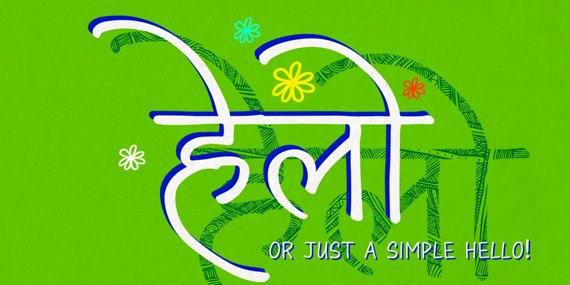
We are thrilled to introduce you to our latest font Maku!
For many of us, the majority of our work nowadays is digital. The use of our hands and physical tools is often neglected in favor of computerized environments. Typeface designers used make precise drawings of letters before physically producing or digitizing them. To create Maku, Kimya Gandhi returned to her natural handwriting as the foundation. She wrote out all letters multiple times, scanned, then digitally traced them to turn them into a font. This gives a real human touch to the design that could only come from writing IRL.
Behind the scenes, Maku is revolutionary for Indian scripts. There are already many technically advanced fonts for Latin-based languages, Devanagari and other Indian scripts are desperately lacking. Maku is the first Devanagari font to include so many advanced OpenType features like swash characters and initial & final forms. The numerous contextual alternates give your digital typesetting an realistic spontaneity made by intelligently selecting different versions of each letter depending on nearby letters. The lack of repeating shapes helps Maku look like real handwriting.
We are very excited to see how you use Maku and what you will create with it!
Maku is available for use in print, websites, apps, and e-Books.
I owe more than I can say to Dr. Fiona Ross. Ten years ago last September(!) I began my MA in Typeface Design (MATD) studies at the University of Reading. In retrospect I can now clearly speak about the impact Fiona had on my life. Her gentle coaxing to simply try designing for another script actually changed my way of thinking, opened up a different career path, and resulted in me moving to a new continent.
I entered Reading with the primary goal to create an original typeface. Before starting, I had not given much thought to either the concept of research based design & writing, or to non-Latin typefaces. Learning how to conduct research is a core concept of Reading’s program (learning this skill is arguably more important than designs one creates), and as it turns out, this is a smart approach.
The non-Latin component of many MATD’s students’ projects is not compulsory, but it is encouraged. The competitive nature of the course means that every year more and more students try out new scripts and writing systems. Making this possible is Fiona Ross who is a mentor, incredible driving force, and constant source inspiration. Her vast experience and passion for all scripts is the motivating factor for so many students to attempt learning about and designing for non-Latin alphabets.
Her first workshop with our batch came in November 2006, and for that two day session she introduced us to the North Indian scripts of Devanagari, Gurmukhi, Gujarati, and Bengali. Her teaching method is to give a short presentation about the scripts, explain how they work, overview their history, show how they are written, and examine how the letterforms have evolved due to typesetting advancements. She then shares stacks of printed materials like books, magazines, comics, original drawings for typefaces, writing primers, ephemera, etc. Students go through everything to get a sense of the script, then they try their hand at writing and calligraphy. This methodology is repeated several times throughout the year for other scripts like Arabic, the South Indian scripts, Thai, and more. (Greek is generally guided by Gerry Leonidas while Cyrillic and most other scripts are advised by other external experts.)
My knowledge of India was embarrassingly low back then – I knew virtually nothing of these different and complex scripts and I had certainly never imagined designing them. But there was something about Devanagari that immediately struck me. I was interested in it and I wanted to delve deeper from the first moment. I never questioned my decision to commit to Devanagari as a major part of my MA work. I began with calligraphy practice and soon after began researching Matthew Carter’s work on the Linotype Devanagari typeface for the VIP phototypesetting system. We had a short essay due in January, so this research (consisting mostly of looking through the original drawings and design correspondences) directly informed my practical work.
The Devanagari calligraphy I was experimenting with would later become Vesper Devanagari (coming soon), and this is actually what inspired the Latin side of Vesper. I was sketching for a couple months trying to find a direction for my Latin typeface, but kept hitting dead ends – either because my ideas were too novel, trite, or they had been done before. This different approach of taking ideas from the Devanagari and applying them to Latin lead me to something new and special. Vesper could not have come about any other way.
Throughout the year, Fiona offered feedback and advice on my work. More often than giving direct suggestions she would ask questions of why I did certain things and she encouraged me to find my own answers. This skill of learning to evaluate and discover things for yourself is an invaluable tool for the future. It was exactly like that parable “give a man a fish vs teach a man to fish”.
Since Reading, and thanks to it, my career has been interesting and fortunate. After my one year stint at Linotype in Bad Homburg, Germany, I moved to Berlin to found Mota Italic in 2008. One of the primary intentions of the foundry was to provide high quality, original typefaces in many scripts – a goal that was directly inspired by my time at Reading. My interests and ties to India were clear from the very beginning even with the company naming: Mota is the Hindi word for Bold or Fat.
So in 2014 when I relocated from Berlin to Mumbai, it might seem like fate or like some grand plan finally worked out… In actuality the decision to move just appeared to be the best option at that time (while I loved Berlin, I am very much loving living in India!). Since staying in India my passion for Devanagari has only increased, as have the opportunities to work with it. Along with Kimya Gandhi (actually usually supporting her), we have worked on many new Devanagari typefaces in the last two years. Most are custom projects, but several will also be retail fonts available for licensing soon.
While this entry may sound mostly about me and my work, I hope it’s clear that much of what I’ve done, and why I did it, is thanks to Fiona. Her spark of interest for other scripts and her unwavering encouragement unquestionably change my life forever. It’s hard to imagine where I would be today if not for meeting her and for our time together.
I could write much more about all of this, but for now I’ll just say thank you again Fiona, and happy birthday!
Sincerely,
Rob
PS – The Typekit blog just did a very nice interview with Fiona last week. Go have a look to hear direct from the source more about her background, accomplishments, and philosophy.