↑ Vesper test prints produced at Reading ’07
It was 10 years ago today that I submitted my type family Vesper as part of the Masters in Typeface Design program at the University of Reading. We had 7-8 months for our typeface projects, but I took so much time finding the right direction for my project, the design that would evolve into Vesper was began in February ’07. The school deadline was by no means the end of development. I submitted four fonts – at different stages of completion (the projects are graded more on their concepts than on the amount of completion). Post-Reading, I redrew the Italic & Heavy, then added new masters for Heavy Italic, Light, and Light Italic, finally two extra weights were interpolated. This whole process was almost an additional year of work. Incase you are interested, you can read more in depth about the design process over at I Love Typography.

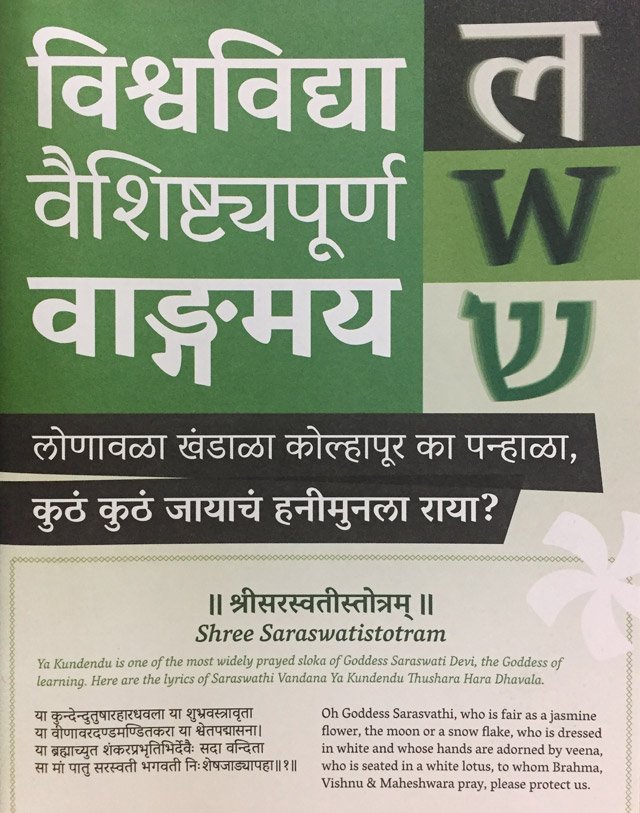
The real news today is an update regarding Vesper Devanagari. Even though Vesper began first with the Devanagari, the Latin side has usually had more focus. But over the years we’ve spent many months working to complete the Devanagari fonts. Thanks to our patience and the evolution of type design tools (mainly Glyphs and the ADFKO tools) these fonts are becoming much more refined and intelligent than would have been any earlier. Don’t worry, the wait won’t be much longer – we will finally debut Vesper Devanagari in just a few months. Please stay tuned!