Maku 2.0 Update

We have a super exciting, major update for you today. Our beloved Maku typeface has been radically expanded and is now a highly useful family for all your informal typesetting needs.

Maku is based on Kimya’s unique & quite pretty (Devanagari) handwriting. So the Devanagari is where it all began and where most of her focus was when initially creating the font. Kimya later added Latin capitals and extra symbols to make the typeface a bit more useful. The whole character set was originally 1,193 glyphs – not bad, but not super extensive. Also, there was only one thinnish “Regular” weight.

Fast forward a few years and Maku 2.0 now has everything and more that you were waiting for (even some extras you maybe weren’t missing). We won’t bore you with each and every change, rather, just have a look at this overview of the major updates and additions.

Cleaner Outlines

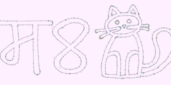
The outlines have always been intended to be organic so they are more realistic at text sizes. Still, for version 2 we went in and cleaned up every single glyph, so it’s all smoother and nicer (and so the forms work better as a variable font). Nerdy trivia: we removed an average of +50 nodes per glyph, for a total amount of 40% less points!

Way More Glyphs

The character set has greatly expanded from 1,193 to 3,347 glyphs!

Latin Lowercase

All caps fonts are fine sometimes, but a lowercase increases the usability infinitely.
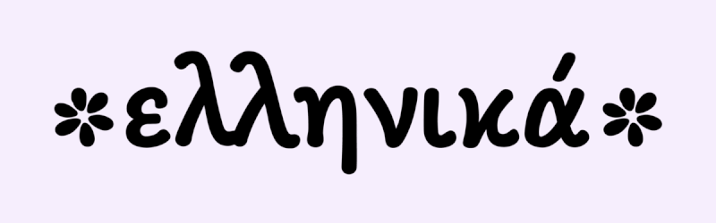
Greek & Cyrillic

Maku now supports Greek & most languages using the Cyrillic script.

Three More Weights

It’s still a compact family, but the four weights give more options and styles to differentiate your typesetting.

A Variable Version

This almost didn’t happen, but in the end it worked out. Now with this font, you’ll get every possible weight in between Regular and Extra Bold, in just one file.

We hope you like this new Maku! If you have any thoughts, feedback, complaints, requests, etc. we are happy to hear from you! Just email or DM us!

😷 2020 Recap: 🔠🇮🇳🇩🇪🧂🖼️

Well 2020 was a weird year – for us all. We are happy to report that we got through it mostly unscathed, and while at times it felt slow and never-ending, when we look back, we did actually do some interesting things 😄 Here are some highlights 👇️

New Beta Fonts Program 🔠

We have never been known for a rapid pace of releasing new fonts. In fact, we usually spend years on our retail typefaces before they see the light of day. So we decided to begin releasing in progress fonts as Beta Fonts. This was designed to be a symbiotic relationship between you and us – you get the freshest fonts sooner and for less money, and we can integrate your feedback into future updates (and we have more pressure to work & release quicker)! So far this project has really taken off and had great feedback!

These are our first three releases:

( BTW, Collection was just chosen by I Love Typography as one of their Top 10 Favorite Fonts of the year! )

Get these now for cheaper! Updates to all three families will be coming soon – and the prices will go up (the prices during the beta stage will be significantly lower than for the final release – so jumping in anytime is always a good idea). Licensing the beta fonts gets you every update and the full final fonts.

Made in India Logos 🇮🇳

As a self-initiated side project, we created a rather advanced logo system to signal goods “Made in India”. For being such a simple idea to convey, this is a rather sprawling and flexible design to work in numerous contexts. There are two distinct stylistic versions, vertical and horizontal layouts, and size-specific optimizations made to work from the tiniest print to huge. (Variable Font Alert: They also come as variable fonts! Woot!)

The logos were released as OpenSourced designs on GitHub and are free for anyone to use or modify.

P.S. — Do you know anyone making things in India? Maybe they’d like to hear about this 😉 Sharing is caring, they say.

Moving to Berlin 🇩🇪

Maybe our biggest news of the year is that we relocated our studio from Mumbai (where we were for the last six years) back to Berlin (where Mota Italic was founded in 2008)! We originally planned to move in March, but thanks to Covid, we finally did in September. The studio is now about set up and we are back to work on several new projects for 2021 :)

We look forward to seeing you in Berlin as soon as it’s safe to meet again. For now you can follow us on Instagram to see what we are up to in isolation.

⭐️ A Few New Products ⭐️

Spicy Label Stickers 🧂

These were a direct result of huge social media feedback after Kimya posted pics of her hand drawn spice jar labels. The result is two sets of labels (localized in Hindi and Marathi) to identify and elevate your spice jars.

Monospaced Fruits & Dogs Print 🖼️

This colorful and unique image was an intricate collaboration between an online AI and a human being named Rob. The story behind it is long, you can read more about it on the product’s page, but regardless, we think it’s fun and beautiful and would look great on your wall! Get your own copy today!

Thanks for catching up with us!

We hope you are well and we wish you a wonderful 2021! This year will certainly be better than the last! Please reach out to us on Instagram or email, we’d love to hear/see what you are up to 😄

💚,
Rob & Kimya