Two years ago I began creating a series of hand-drawn typographic prints based on beautiful vintage type specimens – we called them »Show Letters« Prints. Today the series is getting some big updates!
First of all: what’s “All New”
1) Seven new designs have been added to the collection. These range from some of Hamilton’s funky wooden letters, to metal stars, to Dutch fists.
2) The original series of 29 prints have all been overhauled and are now better than ever.
3) All the prints are on sale for €10 off – they are currently under €30/each till the end of the year :)
4) We are now offering custom colors for each design. Pick your own tricolor gradient to personalize the prints to your tastes & environment.
The prints are sorted in our shop by type style (as in a specimen book). You can jump to each section here:
Serif • Sans • Blackletter • Decorative • Dingbat & Ornament
The Inspiration

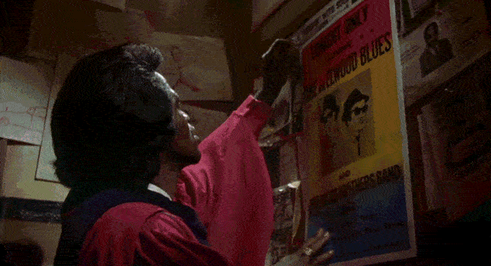
Blues, Soul, and Rock posters like these were the inspiration* for the »Show Letters« series. These were screen printed in two layers – first a tri-color gradient then a layer of black on top. They were quickly made ephemeral items, so they didn’t necessarily have the highest quality production. I find this simple aesthetic still rather striking and contemporary – in an ugly-beautiful sort of way. So following this style, I remixed the content to be of vintage type rather than of some of the G.O.A.T. musicians.
The Gradients
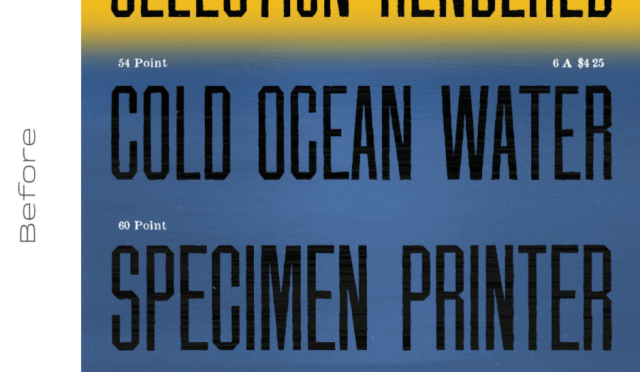
The original concert posters had bands of color that were roughly of equal width and not really influenced by the black design on top (if anything, the black layouts were designed to have top, middle, and bottom sections). I chose to ignore this ‘rule’ and let the color bands vary in thickness/thinness and positioning for my first versions of these prints two years ago. This let the colors integrate somewhat with the designs and be a bit more customized… However, in the months after the release I began rethinking this choice and ultimately decided that sticking closer to the standard 1/3 widths would be more appropriate.
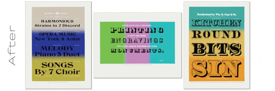
Now all prints, old & new, have fairly regularized band widths. Also, initially all color bands were horizontal to the page (most designs were portrait format ↕︎, few were landscape ↔︎ oriented) because I thought it was clever to keep them parallel with the text. But it now makes sense, to me, to keep the gradients in the same direction – as if the ink is always being pulled across the short edge of the page. This change seems to be a bit divisive so far. I showed some friends pre-release versions of these updates and about equal numbers preferred either the horizontal or vertical color bands for the landscape images. I may change them back later, so if you like them this way – buy one now! If you’d rather see them rotated back 90° to be horizontal again, message me and maybe I’ll do it sooner!
Real & Faux Textures
Ideally, I’d have liked to actually screen print these, but for now, they are produced as super high-quality ink jet prints. The prints are so smooth & clear, I added some digital grunginess and texture. However as with the gradients, I’ve had a change of opinion about how exactly I approached this and have now subdued things for these current versions.
The first prints had intentionally noticeable marks and imperfections. To me these decently approximated something that was physically made. However, I received feedback from a customer who perceived the textures to be from real life poor inkjet printing… not as an intentional simulation of smeared ink. Not good.
I remain adamant about still needing some texture. Digital prints are just too smooth and clean. All 36 prints now have more subdued blemishes – just enough so it’s not totally perfect and digital-looking. We hope you will enjoy and appreciate the new and improved looks!
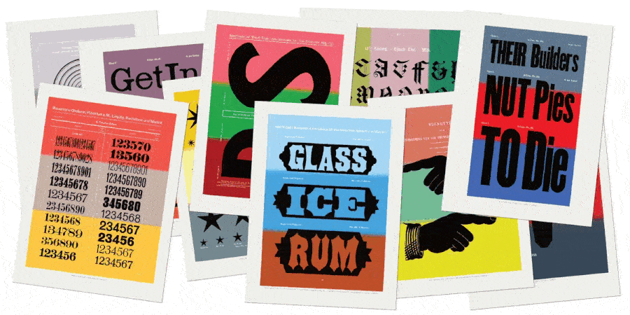
The New Designs

These are some thumbnails of the seven new specimens added to the collection. They are interspersed into each stylistic categories along with the existing designs. You’ll have to poke around there to find the larger versions of each :)
One More Thing
There’s no need to analyze the color palettes – they are completely arbitrary as per my preferences. However, since these were made digitally, and are printed on demand, we have the ability to customize prints. We are now offering that you can pick your own three colors for any design. Simply reach out to us, let us know your preferred print & bespoke colors, and we will quickly create a unique print for you! We’ll even send a mock up to make sure you are totally happy before shipping you the final piece.
Postscript —
*The exact inspiration may have subconsciously came from the Blues Brothers film. If you haven’t seen it, it’s one of the greatest pieces of American cinema (even if it’s basically a Bollywood movie).