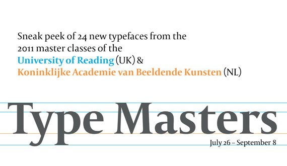
Sneak peek of 24 new typefaces from the 2011 graduating master classes at the University of Reading (UK) and the Koninklijke Academie van Beeldende Kunsten (NL).
Was on display July 26 – September 08, 2011.

Antithesis – Push to the limit, reduce to the maximum. Colors of light, pulses of sound. All goes to one. Interpolation is so ’90s.
Born in Dresden, Germany. Yanone started to design type in his first university years at the Bauhaus-University in Weimar, leading to the release of his first typeface Kaffeesatz in 2004. Internships took him to SYNTAX in Amman, Jordan and FontShop International in Berlin and he finished university with his Arabic/Latin typeface Amman for the rebranding of Jordan’s capital which was released in 2009 by the FontFont library.
Arlecchino has playful and quick gestural qualities that translate to very different but cohesive styles, in both Latin and Greek scripts.
Luisa Baeta started her infatuation with design in Brazil with a BA and substantial work in studios and as a freelance book designer. She continued her studies in London, where she now lives and works, with a Postgraduate Diploma at the London College of Communication and finally an MA in Type Design at the University of Reading, in which she is currently finishing her final project and walking around lots of ducks.

Artigo is a typeface designed for lifestyle magazines. The design of all scripts explores a connection between handwriting and typography.
Joana Correia da Silva is a Portuguese designer and architect with a love for the written word. After studying architecture she studied Graphic Design where she found a bigger interest in Type Design. This year, she attended the MATD course at Reading. The goal was to emerge immerse herself in the vast world of Type Design and Typography. Reading was the perfect place for that!

Bois is a Roman Antiqua with Gothic influences. Didelle is an in-development sans serif, inspired by Peignot, Didot, and swiss grotesques.
Yassin Baggar is a freelance graphic and type designer, based in Berlin. He recently graduated from the TypeMedia Master at the Royal Academy of Art (KABK), The Hague.

Cassiope is destinated to set theatre plays. Delicate and small, it is intentionally dark yet the counters are open to ensure legibility.
Marion Delsuc was born in France in 1987. She studied graphic design for four years before coming to Reading to attend the Master of Typeface Design. She decided to undertake the design of a new bookface for theatre. This was the opportunity to work from traditional inspiration, yet the liveliness of theatre was also matching the need for expressiveness that Marion was interested in when she started to work on her design.

Cassise is a contemporary interpretation of early 19th century type designs. Its distinctive styles are based on a similar skeleton to form one unified typeface family.
Malte Herok’s interest in type design was sparked during his studies of Communication Design at the HTW Berlin from where he graduated in 2010, having spent several semesters in the type design classes of Jürgen Huber, Luc(as) de Groot and Fred Smeijers. In 2011, he graduated from the t]m Master program at the Kabk in Den Haag. Malte is currently working as a graphic and type designer in his hometown Berlin.

“Chic” is a type system that explores different styles featured in a woman’s wardrobe.
Marina Chaccur is a Brazilian graphic designer and teacher, graduated at Fundação Armando Alvares Penteado – FAAP, and with an MA from the London College of Communication. For the past years she has been involved in conferences, lectures, workshops and exhibitions in Brazil and abroad. Currently she works as a freelance designer and also ATypI board member.

Civilian is a typeface family developed specifically for use on web interfaces. The design combines the pixel grid with personable details.
Colin M. Ford has been designing websites since the Dot Com boom, when he was about 12 years old. At 21, he was introduced to the world of typeface design by the punk rock design duo Post Typography while studying at the Maryland Institute College of Art and has since never put down the pen tool. These days he has found his niche exploring the intersections between the worlds of the web and of typeface design.
Clint is a multi-script typeface that is designed to perform well in poems, lyrics, dramatic texts, short stories, screenplays & fairy tales.
After a year studying Civil Engineering in the Netherlands, Bianca Berning enjoyed the Communication Design course at the Hochschule Niederrhein (including a semester at the Kunsthøgskolen i Bergen in Norway) where she discovered the intriguing world of detailed typography and type design. She worked as a freelance graphic designer during her studies and before attending the MATD at the University of Reading.

Colette is a transitional type family with extremely sharp detailing, including both functional text and expressive display styles.
Lauri Toikka is a Finnish graphic designer. Originally from Helsinki, Lauri studied in Lahti Institute of Design and graduated in spring 2010. After Type]Media Lauri will move to Berlin to start a graphic design studio/type foundry with his classmate Florian Schick.

Eczar was designed with an intent to bring liveliness and vigour to academic books with a focus on Devanagari-Latin multi-script typography.
Vaibhav Singh is a student of type design. He studied architecture and visual communication before joining the MA in type design at the Department of Typography and Graphic Communication, at the University of Reading in 2010.

Emrys is an extremely versatile, prominently modulated sans-serif type family for multiple scripts.
Ben Jones is a British typeface designer. After spending his formative years in Switzerland, Ben returned to England to study Typography at the University of Reading before establishing Protimient, an independent web, print and type design enterprise that has since turned its focus solely to the production of original typeface designs.

Ernest / Ernie / Ernesto – A modest transitional text cut for continuous reading, a caption cut made for small sizes with simplified letterforms and a display-caps-only cut with playful alternates.
Linda Hintz studied at HfG Schwäbisch Gmünd, internships took her exploring classical graphic design at Atelier Anton Stankowski and signage systems at Intégral Ruedi Baur et Associés. Since graduation in 2007 she worked professionally designing books, magazines, catalogues, businesscards, exhibitions, posters, pictograms and all kind of other things for both big and small clients. A course with Luc[as] de Groot led her to Den Haag to find out more about type.

Eskorte is a seriously reliable corporate typeface family. Diversity in style allows uniqueness while simultaneously covering legibility.
Before attending the MATD program Elena Schneider studied Graphic Design in Wiesbaden and Dortmund and eventually finished with a diploma in 2008. She has been working as a freelance graphic designer since 2004. Together with two of her peers Elena founded RADAU – a studio for design in Dortmund in 2008.

Foxhill – A typeface especially designed to work in small sizes such as bilingual religious texts. Latin & Greek are designed to work harmonious together. It includes polytonic Greek, used in historical texts, literary texts & poetry.
Hanna Donker is a (typo)graphic designer currently living and working in the United Kingdom. After graduating at the ArtEZ Arnhem academy in 2008 in The Netherlands she worked for two years as a freelance graphic designer. Besides this she taught first year graphic design students the course Typography at MIADA art academy in Chongqing, China. Before studying the MA Typeface Design at the University in Reading she participated in the Typography Summer School in London, UK.

Lemona is a typeface for literature, an experiment exploring conventions in weight distribution and proportions of old-style typography.
Born 24 years ago in Bogotá, Colombia. Julián Moncada studied graphic design, and as of today he is part of the MA in Typeface Design at the University of Reading and looking forward to draw, write and teach about letters.

Mag Grotesk – A Grotesque type family, with 15 styles from Bold Extended to Thin Condensed, including 2 Italics. The idea was to create an expressive type family which provides strong contrast between all styles.
Florian Schick studied graphic design at the University of Applied Sciences and Arts in Hannover and the Royal Academy of Arts (KABK), Den Haag, from which he graduated with distinction in 2010. Since 2006 he has been working as a freelance designer and founded his type foundry Schickfonts in 2008. In fall 2011 he will start a design studio in Berlin with his classmate Lauri Toikka.

Marco is a superfamily typeface designed for multilingual publications. It contains Roman and Sans in Latin, Greek, Cyrillic, and Mongolian.
Toshi Omagari was born in Fukuoka, Japan. After he graduated from the Musashino Art University in Tokyo at which he learned typography and graphic design, he went to the MA Typeface design Course at the University of Reading. One of his typeface Tangerine is available from Google fonts.

Modern 7 is an interpretation of the style introduced by the Didot dynasty, intended for—but not restricted to—literary prose.
Adrien Vasquez graduated from the ESAD Valence (FR) in June 2010. His diploma project was centred on the design of a family of typefaces, while the submitted dissertation was a personal point of view on contemporary attitudes and practices in graphic and type design(s). Adrien is currently finishing the MA Typeface Design at the Department of Typography and Graphic Communication, University of Reading (UK).

Naej is legible, fun and inviting with a touch of elegance. Organic rather than mechanical,this typeface displays a humanist axis, modulated stroke and open forms.
Born in the island of Barbados, Blondina Elms Pastel is an independent designer, typographer, lecturer/tutor and type designer. Her atelier, Elms, conceptualizes and produces two-and-three dimensional projects in all visual communication areas. Blondina obtained her Diplome National d’Art et Technique DNAT—avec les félicitations du jury—in 1999 from l’Insitut régional d’art visuel de la Martinique and is presently completing a Master in Typeface design at the University of Reading.

Quintet script looks double-stroke but consists of a single stroke and has the same letter widths to be used as a layer font.
Kunihiko Okano graduated from Kyoto City University of Arts in 1995. After working as a packaging designer for about a decade, he started his design office Shotype Design in 2008 and has been providing Latin parts to Japanese type foundries.

Designed for Korean and Latin multi-script magazine situations, Saja offers two text weights—one dark and one light for regional preference.
Passionate about Asian language and culture, Aaron Bell earned a bachelors degree in Asian Studies, with a minor in Japanese. After graduation, he worked for two years as a web developer and studied graphic design with a focus on typography. He is currently a postgraduate student at the University of Reading in the MA in Typeface Design program, focusing on Latin and Korean multi-script design.
Superhero is a experimental type family featuring 6 styles. It is purely in the display realm, with various superpowers for each of the weights.
Sun Jung Hwang is a graphic designer originally from South Korea. Currently she lives and works in Rotterdam as independent graphic designer. She graduated BA in graphic design at KABK, the Hague, in 2006. Before coming back to KABK for her study, she has worked in the fields of graphic design and advertising. Sun is fascinated by complex things in life. Complex layers and colors are her best friend.

Taiga is a small type family designed especially for fiction books, poetry or multiple languages.
Emma Laiho studied in Aalto University School of Art and Design in Helsinki but caught the type fever during her exchange studies at the KABK. Couple years later it was time to return to Netherlands for Type and Media. Her graphic design work has been concentrated on editorial and book design, so it is logical her main focus in type design so far has been learning the intricacies of text type.

Capitolium, designed by Gerard Unger for Rome and the jubilee of the Roman Catholic Church in 2000, carries the city’s two-thousand-year-old tradition of public lettering into the twenty-first century.