19th July, 2022 by Rob Keller

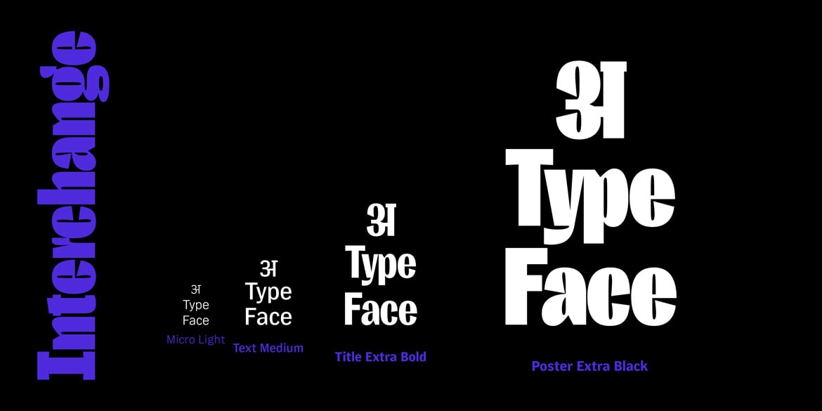
We are very excited to announce the launch of the text companion to Interchange Display – Interchange Text! Interchange is growing into a large family that will contain 80 fonts (4 optical sizes, 10 weights, plus italics). So for these FutureFonts releases, we broke the family up into two parts: Text & Display, small & large, legible & funky; etc & etc.
The final Interchange family will eventually contain 80 fonts, so splitting it into two parts lets us offer them at lower price points for each of the developmental releases. With Future Fonts, as well as our Beta Fonts Program, each new update to the fonts raises the price a bit, so the earlier you jump in and license the new fonts, the more inexpensive they will be!

So while the first Display versions were made to be used really large, and for just a few words, Interchange Text is meant for small typesetting of longer texts.
The letters have longer ascenders and descenders, larger x-height, wider bodies, more open shapes/apertures, and much looser spacing. These customizations are specifically made for these fonts to look clear and readable at sizes of roughly 10-20 points. Of course, you can use them at any size, but much smaller and the legibility will be somewhat less, and much larger and the spacing will begin to look too loose. (However, this can be corrected with some manual adjustments to tracking and kerning.)

As for the next updates, Interchange will soon receive more weights as well as have its character set expanded to support more languages and punctuation. The longer plans for both families will be to then create the two other optical sizes – in both cases, this means fonts optimized for smaller sizes. Interchange Text will get a “Micro” version (for text at about 5-10 points) and Interchange Display will get a “Title” version (for typesetting at about 20–50 points).
Jump over to Future Fonts to check these out now!
Interchange Text & Interchange Display
- News
See more posts filed under: