Rotation, Reflection, Repetition, Repetition.

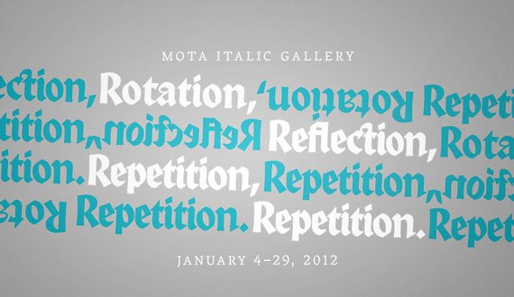
January 4th–29th, 2012

Our first exhibition of the year starts off appropriately at the beginning with some of the basic concepts of visual design. Using the foundational ideas of rotation, reflection, and repetition, the exhibited project creates complex & beautiful patterns and textures using a selection of blackletter typefaces.

Presented in this show are 44 typographic patterns created by students in the Visual Communications program at the Universität der Künste Berlin. The participants of Simone von Eldik’s typography seminar (assisted by Tanja Kapahnke), inspired by Judith Schalansky’s book »Fraktur mon Amour«, created patterns from glyph fragments or letter combinations from four typefaces that had been theoretically examined in class: Textura »Weiss Gotisch« (Emil Rudolf Weiß | Bauersche Gießerei 1936 | Petra Heidorn 2004), Rotunda »Alpine« (Dieter Steffmann 2000), Bastarda »Bastarda K« (Manfred Klein 2004), and Fraktur »Leibniz« (ca. 1750 | Genzsch & Heyse 1912 | Petra Heidorn 2003). In contrast with the ever-present stereotype of blackletters as being symbols for Germanism and patriotism, a multitude of patterns with surprisingly modern, contemporary aesthetics emerged.

The works were created by Anita Ackermann, Melanie Bossert, Anna Cairns, Dora Ferency, Malin Gewinner, Marcus Gruber, Ana Halina Ringleb, Claudius Hog, Miriam Kadel, Isabel Kronenberger, Lucas Küng, Hans Lichtenwagner, Till Lukat, Sophie Lundström Halbert, Mona Peters, Carlotta Richter, Giulia Schelm, Timo Schmitt, Romy Strasser, Balazs Surjan, Rene Thoms, Vincent Tollens, and Ryuhong Yoon.

Happy 2012 – Looking back to ’11

2011-happy2012

Happy New Year Everyone!

 2011 was a great (and busy) time for us at Mota Italic. We appreciate all of your support making it an unforgettable year! Here is a quick recap of some highlights in case you missed the news the first time around.

New Work

2011-skoda

We began the year by finishing the work on our custom type family for Skoda Auto.

The New Boutique and Gallery

2011-sign

In May, we opened a boutique and gallery space in Prenzlauer Berg. It has been slowly and steadily growing thanks to Berlin’s awesome design/type community, countless visitors, and all of our friends online!

2011-shop-may

The shop when we opened in May.

2011-shop-december

The shop as of December!

Every week, new books and merchandise are coming into the boutique. We recently began adding the books to our online shop, in case you aren’t able to make it to our space in person. Keep checking back, as there are still many more products to upload.

>> The bookshop

We Hosted Four Exhibitions:

2011-capital

The first was “CAPITAL: Berliner Buchstaben” featuring 27 Berlin-based type designers’ letters illustrated by 27 Berlin-based artists/illustrators/designers.

>> Images from the exhibition

>> Check out the catalog here


2011-typemasters

“Type Masters” was our second exhibition and the first preview of the typefaces of this year’s graduating master classes of the MATD program from Reading, England and the t]m program in The Hague, the Netherlands

>> The show & links to more of the students’ work


2011-plinc

In October, House Industries presented their fine silk screened prints from the Photo-Lettering Inccollection.

>> Images from the PLINC show


2011-blacklecker

For the final show of the year, we made an installation called “Blacklecker: tasty fraktur” featuring 22 of the most significant new blackletter typefaces of the last 21 years.

>> More about Blacklecker here

Next…

We have a lot of plans for 2012 and are really looking forward to it! Get ready for some new fonts, updates to Vesper and Mota Pixel, new exhibitions, and many more books and products to come this year.

The next show “Rotation, Reflection, Repetition, Repetition” starts this week! Stay tuned for more information!