All posts by Mota Italic

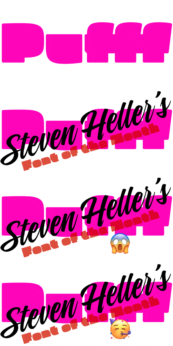
Pufff: Steven Heller’s Font of the Month!

The following text was written by Steven Heller, and what a beautiful piece it is! This page is a cross-posting of the original over at I Love Typography. Thank you so much to Steven & I Love Typography for selecting Pufff! 🖤

Show me a font where most of the letters appear to be made from amorphous ink blotches (or some other bold mottled forms) and I’ll show you my favorite face of the month – and possibly of the year – as well as my preference for best name to boot: Pufff produced by Mota Italic and designed by Rob Keller.

It is plucky and audacious for breaking every possible rule of legibility while retaining unequivocal readability. Pufff is too well-crafted to be written off as a novelty, although admittedly a strain on the eye to read many contiguous blocks of it, but not impossible. In fact, Pufff is proofff that even blobs with just minor tweaks can not only be recognized as letters but make eye-catching typography.

Pufff is labeled a “fffat ffface” but it is more than excessive fatness that pushes Pufff to the outer limits. Just take it for a test drive in caps and/or upper- and lowercase, and you’ll find that the smaller the point size, miraculously, the more legible it becomes. While in larger settings the font’s legibility is reduced, its readability remains consistent. Despite the bloating effect, the tiny nuances that, for instance, distinguish the forms from totally amorphous into articulated letters retain integrity and identity (take a look especially at the lowercase a and m).

Puff is unabashedly functional, serving the fundamental requirement — to be deciphered — and the secondary role of expressing a distinct personality. Try it; you’ll see! While playing obsessively with the “type tester”, Pufff reminded me of the one time I witnessed a blowfish balloon itself from a normal fish into a ball before my very eyes. There are times when the natural world is so incredibly weird, and times when typeface design is so naturally incredible.

You can license Pufff from two places:

I Love Typography
&
Mota Italic

Maku 2.0 Update

We have a super exciting, major update for you today. Our beloved Maku typeface has been radically expanded and is now a highly useful family for all your informal typesetting needs.

Maku is based on Kimya’s unique & quite pretty (Devanagari) handwriting. So the Devanagari is where it all began and where most of her focus was when initially creating the font. Kimya later added Latin capitals and extra symbols to make the typeface a bit more useful. The whole character set was originally 1,193 glyphs – not bad, but not super extensive. Also, there was only one thinnish “Regular” weight.

Fast forward a few years and Maku 2.0 now has everything and more that you were waiting for (even some extras you maybe weren’t missing). We won’t bore you with each and every change, rather, just have a look at this overview of the major updates and additions.

Cleaner Outlines

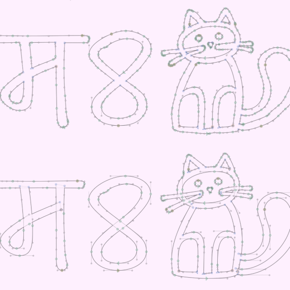
The outlines have always been intended to be organic so they are more realistic at text sizes. Still, for version 2 we went in and cleaned up every single glyph, so it’s all smoother and nicer (and so the forms work better as a variable font). Nerdy trivia: we removed an average of +50 nodes per glyph, for a total amount of 40% less points!

Way More Glyphs

The character set has greatly expanded from 1,193 to 3,347 glyphs!

Latin Lowercase

All caps fonts are fine sometimes, but a lowercase increases the usability infinitely.

Greek & Cyrillic

Maku now supports Greek & most languages using the Cyrillic script.

Three More Weights

It’s still a compact family, but the four weights give more options and styles to differentiate your typesetting.

A Variable Version

This almost didn’t happen, but in the end it worked out. Now with this font, you’ll get every possible weight in between Regular and Extra Bold, in just one file.

We hope you like this new Maku! If you have any thoughts, feedback, complaints, requests, etc. we are happy to hear from you! Just email or DM us!

Fip: Font Release

We are incredibly excited to announce the release of our long-overdue family Fip! This unique monospaced family began in the Mota Italic Gallery in Berlin as an exhibition to demonstrate the type design process. Titled “In Progress:”*, the show lasted for one month and consisted of Rob Keller sitting in the gallery every day designing this new type family from scratch. Every day or two, new prints were added to the walls along with commentary evaluating progress and explaining why specific decisions had been made.

The work was nearly complete at the end of the show, but as the deadline grew closer, the scope for the family ballooned, and so the deadline was pushed back. Fast forward two and a half years and Fip is now a refined and extensive super family.

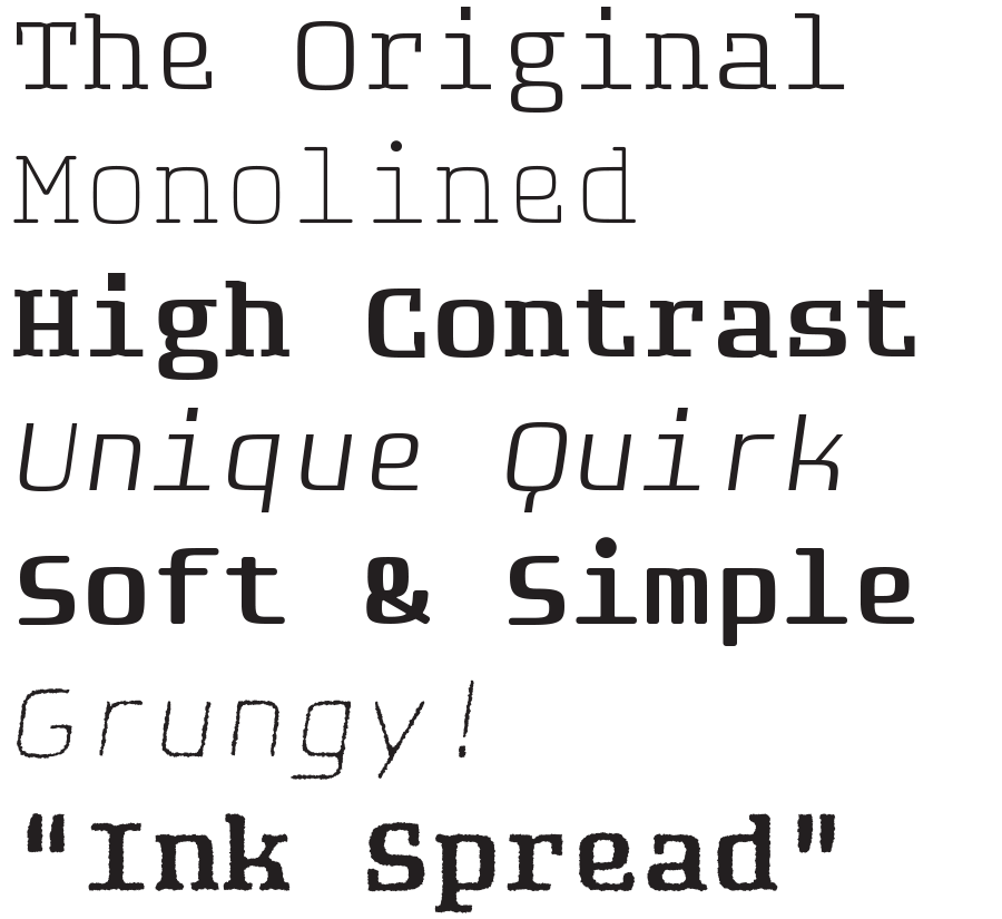
Fip’s family contains a whopping 64 fonts. The four variations – Regular, Rounded, Sans, & Sans Rounded – all come with Italics and Rough versions.

fip-one-liners

Learn more about Fip here, and see the exhibition where it all began.

* The name Fip was derived from the exhibition title (über creatively) as “Font In Progress”. The hipster relationship may or may not have been intended.

Presentation @ Berlin’s Typostammtisch

mota-italic-at-berlin-typostammtisch-large

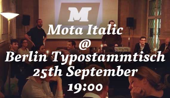
Come to Max & Moritz this week to hear Rob speak about his time in Berlin. Just days before his relocation from Germany to India, he will reflect on his experiences in Germany – how he got where he is now, share some cool projects, and reveal what worked and what didn’t for Mota Italic in Berlin.

Und eine bessere Beschreibung auf Deutsch:

Für Rob Keller wird dieser Berliner Typostammtisch der vorerst letzte sein. Er sitzt auf gepackten Koffern und wird schon bald seine Zelte im fernen Mumbai aufschlagen. Zum Abschied wird der Stammtischstammgast erstmals zum Stammtischredner.

Rob wirft einen Blick zurück auf seine Berliner Jahre, die hier entstandenen Schriftentwürfe und die Highlights der schon jetzt legendären Mota Italic Gallery. In einem zweiten Teil gibt er einen Ausblick, wie seine ganz persönliche Reise weitergehen wird – die Zukunft liegt in Indien. Und in indischen Schriften, natürlich!

Brashy Twitter Contest

Brashy Contest

Time to give away some fonts!
This week on Twitter we are holding a small contest/giveaway for Brashy. It’s simple to enter, and you can try every day!

1) Compose a tweet saying why you like Brashy.
2) Include @motaitalic & a link to www.motaitalic.com/typefoundry/fonts/brashy in your tweet.
3) Send!

A random winner will be picked every night and announced the next morning.

Contest starts today, and will go for seven days with seven winners. You can enter once per day, so give it a shot (or seven)!

Mota Italic – What’s Next

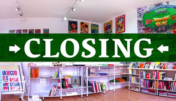
closing-banner
closing-motaitalicshopsign

Dear Friends,

It’s time to write a bit about the next stage for Mota Italic and how we got here. The news has been slowly spreading around, but to many of you this is probably new… The big announcement is that our Berlin shop and gallery will be closing this month – on September 21st to be specific.
But don’t worry, the type foundry and online shop are still open! There is much more to still come.

What happened

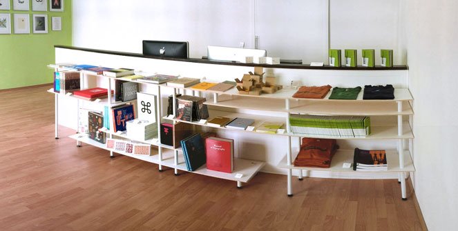
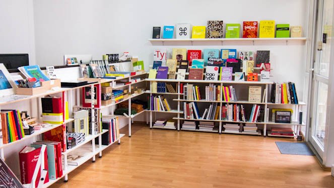
About 2.5 years ago we opened our Prenzlauer Berg type shop and gallery. It started extremely modestly with only a few books, some t-shirts, and prints from our first exhibition. Slowly over the next year the shelves grew and we began offering a more extensive collection of type books (mostly imported and ones difficult to find in Germany). Till this point, we have stocked 237 different book and magazine titles and 33 different kinds of typographic merchandise like magnets, necklaces, cards, pillows, games, posters, etc.

2011-shop-may

(The first weeks in 2011)

closing-motaitalicshop-2

(A special arrangement in 2012)

closing-motaitalicshop-1

(The shop in 2013)

The gallery space has hosted sixteen exhibitions during this time as well. They’ve included student projectscalligraphers, and intricate installations. The aim was to curate and design shows that were approachable and educational to the general public yet interesting and relevant for the more ‘elite’ Berlin type-crowd. More will be written about the gallery in a following post.

closing-motaitalicexhibition

What’s now

The decision to close came only after months of deliberation. There was not one predominant reason leading to this, but rather many factors that when added together, made closing the sensible option.

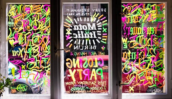
Our final day will be Saturday, September 21st and will be one long, last party! You are invited to come over and help us finish our wine reserves and empty the shelves of the remaining stock. Everything must go!

Starting now, we are offering 10% discount on most books and objects in the physical shop (offer not valid online). Also, all purchases over €10 get a free copy of Berliner Buchstaben (a €10 value).

What’s next

Just to be clear, in case you were worrying: Mota Italic as a company is not ending — only the brick and mortar shop will close. The company’s focus will return to typeface design (something that has been almost impossible to find time for while managing the shop and exhibitions). Some books and merchandise will still be available through our website for the near future, but fonts will (again) be the priority.

As for exhibitions, the curation, designing, and sharing of typographic shows remains a special interest. We are already working on ways to continue bringing new type-related exhibitions to Berlin (and maybe other cities). We are talking with several studios and galleries to work together to make new exhibitions possible! Don’t fret, there will be more to come!

Thank you

We’d like to take a moment to say thank you to everyone who made this experience wonderful.

Thanks to all the great new friends and visitors who’ve stopped by and gotten to know us. Thank you also to everyone who helped support us through tweeting, blogging, and spreading the word about what we were doing. And especially thank you to those who bought books here. You are awesome for supporting your local book shop!

Don’t forget to save the date September 21st for the big, all-day closing party!

Typographic Thali

Typographic Thali
Serving Letters from India

On display August 15th – September 21st, 2013.

The exhibition/gallery/boutique’s final closing party will be on Saturday, September 21st. Hope you can join us to celebrate, buy discounted books, and drink!

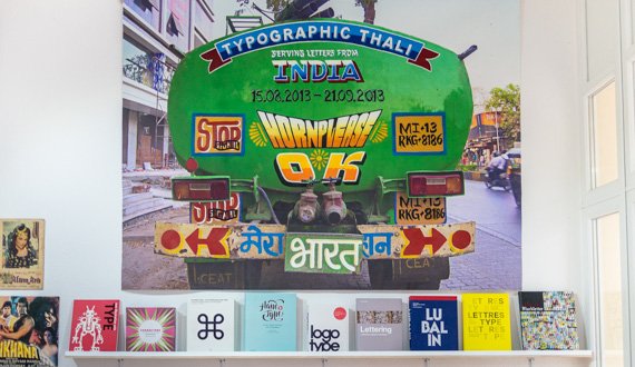
“Thali” is the Hindi word for plate. In its normal context, a thali is often a large sampling platter, serving multiple curries, veggies, and dips. This exhibition highlights the diversity of Indian typography and writing systems by showcasing hundreds of images, objects, toys, books, newspapers, posters, etc. collected in India. The installation promises to be visually stunning and more crowded than a Mumbai train, as well as educational and inspiring, too.

Mastering Type 13

Mastering Type 13

For the third time, we present the typefaces of the 2013 masters students of the Koninklijke Academie van Beeldende Kunsten (NL) and the University of Reading (UK). This joint preview of Europe’s two greatest MA programs provides a first view of their fresh new designs.

July 12th – August 3rd, 2013

Featuring:


Aakriti
Aakriti (ಆಕೃತಿ) harmonises Kannada, a south-Indian script used by 38 million people, with Latin script.

Katy Mawhood
is an experienced and professional typographer from the United Kingdom. She has worked on a range of projects and specialises in complex typography. She entered the course in typeface design at the University of Reading in the hope of expanding her knowledge of non-latin scripts. Once she graduates from the MA Typeface Design, she hopes to continue her career as a typographer with a fresh perspective and a new specialism.


Amanita
Amanita is a family of three styles: regular and black stencils, and a matching text version.

Krista Radoeva
is a designer with a focus on typography and type design. Born in Bulgaria, she grew up with a love for history and language and continued exploring these subjects in her work as a graphic design student at Central Saint Martins College of Art and Design in London. Her studies and her work experience in publication design both in the UK and Bulgaria influenced her to pursue further education in type design on the Type and Media course in The Hague. Underlining themes in her work relationships between language, history, typography and experimentation. During her time in The Hague, alongside working on her final project, she had the opportunity to pursue her interest in Cyrillic type design and the contrast between Russian and Bulgarian Cyrillic.


Aronde
provides a variety of weights (regular, bold and italic) to enable more design possibilities for children’s books, magazines, catalogues or packaging.

Stéphane Passerat
is a French designer born in 1986. He did his master in graphic design at the visual communication school of Paris in 2010 followed by a master in typeface design at the university of Reading this year.


Binky
is a type family inspired by wood type. The display styles explore extreme proportions while the text styles work in smaller sizes.

Teo Tuominen
is a Finnish graphic and type designer. Before attending Type and Media he graduated from the Pekka Halonen academy in 2009 and the Lahti Institute of Design in 2012. He has been working as a graphic designer since 2008 focusing mainly on visual identities and typography. In the future he hopes to be able to combine graphic and type design in his work.


Botanica
is a high contrast humanist typeface. Aside from its use as a text-face, it is devised to be found in the context of technical drawings relating to botanics.

Tania Alvarez Zaldivar
(Mexico City, 1985), graduated from Concordia University, Montreal (BFA, Major in Design, 2009), EINA, Barcelona (Postgraduate course in Typography, 2010) and The Royal Academy of Arts, Den Haag (Type & Media, 2013). Throughout her career she has collaborated as Research Assistant in Montreal for full-time faculty in experimental design based projects, and as an independent / in-house designer for studios in Barcelona and Mexico City. She currently develops her independent design practice based in Mexico City.


Brisbane
is a relaxed, self-assured sans serif designed specifically for pedestrian wayfinding in the city of Brisbane, Australia.

Troy Leinster
Troy Leinster is a self-employed graphic designer originally from the city of Brisbane, Australia. Before studying TypeMedia at KABK, Troy attended the type design unit at Monash University in Melbourne, followed by the condensed type design program at Cooper Union in New York.


Caligula
is a typeface family intended for both magazines in print as well as on screen. Styles for highly legibile bodytext are accompanied by various and distictive display styles for expressive headlines.

Jonas Niedermann
grew up in Switzerland and graduated at the Zurich School of Art (ZhdK) in Visual Communication in 2007 and with a CAS in Type Design in 2009. Before attending the MATD program in Reading, he worked as a typographer at TGG Hafen Senn Stieger.


Chimera
is confident enough to break traditional conventions. It’s distinctive character makes it perfect for bringing an impressive look.

Maria Doreuli
earned a Master at the Moscow State University of Printing. During that time she attended Type Design Workshop and worked on William typeface, under the head of Alexander Tarbeev, whose influence encouraged her to pursue her love for letters. As a result William received Letter.2, Granshan and NewCyrillic awards. She was also selected for ‘Young designer of the year’ by Akzia newspaper in 2011.
Alongside the studies, Maria has been doing commercial type-related projects as a freelancer since 2009. She also had a 3-year experience as a full-time graphic designer.
Since graduating, she always wanted to have the opportunity to continue her studies in type design, at a school that focuses not only on producing typefaces, but on the process of calligraphy, sketching and searching for new directions in design. This is why, last year she moved to the Hague.


Curtis
is a typeface with a strong calligraphic background. It explores a free approach to contrast and plays with rotation of the tool.

Bernd Volmer
is a graphic and type designer from Germany. Before attending type and media, he graduated with a BA in 2011 from the ArtEZ in Arnhem. During this time he also did an internship at Atelier Carvalho Bernau and developed his knowledge and interest in type design and typography. After graduation he started as a freelancer and worked for Catalogtree. Unconventional and unexpected aesthetics play an important role in his design work, as well as working with and around limitations in the design process.


Damien
is a project is about the design of a serif typeface with different styles for headline and text sizes.

Lukas Schneider, graphic and type designer, studied visual communication at the Hochschule für Gestaltung in Offenbach am Main. He recently graduated from the master course in type design from the Type and Media program at the The Royal Academy of Art in The Hague.


Editura
is a type family for serious publications, ready to help the designer build structured typographic hierarchies.

Diana L. Ovezea
Born close to the Black Sea coast in Romania, Diana moved to Austria as a child, where she attended the American International School. After graduating with honors from the New Design University in St. Pölten, she worked as a graphic designer, mainly on book and corporate design projects. Her interest in type design has its roots in the fascination with complex systems of design, letter shapes, and micro-typography.


Kingyo
is a typeface that was made for bilingually typesetting Latin and Japanese.

Reiko Hirai
is a graphic and a typeface designer whom grew up in Japan and America. She has BA in educational linguistics, and also has experience working as a consultant and a research marketer. Therefore, her design works are influenced by her academic and professional background. Compared to her design style, her artistic sense can be seen in her photographs, as she interprets photography as a poetic gesture. She also has experience winning a prize in graphic design competitions. Reiko Hirai currently lives in Reading, UK, to accomplish her master in University of Reading.


Klabauter
The Klabauter typeface family combines reliable text weights with fresh shapes and playful secondary styles. It supports Latin and Greek.

Louisa-Helen Fröhlich
is a graphic and type designer based in Mainz, Germany. She studied communication design in Mainz and has worked with various design studios since her graduation. She is interested in multi-script typography and corporate design and is currently attending the MA in Typeface Design at the University of Reading.


Makeda
brings closer 3 different worlds. Hebrew, Amharic (Ethiopic) and Latin are harmonised, while being loyal to the structure of each script.

Liron Lavi Turkenich
is a designer from Israel. She finished her B.Des in Graphic Design, studied and worked for the type designer Oded Ezer. Soon after, Liron started Typeface Design course at Reading University (MATD). Liron has a passion for dusty archives, colours and working with multiple writing systems. (also for food, fashion and traveling, but that’s another story!)


Mala
is a type family designed for cartography. It provides selected widths and weights which perform efficiently on the map’s surfaces.

Barbara Bigosińska
graduated from Type and Media in 2013 at the Royal Academy of Fine Arts in the Hague. Before that, she received her master degree in Graphic Design at the Academy of Fine Arts in Katowice. In 2010/2011 she was a student-assistant in the Lettering and Typography studio. She is a double scholarship holder from the Ministry of Culture and National Heritage in Poland (2011, 2013). Currently, Barbara is an active designer, not limiting herself to one thing. Her works are featured and exhibited on international and domestic events.


Mellow
is a cheerful serif type family supporting Latin and Gujarati. Mellow feels most comfortable in a cultural environment.

Lisa Timpe
is a self-employed graphic designer who is currently based in Reading, UK. She used to work mainly in the field of corporate design, focused on any kind of printed matters, after having graduated from University of Applied Sciences Mainz in 2009. After three years as freelance designer as well as employee, she decided to develop her knowledge in type design. Therefore she moved from Mainz to Reading to attend the MATD course at the University of Reading. This very special year supported her desire to get specialised in type design and typography.


Natan
is a punch cutting fantasy turned into Bézier curves. A tribute to craftsmanship sans nostalgia.

William Montrose
is a German / US type designer currently based in Reading. His background ranges from type design, lettering and calligraphy to marketing and advertising. Apart from the Ampersand Type Design Exhibition and a number of unauthorised paintings the fruits of his labours haven’t been publicly displayed so far. If you have something going on, feel free to drop him a line at william@bezierfantasy.com, he might be interested.


Nomad
While Nomad’s natural habitat is at the crossroads of referential and literary work, by nature it enjoys discovering the unknown.

Florian Runge
is a typographer and typeface designer from Germany. He spent five years studying and working as a graphic designer in Denmark and subsequently moved to London where he gained a BA in Graphic Design while freelancing alongside. Typeface design lets him combine his genuine curiosity with his methodological design approach and his technical mind. He is fascinated by the writing systems of the world and enjoys growing interest in practice-based research. Currently he is nurturing his desire to learn by attending the MA in Typeface Design at the University of Reading.


Nurraq
is a multi-script typeface family matching latin and Canadian Aboriginal Syllabics.

Étienne Aubert Bonn
studied graphic design at UQAM in Montréal, type design at Type@Cooper, in New York, and just completed the Type and Media MA in The Hague.


Prakashan
is a type family that addresses multi-script settings for Odia and Latin, bringing variety and dynamism in style to both scripts.

Alessia Mazzarella
is a student of typeface design. Before joining the MATD at the University of Reading, she studied graphic design at Central Saint Martins in London and at La Sapienza in Rome. She lives and works in Reading.


Ricochet
is inspired by the speedball D-series, the ball shaped nib developed by the American sign painter Ross Frederic George.

Sun Helen Isdahl Kalvenes
is a Norwegian designer, educated with a BA in Visual communication from the Royal Danish Academy of FIne Arts school of Design in Copenhagen. Internships and studies have brought her living between Stavanger, Copenhagen, Berlin and The Hague.


Salom
is a type family for complex, yet lively typography, supporting Arabic, Hebrew and Latin.

Igor Labudovic
is a graphic and type designer from Vienna, Austria. After six years of studying design and one year civilian service he managed to get into type design program at the University of Reading, UK. Now he is very busy.


Téras
the monster, is versatile, fierce and eight feet tall. Every syllable it utters is a mongrel mouthful of various cultural influences.

Sebastian Losch
Prior to pursuing an MA in Reading, he worked as a graphic designer in various places in Germany, stronlgy focusing on editorial design and typography. In the future he hopes to be able to also weave typeface design into the carpet of his professional life.


Westeinde
is a sans serif type family, with Caption, Text, and Display optical sizes in several weights from Hairline to Black, influenced by the Bauhaus and the Constructivism, and designed in concrete spirit.

Adam Katyi
is a hungarian graphic designer and typographer. Originally from Sopron. He graduated as a graphic designer with a BA from the University of West Hungary at Institute of Applied Arts, Sopron in 2010, and with MA from Moholy-Nagy Art and Design University, Budapest in 2012. Currently he works as a freelance designer, specializing in type and graphic design.
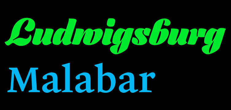


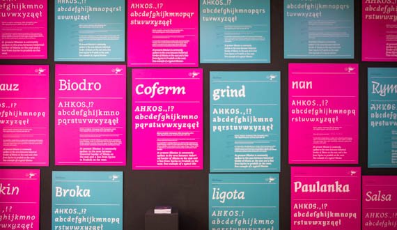
The typefaces used for the exhibition’s were kindly donated by two Berlin-based KABK and Reading graduates.

The titling face is Ludwigsburg by Fritz Grögel (KABK 2010) who co-founded LetterinBerlin with Elena Albertoni in 2011.

The text face is Malabar by Dan Reynolds (Reading 2008) who is currently a research assistant and doctoral candidate at the Braunschweig University of Art.

Type Lab with Glyphs.app

Type Lab with Glyphs.app

(Schriftlabor mit Glyphs.app)

Thursday, 6 June:

‘Start your own first font with Glyphs.app’. Full-day workshop for beginners, 10.00 – 18.00, €50. No prerequisites, just bring your MacBook (OS X 10.6.6+)
(‘Mach deinen ersten eigenen Font mit Glyphs.app’. Ganztägiger Workshop für Anfänger. Keine Voraussetzungen außer das eigene MacBook mit mind. OS X 10.6.6.)

Friday, 7 June:

3 workshops, €20/each (3 Workshops, jeweils EUR 20)

10.00 Scan your handwriting and other goodies (Handschrift scannen und andere Tricks)

12.00 Lunch break (Mittagspause)

13.30 Monoline workflow (Arbeiten mit offenen Pfaden)

16.00 Turn your Illustrator drawings into a webfont (Von Illustrator zum Webfont)

Saturday, 8 June:

3 workshops, €20/each (3 Workshops, jeweils EUR 20)

10.00 Interpolating a font family (Eine Schriftfamilie interpolieren)

12.00 Lunch break (Mittagspause)

13.30 Spacing and kerning (Zurichten und unterschneiden)

16.00 Coding OpenType features (OpenType-Features schreiben)

The topics get more and more advanced in the course of the three days. If you have no idea about type design, you can take the first workshop and gradually build up with the other sessions.

(Die Themen werden im Lauf der drei Tage schrittweise anspruchsvoller. Auch als blutiger Anfänger kannst du an allen Workshops teilnehmen, wenn du den ganztägigen absolviert hast.)

There are a total of 8 slots available. Email us at info @ motaitaic.com to reserve a spot.

[UPDATE] There are only 3 remaining places.

Word Jazz

Word Jazz

On display May 15th – July 6th, 2013

Word Jazz is a couple things: its the title of an old jazz LP by Ken Nordine that turns the human voice into both communicator and post-modern musical instrument, and also the title of this exhibit of recent large calligraphic works. Jazz improvisation is high-stakes art in the sense that you constantly push your creative process while others listen along for the ride – to take melodic risks in front of an audience. Graffiti and Zen calligraphy are two writing systems that deploy similar sets of aesthetics and conviction in gesture as in jazz. I sought to explore the possibilities of mixing all three of these art forms together, to use Roman letterforms as the back beat while I solo the tale of each letter’s construction. Each piece’s content is a short-form poetic meditation on a variety of subjects, from loss to love to contemporary art. Ultimately the work is about untangling preconceptions about letters, form, writing and art, and recombining them to create new, pretty possibilities for writing to come.

Drury Brennan (b. 1981) is an artist in Minneapolis, Minnesota. Originally a jazz drummer, he studied in photography before moving to ceramics, and upon graduating from School of the Art Institute of Chicago, became a senior editor at Flaunt Magazine in Los Angeles. Working in a variety of media, his most recent work explores the delicate links between calligraphy, street lettering and jazz music. This is his first solo exhibition of writing.

Fajrant: Ala has a pen

Fajrant

Ala has a pen

On display April 10th – May 11th, 2013

Opening Party:
April 12th from 6.00pm

Accompanying lectures by professors and type designers will be held be held at the gallery during the exhibition. Speakers and dates will be announced soon.

Ala has a pen final exhibition, presenting the workshop results and selection of works by Polish students of the Script and Sign Design Studio, as well as Henryk Sakwerda’s calligraphy. The exhibition is accompanied by the promotion of fajrant book (which received “Certificate of Typographic Excellence” of Type Directors Club) containing the workshop teachers’ lectures and the typefaces designed by the participants.

This is the second workshop in the “Ala” series that has been organized by The Academy of Fine Arts in Katowice under the guidance of Ewa Satalecka.

Die Austellung ‘Ala hat einen Füller’ zeigt Ergebnisse aus dem gleichnamigen polnischen Workshop, ausgewählte Studentenarbeiten des Studios ‘Schrift und Zeichen’, sowie Kaligraphie von Henryk Sakwerda. Begleitend zur Austellung wird das Buch ‘fairant’ (mit einem ‘Certificate of Typographic Excellence’ des Type Directors Club) mit den Vortragstexten des Workshops und den dort erstellten Schriftsätzen vorgestellt.

Wystawa Ala ma pióro prezentująca rezultaty warsztatów oraz wybór prac studentów Pracowni Pisma i Znaku, a także kaligrafii Henryka Sakwerdy. Wystawie towarzyszy promocja książki fajrant (która otrzymała Certificate of Typographic Excellence w konkursie Type Directors Club), zawierającej wykłady nauczycieli oraz kroje pisma powstałe w czasie warsztatów.

Lettering vs Calligraphy

Lettering vs Calligraphy

On display February 28th – April 6th, 2013

Opening Party:
February 28th from 7.00pm
with a presentation by Giuseppe and Martina at 7.30pm

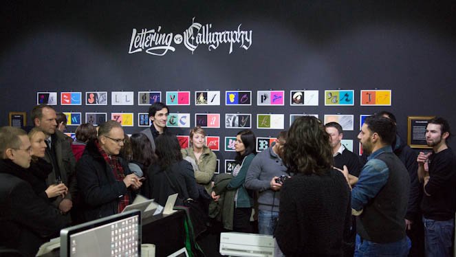
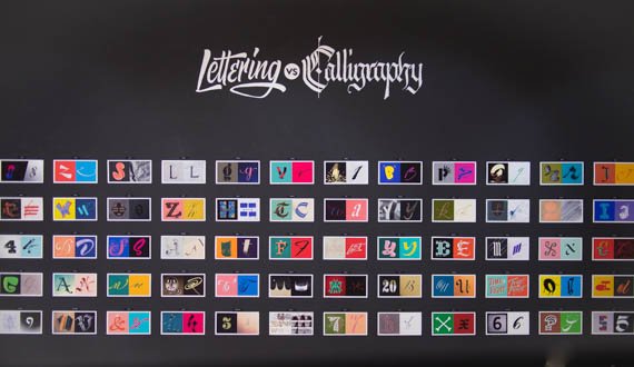
After three months online, Lettering vs Calligraphy sets its first exhibition. Martina Flor and Giuseppe Salerno present their library of letters in a show that allows visitors to vote for their favourites. The installation includes more than one hundred letter forms that bring the craft of drawing letters and the art of writing into one picture.

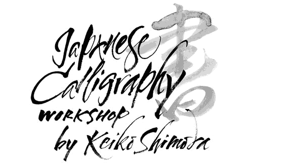
Japanese Calligraphy Workshop Recap

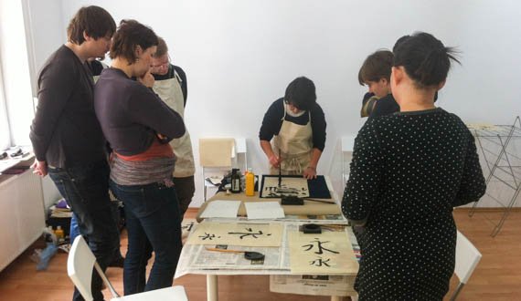
Last week was our first workshop here in our shop/gallery/studio space. Instructed by Keiko Shimoda and organized by Shoko Mugikura, we had an exciting day learning all about Japanese calligraphy.

Shoko began the day with an overview of how Japan’s complex writing systems work followed by examples of historical and contemporary typography. Keiko then presented an introduction to the long tradition of calligraphy in Japan.

After these theoretical basics, it was time to get creative. Keiko explained and demonstrated every aspect of the process including the paper, ink-making, brushes, proper handling of brushes, and how to write a few characters in different styles. The participants then spent the morning intently practicing. In the afternoon they chose some simple words to learn to properly write. Keiko nicely concluded the workshop with a helpful group critique of everyone’s work.

(Font) In Progress:

(Font) In Progress:

Creating a New Typeface


On display January 21st – February 23rd, 2013

Thanks to personal computers and the trendiness of letters and lettering, the general public seems to know about, and slightly understand the concept of, fonts. Most at least realize that they can change the default typeface options in word processor or when they need to type something. But once you move a bit deeper into the universe of typefaces, the quality and quantity of knowledge dramatically drops off. There are still many who believe fonts are something that simply come with your computer. Some know that real designers sit and create them. Fewer still can appreciate the facts that serious type families demand considerable work and can easily take years to complete. Even for the most avid fans of type and typography, the process of creating a font is still often a mystery.

The (Font)In Progress installation is here, now, for two reasons. The primary motivation was completely selfish: it’s an excuse (and pressure) to work on new fonts. Since opening the gallery and shop space, the amount of time and resources I’ve had to work on type design has greatly diminished. What was once 80-90% of my work efforts is now only 5-10%. So, the hope is to dedicate a few weeks to the task of beginning a new type project (even if it’s not brought to completion).

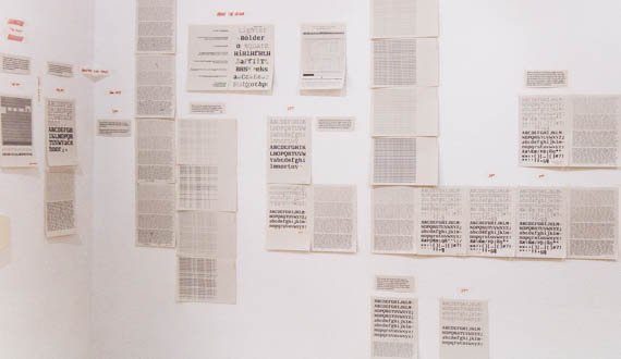
The other intent for this show is to help demystify the process of creating a typeface. My workflow will be documented almost daily in this installation, so visitors can view my various steps, methodologies, and tricks that I employ when creating a new design.

The work will be primarily documented in the form of test prints on display in the gallery. However, for those not fortunate enough to be in or around Berlin in January or February, there will also be an online archive of the work presented here.

At the end of the exhibition we will celebrate with a Finissage on Saturday, February 23rd from 6pm to get one last look at the display and evaluate how the work went.

Japanese Calligraphy Workshop

Japanese Calligraphy Workshop


Shoko Mugikura of Just Another Foundry teamed has kindly organised a Japanese calligraphy workshop by Keiko Shimoda to be held here at Mota Italic!

The main details:

19th January 2013, Saturday, 11am

– Max. 8 participants

– 4-5 hours

– The workshop will be in English and all necessary tools are provided

– Please bring €20 to cover the cost for the writing tools and paper

The workshop is intended for those who have interest in Japanese and Chinese calligraphy but never had the opportunity to try it. Even if you don’t know anything about Japanese language, not to worry – we’ll have a short introduction of the Japanese writing systems by Shoko, as well as an explanation of the history and theory of Japanese calligraphy by Keiko.

But the workshop is mostly about practising – it is a wonderful opportunity to learn new writing systems, skills and methods developed in the Far East. You could even try Japanese calligraphy methods to write Latin script.

Keiko is an unusual person to practice both Japanese and Latin calligraphy. Based in London, she produces beautiful invitation cards, certificates and logos etc. in both Latin script and Japanese or Chinese characters. She also sometimes works for films. In fact, you might have already seen her work – her piece appears in the new James Bond Skyfall! To see more her work, please visit her website.

Although not a calligrapher, Shoko will also be around to answer questions on Japanese scripts.

If you’d like to participate, please email to:

workshop_01_2013@justanotherfoundry.com

Update: There is only a space or two left!

Update 2: The workshop is now fully booked!

OMG Goodbye 2012

2012-omg-2

Well, 2012 is coming to a close. With only three more days open, we might as well start saying goodbye to the year and start looking towards 2013.

This year was busy – possibly evident by the lack of blog posts we managed to make (this is our second post of the year). Our report for this year is quite similar to last year’s. In short, there was one major type project, more growth of the boutique, and many new exhibitions in our gallery space.

New Fonts:

2012-gemma

We finally released our extensive type family Gemma. This fun – but seriously equipped – family has just about everything you could ask for when looking for an informal sans. OK, so it doesn’t have traditional, boring old italics, instead, it comes with 2 sets of awesome rotalics.

The Boutique:

A lot has changed over the last year… most noticeably is a greatly expanded selection of books. We currently have 180 book titles in stock, for a total of about 400 books. This is fairly small for a regular book store, but in our case we carry only the best selection of typography-related books – as opposed to everything that is available.

OLYMPUS DIGITAL CAMERA

We are still getting in new things in all the time… Come stop by!

The Gallery:

We held 6 exhibitions here this year!

OLYMPUS DIGITAL CAMERA

In January we had “Rotation, Reflection, Repetition, Repetition.”: a project by students of the UdK in Berlin.

>>Images from the installation

OLYMPUS DIGITAL CAMERA

New Vintage Digital Vernacular Letters was our first photography-related show. From an open call we selected almost 600 images from 120 photographers from 40 countries.

>> Some pictures of the pictures

OLYMPUS DIGITAL CAMERA

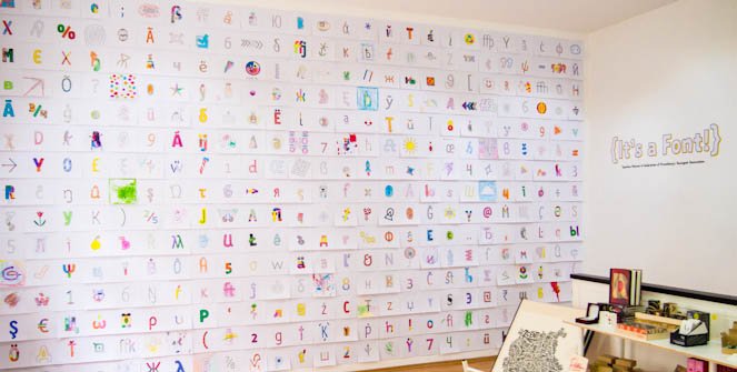
Celebrating the release or type family Gemma, we created the {It’s a Font!} installation. Hundreds of neighborhood children helped us color a selection of glyphs from the fonts to fill the wall.

>> Images from the show

OLYMPUS DIGITAL CAMERA

For the second time we exhibited the works of this year’s graduates from the University of Reading and the KABK master’s in typeface design for Mastering Type 12.

>> More about the show and the students

OLYMPUS DIGITAL CAMERA

Mister K & Franz Kafka joined us here in the autumn. Julia Sysmäläinen’s remarkable exhibition transformed the gallery into a Kafkaesque space full of fascinating stories and creations based on her Mister K typeface.

>> See every angle of the room that Kafka built

OLYMPUS DIGITAL CAMERA

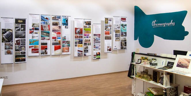
Stephen Coles presented a large selection of curated photographs from his chrome lettering “Chromeography” collection.

>> More on Chromeography

Thanks for all your support this year. We are looking forward to continuing to offer more books and typographic merchandise (both in the store and online), and share more interesting and inspiring exhibitions. So, providing the world doesn’t end tomorrow, see you in 2013!