20th December, 2011 by Mota Italic
Here are a few images and comments about the concept, design, and setup of our installation “
The basic concept for the exhibition was to show some of the greatest/most influential/most popular/our favorite modern blackletter designs. There have been quite a lot of new blackletter typefaces coming out in the last years, so the selection was difficult. The selected designs were released between 1990 and 2011 plus a couple that are unfinished and not yet commercially available.
Our general guidelines while curating these designs necessitated taking queues or inspiration from traditional blackletter styles, but to interpret them in new and contemporary ways. So whether the designs were influenced by 90’s grunge, pixels and the digital environment, or trying to blend blackletter and Latin types, they have all expanded the previous boundaries of pre-digital blackletter styles. The second round of selection involved choosing an appropriately wide variety of styles: different weights, widths, inspiration sources, amounts of ‘blackletterness’, text vs. display use, etc.
There are (only) 22 typefaces represented in this installation, although ideally, many more could have also been included. Regardless, through this small cross-section of designs, it is clear that the blackletter genre is continually advancing with technology and designer’s tastes and there is still room for more.
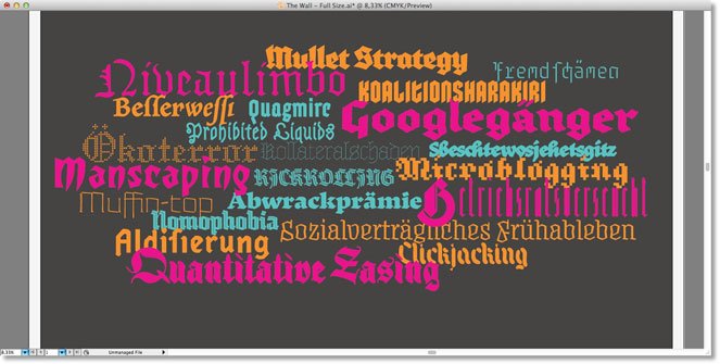
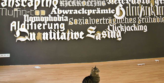
After selecting the typefaces and words (more on the word choices below), the layout was made on the computer. The color coding represents the letters’ sizes, distance from the wall, and age of the fonts. The layout is somewhat of a Blackletter Big Bang – the oldest fonts are the largest, more to the outside, and the letters are physically furthest from the wall (as in 3D; more on this also below). The newest fonts are smaller, more central, and closer to the wall.
Pink = 1990-1999; Orange = 2000-2009; Blue = 2010–still unreleased
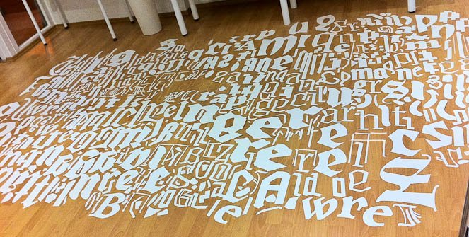
The letters were laser-cut out of a thick, white card stock. Our obsessive-compulsive intern, Sláva Jevčinová , laid them all out on the floor to help sort the mess back into words.

Then the paper negatives were also sorted.

Slávka painstakingly recombined all the sheets to create one giant stencil.

The final stencil.

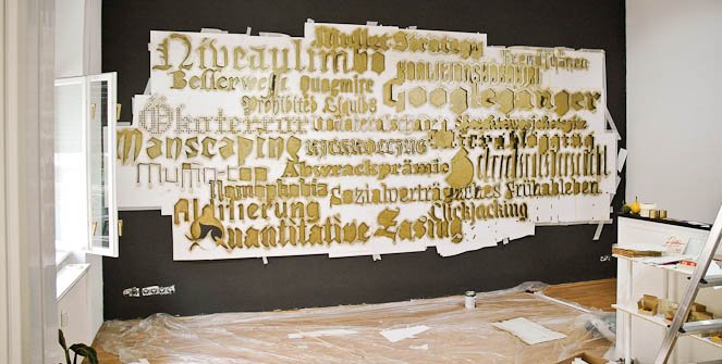
We then cut the stencil into several large pieces to attach to the wall.

Beginning to spray paint the counterless letters gold.
Done.

And done.

Gold on dark gray.

It took three people about two days to mount all the paper letters to the wall.
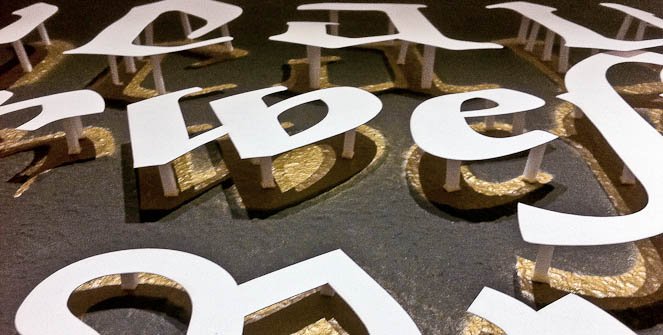
Mounting the letters was incredibly time-consuming due to the 3D aspect. Each word has its own length of foam posts that were cut by hand. There are more than 300 letters averaging 5-10 posts per letter x 2 hand-cut squares of tape per post. This doesn’t include the additional ≈ a million ‘pixels’ in the word “Ökoterror”.

The final piece.
Not all tapes are created equal. We used a few different varieties, but ran out of the best one mid-way through the hanging. For the first several weeks, letters were jumping off the wall. This was the scene the morning after the opening party – by far the worst day. After repairs with a stronger tape (and in some cases additional foam posts), the letters were securely in place for the remainder of the show.
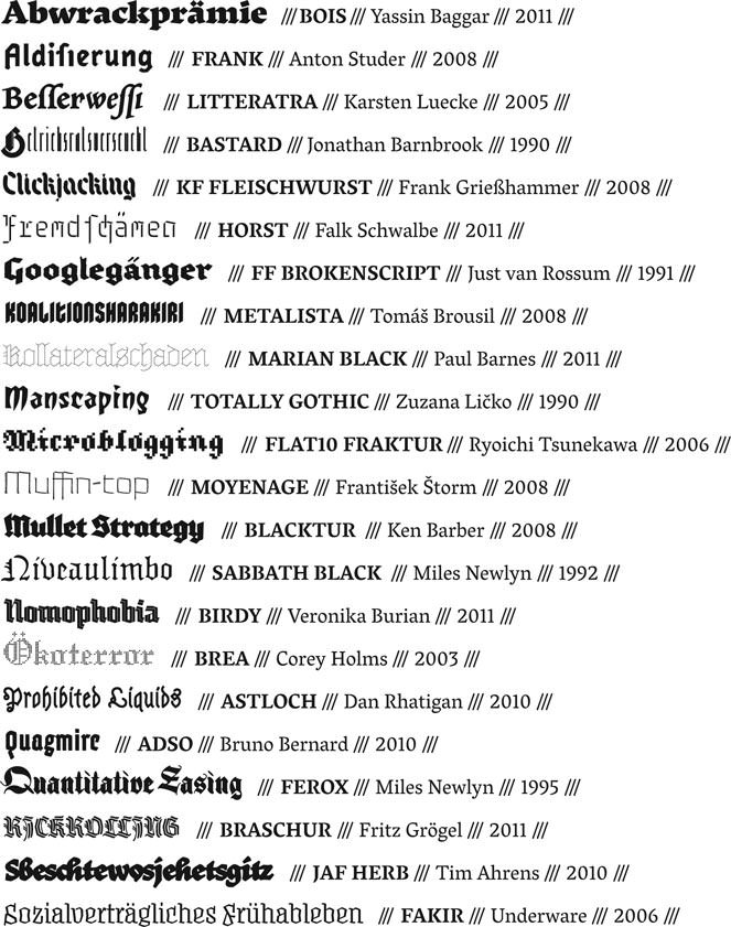
One last comment regarding the selection of words. Being ‘modern’ blackletter designs, we chose appropriately ‘modern’ words and concepts. They were split 50/50 in German and English to accommodate most of our audience. The German words are all official ‘words of the year’ from the 90’s through now – these were voted on each year and they represented popular linguistic trends and buzzwords for that year. The English words are similar; they were either hot topics of the year or were newly included to various dictionaries. In both the English and German, the words range from entertaining to highly political. The words were matched to the typefaces for a variety of reasons: sometimes they were appropriate to the type designer (based on their personality/beliefs), to the intent of the typeface, to the typeface’s style, or simply because the word shows off particularly nice letters from that typeface.
Thank you again to all the designers who sent in their designs. And thanks also to our awesome intern Slávka; without whom the show would have never been up on time!
- Mota Italic Gallery
See more posts filed under: