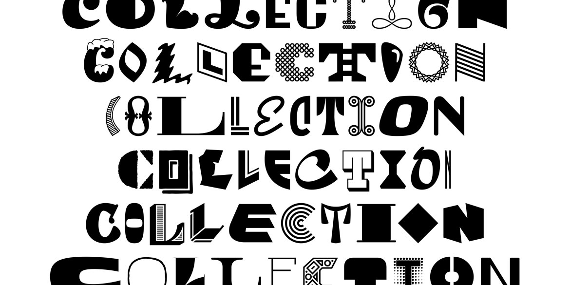
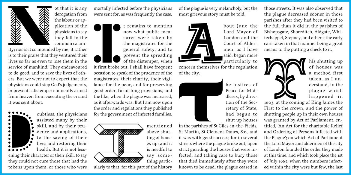
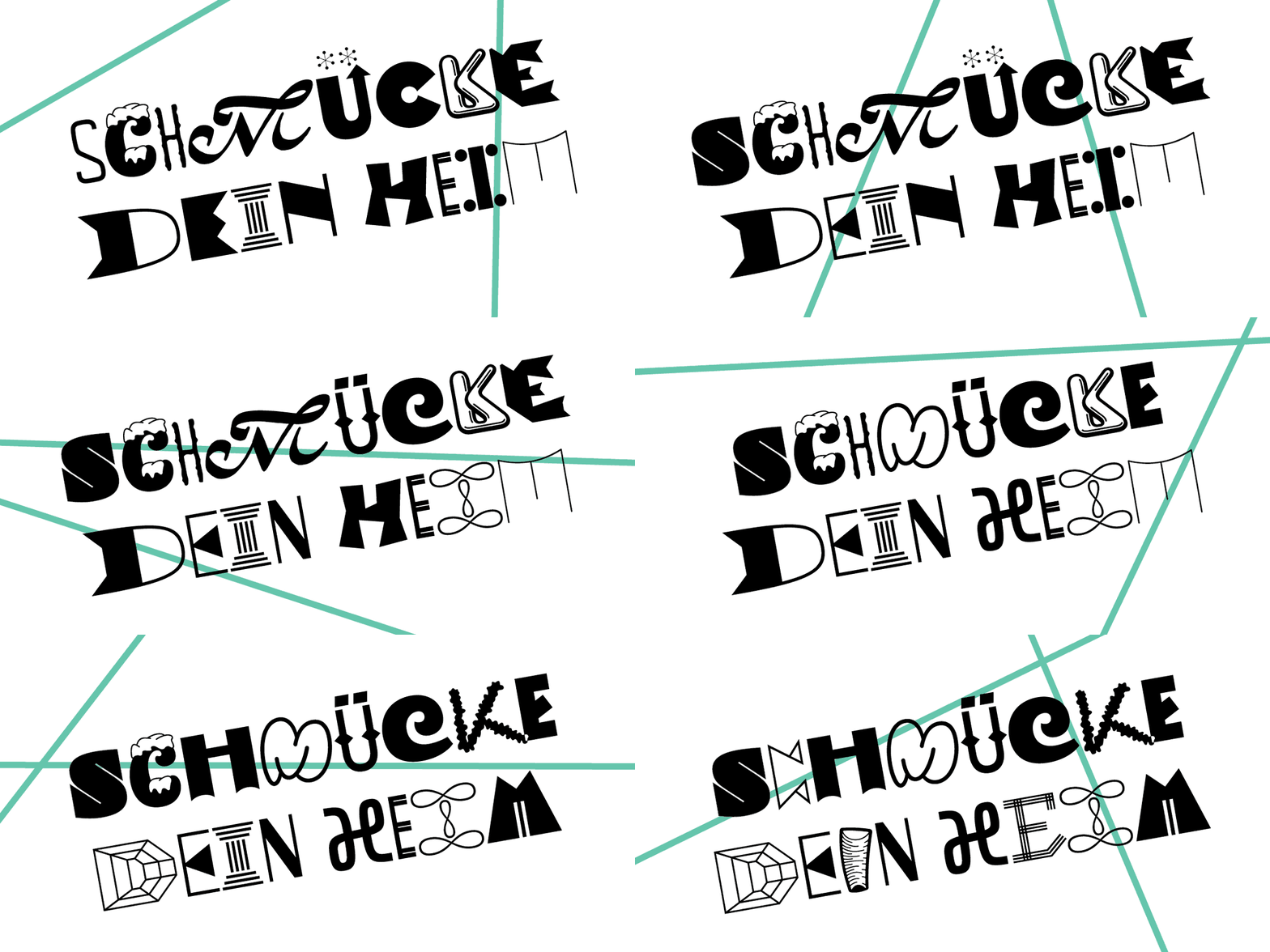
This is a one stop shop for all your funky & eclectic typographic needs. Collection is a hodgepodge of diverse styles – no two letters match… Yet remarkably, you can easily typeset almost anything (it works best for a few words at a large size) and it will look awesome. With at least 50 versions of each letter, Collection is our weirdest and most ambitious font to date.
Designed by: Rob Keller
Current Version: 0.3
Current № of Styles: 1
Planned № of Styles: 2
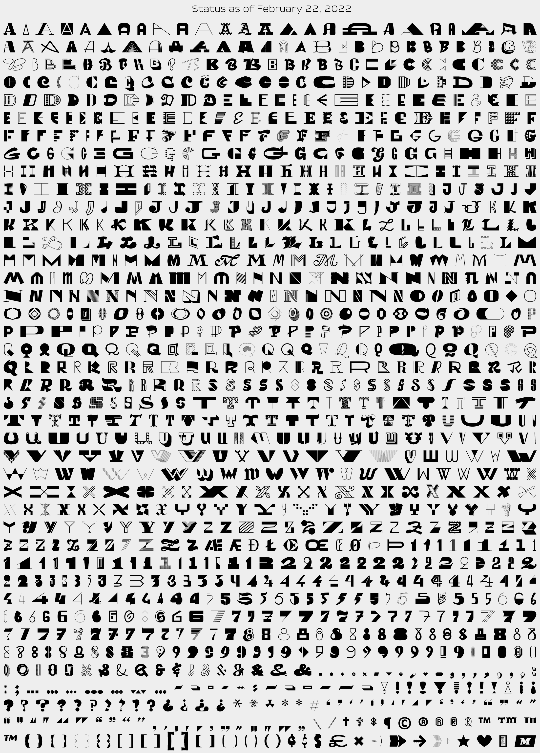
№ of Characters: 1,210 & still growing
Scripts: Latin
View the PDF specimen
Current License Price: €29
Inside the Collection
We are constantly surrounded by interesting letters – be them in signs, logos, book covers, or architecture – in both real life and of course online through Instagram and websites. Many years ago I started sketching and saving random cool letters – both newly invented ones and also ones inspired by found lettering. To push them farther, I’d look for the kernel of their idea and exaggerate it to make it even more unique. In 2015 I started digitizing these sketches (about 2,500 of them!) and putting them into this font.

The first rule of Fight Club Collection is that all the wildly different letters must have an equalized capital height. This helps retain some amount of legibility and cleanliness – the character widths are entirely flexible.


Each letter should be as legible as possible on its own – while still being interesting of course. Some other wacky display typefaces out there have individual letters that look cool, but are unrecognizable out of context. We don’t have time or interest in letters that are indecipherable. The fact that this typeface by already so irregular, it’s important to retain as much legibility as possible.

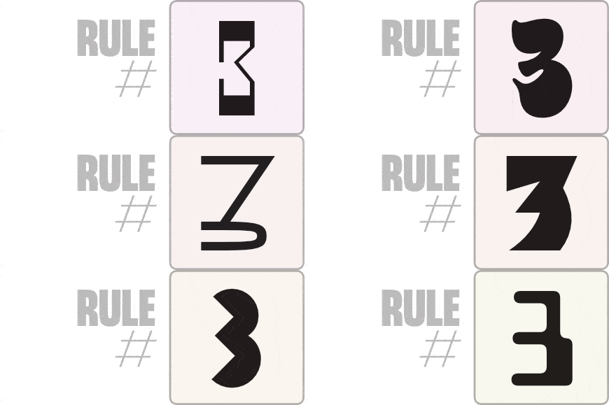
The only other ‘rule’ to this design is that no two letters should look like they came from the same typeface. They are all uniquely styled, with their own weight, width, decoration, etc. In theory, any one of these glyphs could be expanded into a whole new typeface.

BTW, Collection also has its own Instagram account! Give it a follow to see more of this design progressing and being used!

Your Help!
Since this font is still in progress, we can easily make modifications and improvements based on your opinions. If you have any thoughts, critiques, suggestions, etc. for Collection, please let us know! This form is quick and anonymous (unless you want to share your name/contact info).
We really appreciate your help!!!
Beta Updates
v0.3 → Another 10% Moar 22 Feb, 2022
→ 110 all new characters, plus tons of minor adjustments all over.
v0.2 → The 10% Update 02 October, 2020
→ 100 all new characters, 125 letters improved/redrawn, & every single glyph has been re-spaced!
v0.1 → Initial Release 18 May, 2020
→ Font contains 1,000 characters
→ The “RAND” (random) OpenType feature is implemented, but “CALT” is not yet working. If the RAND feature is not supported in your app, you’ll need to manually select letter alternates with the glyph palette. Future versions will automatically select random letters with CALT.
