Well, 2012 is coming to a close. With only three more days open, we might as well start saying goodbye to the year and start looking towards 2013.
This year was busy – possibly evident by the lack of blog posts we managed to make (this is our second post of the year). Our report for this year is quite similar to last year’s. In short, there was one major type project, more growth of the boutique, and many new exhibitions in our gallery space.
New Fonts:
We finally released our extensive type family Gemma. This fun – but seriously equipped – family has just about everything you could ask for when looking for an informal sans. OK, so it doesn’t have traditional, boring old italics, instead, it comes with 2 sets of awesome rotalics.
The Boutique:
A lot has changed over the last year… most noticeably is a greatly expanded selection of books. We currently have 180 book titles in stock, for a total of about 400 books. This is fairly small for a regular book store, but in our case we carry only the best selection of typography-related books – as opposed to everything that is available.
We are still getting in new things in all the time… Come stop by!
The Gallery:
We held 6 exhibitions here this year!
In January we had “Rotation, Reflection, Repetition, Repetition.”: a project by students of the UdK in Berlin.
>>Images from the installation
New Vintage Digital Vernacular Letters was our first photography-related show. From an open call we selected almost 600 images from 120 photographers from 40 countries.
>> Some pictures of the pictures
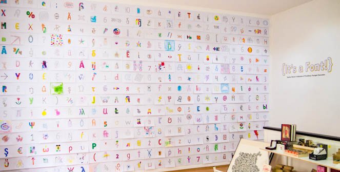
Celebrating the release or type family Gemma, we created the {It’s a Font!} installation. Hundreds of neighborhood children helped us color a selection of glyphs from the fonts to fill the wall.
For the second time we exhibited the works of this year’s graduates from the University of Reading and the KABK master’s in typeface design for Mastering Type 12.
>> More about the show and the students
Mister K & Franz Kafka joined us here in the autumn. Julia Sysmäläinen’s remarkable exhibition transformed the gallery into a Kafkaesque space full of fascinating stories and creations based on her Mister K typeface.
>> See every angle of the room that Kafka built
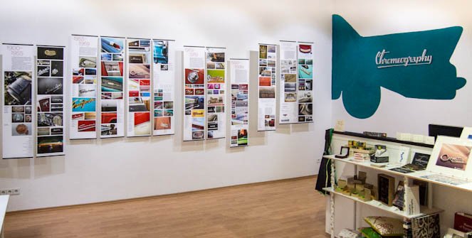
Stephen Coles presented a large selection of curated photographs from his chrome lettering “Chromeography” collection.
Thanks for all your support this year. We are looking forward to continuing to offer more books and typographic merchandise (both in the store and online), and share more interesting and inspiring exhibitions. So, providing the world doesn’t end tomorrow, see you in 2013!


