
When David Jonathan Ross created Fit, he was so busy pushing the boundaries of the variable font format that he probably never imagined the impact this typeface would have. Over the years it has inspired collaborators from around the world to bring their scripts into the family: Hebrew (Oded Ezer), Armenian (Gor Jihanian), Devanagari (Kimya Gandhi), Tamil (Aadarsh Rajan), Arabic (Sahar Afshar), and most recently Kannada (Taresh Vohra). Now Fit is continuing its way across the Indian subcontinent.
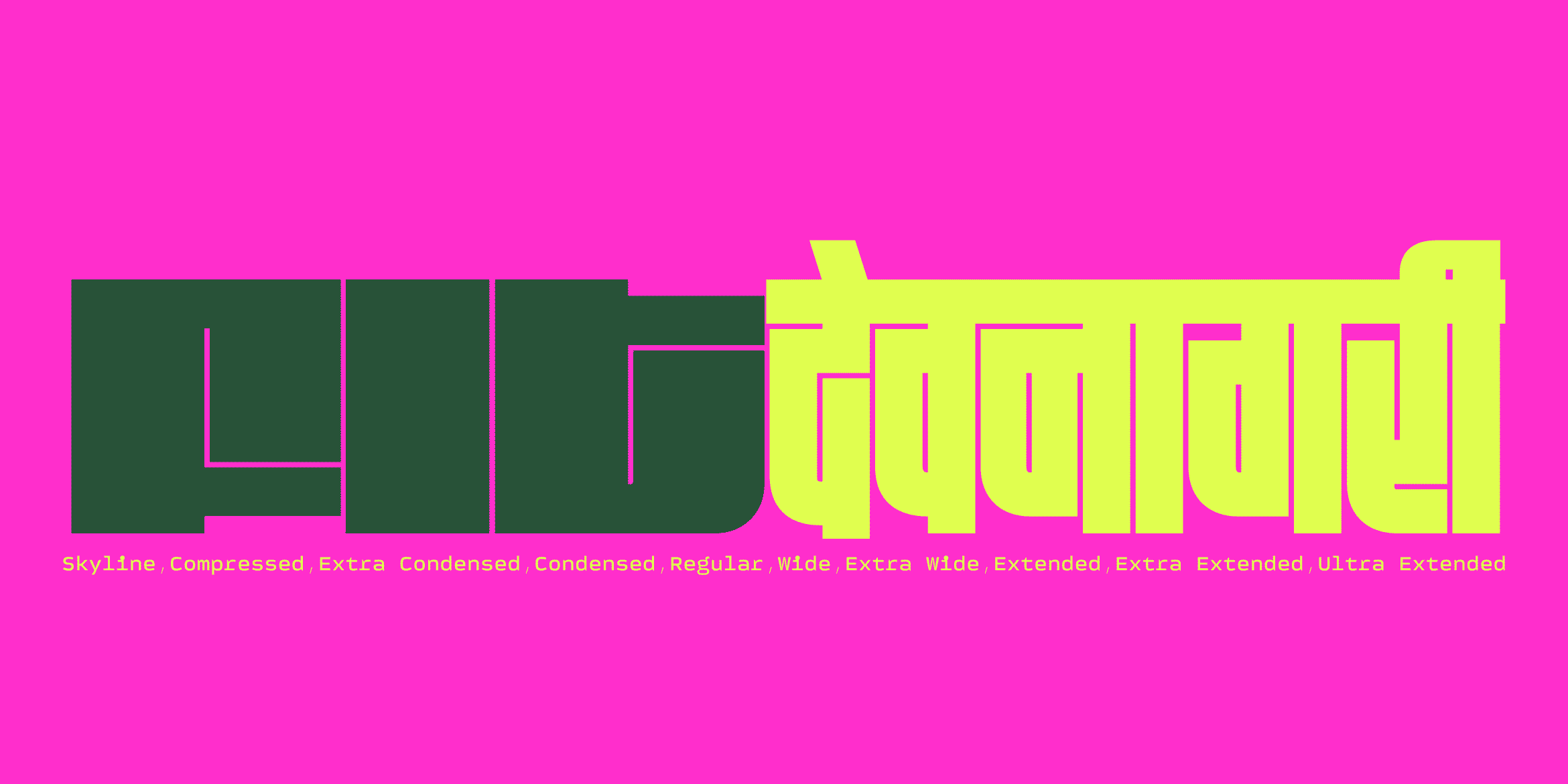
The premise of the design is deceptively simple: geometric shapes that stretch dramatically, from a super-skinny Skyline to a sprawling Ultra Extended, all while the white spaces hold steady while the black shapes do all the moving. This logic transfers beautifully to every script to create dense, graphic, almost architectural textures that turn any word into a monument.
Devanagari
Kimya Gandhi’s take on Fit, navigating Devanagari’s intricate conjunct system across ten widths without losing the script’s character. ➡️
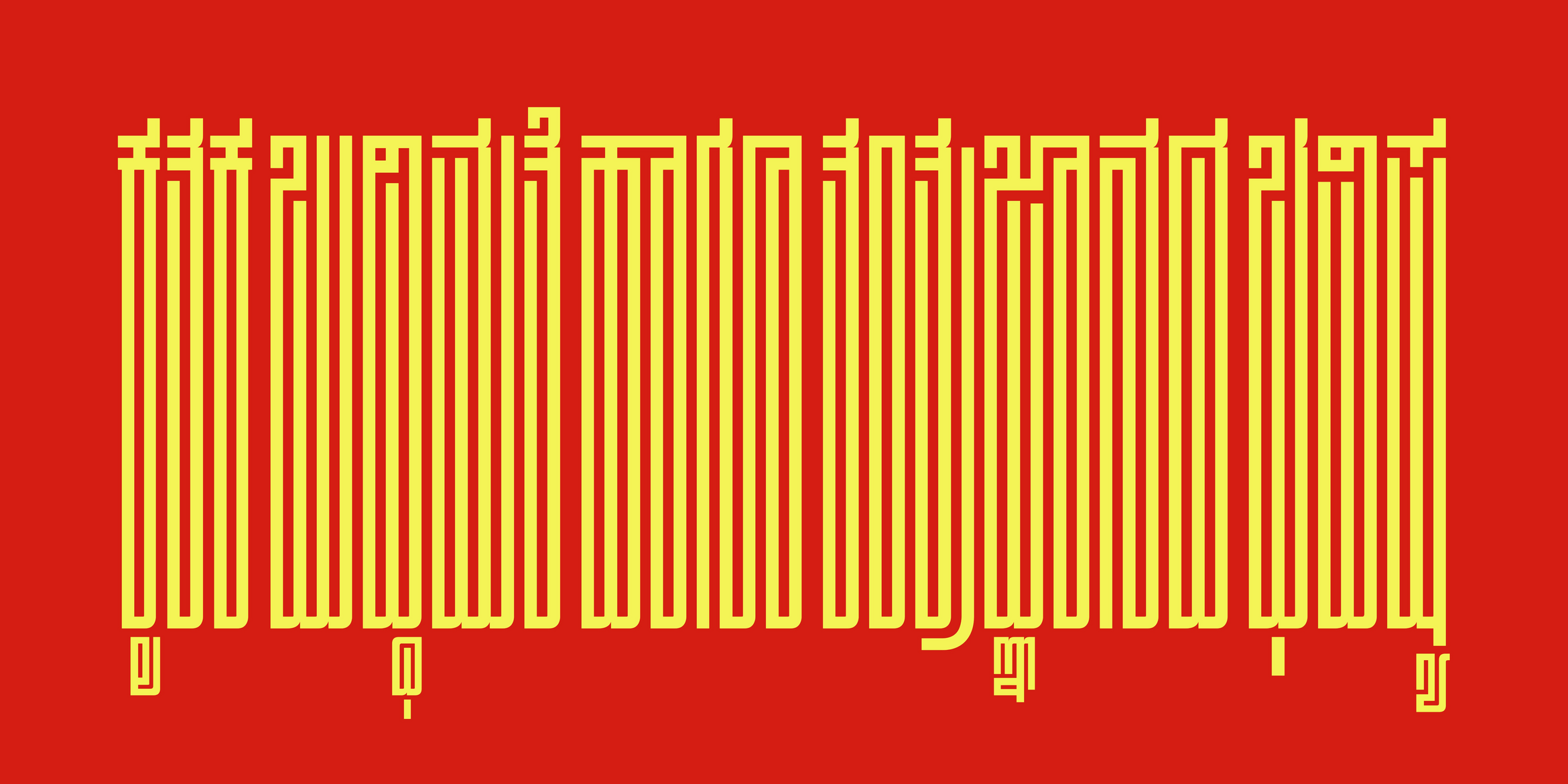
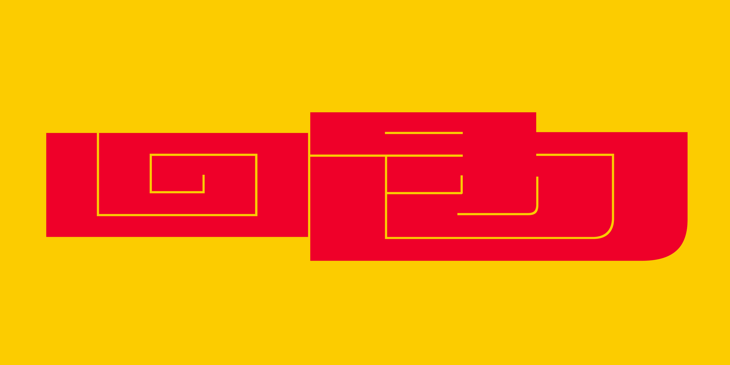
Kannada
Designed by Taresh Vohra, Kannada’s ottus & vowel-signs squeezed into Fit’s modular grid. Legible where it counts, unhinged where it can be. ➡️
(PS: Odia is up next, with many more scripts to follow 😄)