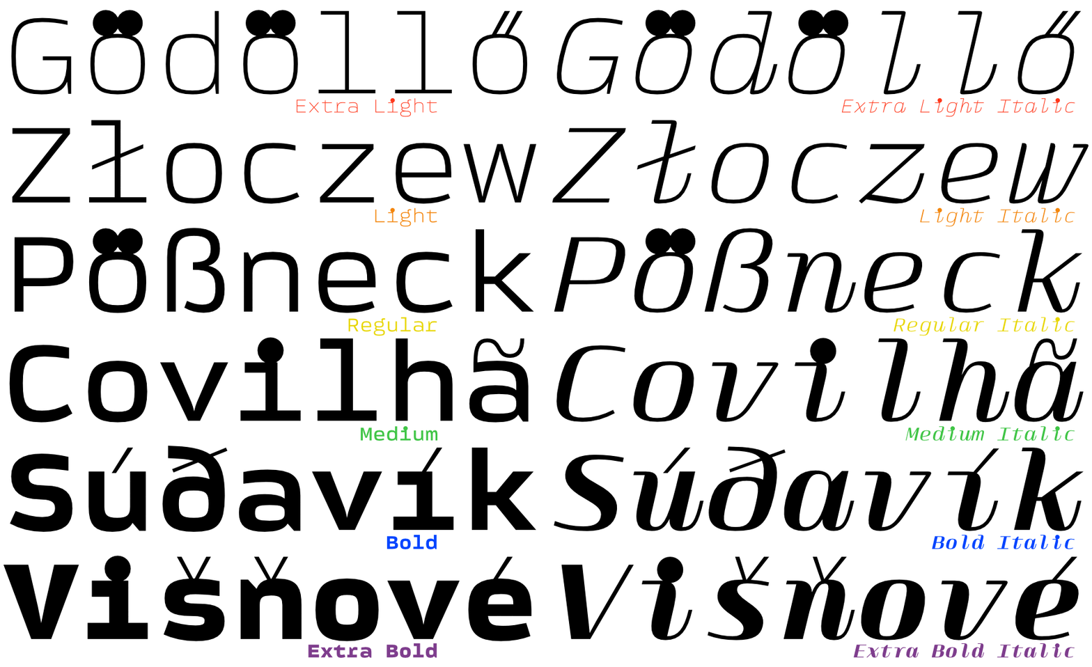
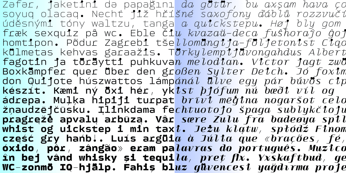
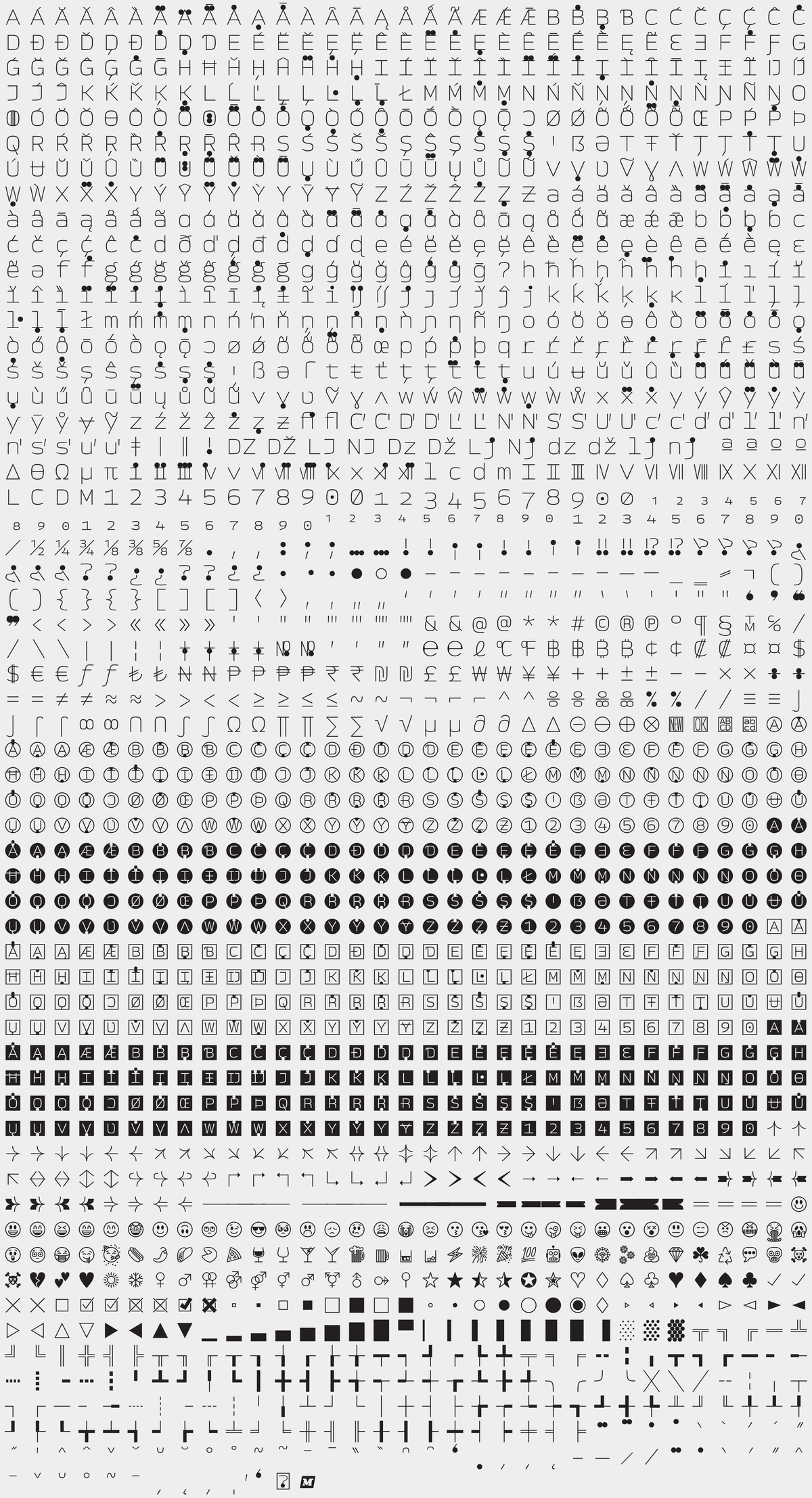
Monospaced typefaces were once primarily associated with typewriters… now they are mostly used by programmers. But there’s no reason they can’t be used everywhere! The strict grid, forcing the letters to be exactly the same width, gives your typesetting a funky rhythm and a surprising texture. 💯% cool!
Designed by: Rob Keller
Published in: 2021
Styles: 6 weights + Italics + 2 Variable Fonts
Scripts: Latin
№ of Characters: 1,926
View the PDF specimen
Licenses from: Free!
Show Me the…
…Keming
Sorry, there is no kerning 🤪 That’s a feature – not a bug! This is probably stating the obvious: these fonts are monospaced. Technically there are a few double width letters, but for all intents let’s just say every letter is exactly the same width.

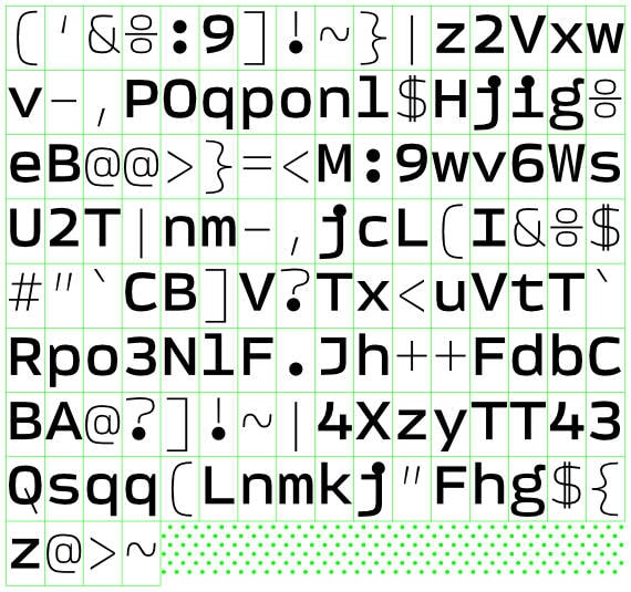
…Speckly Bits
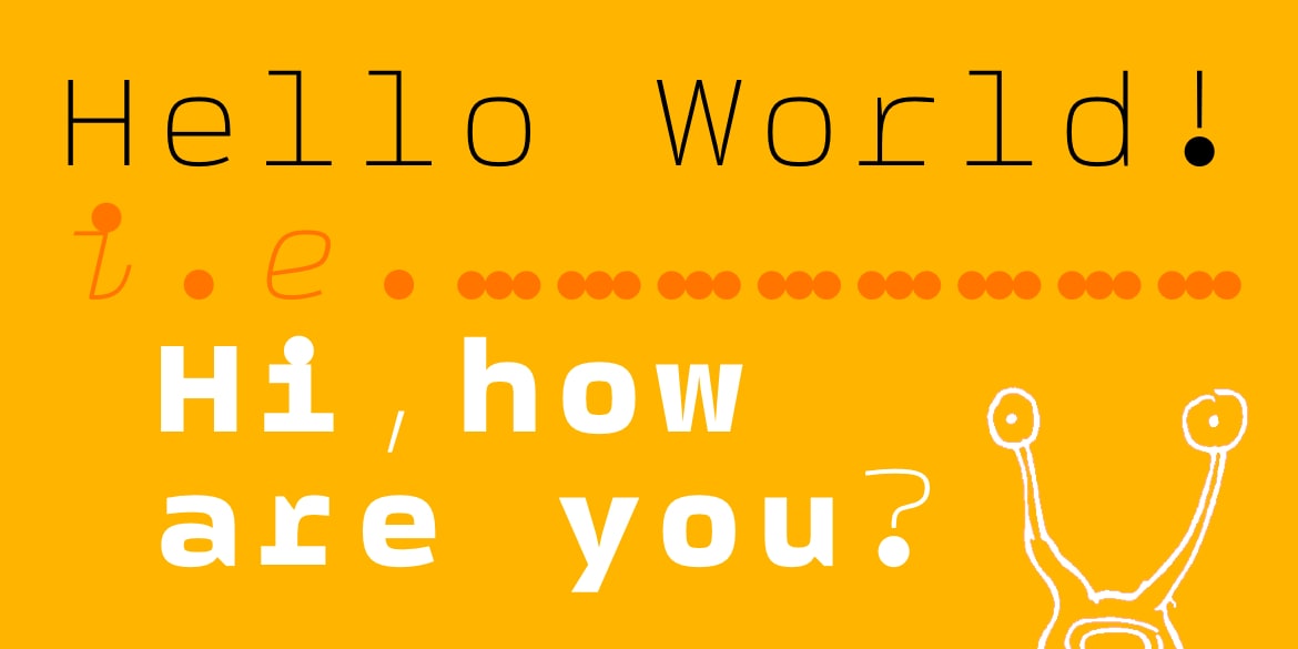
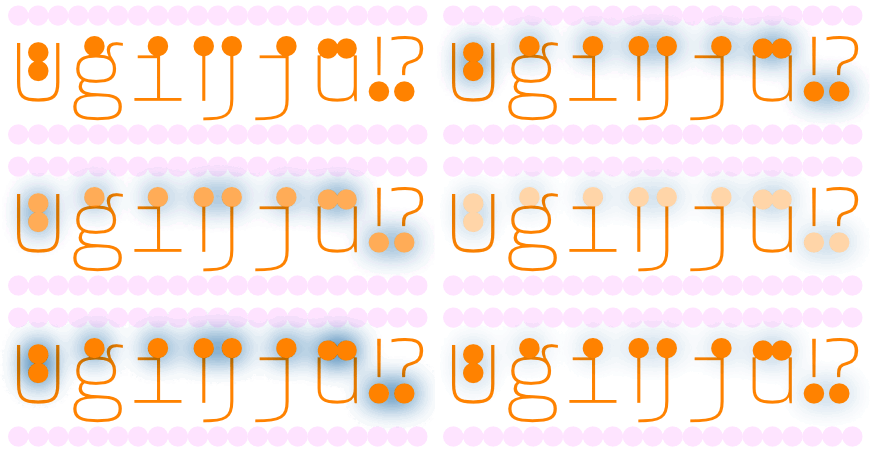
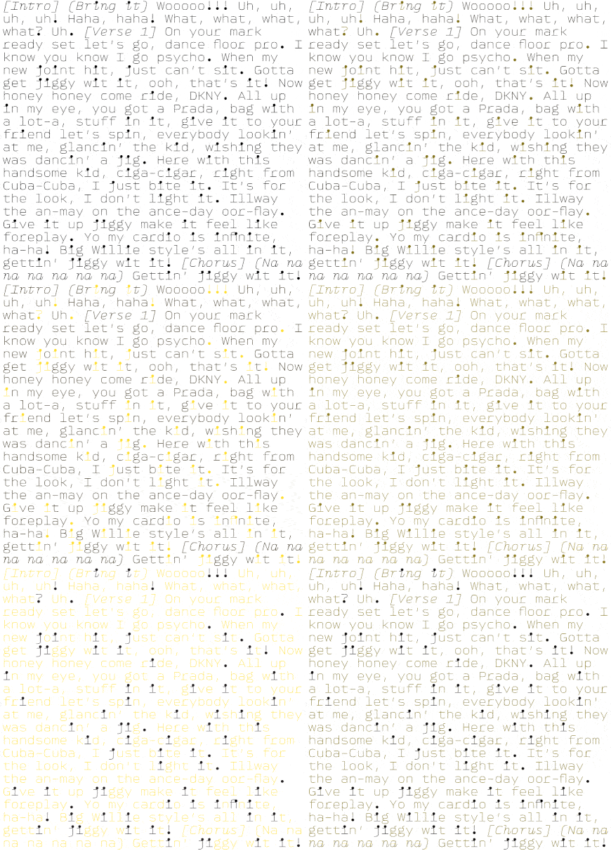
Since we aren’t 12 anymore, we won’t joke about big tittles & balls. Rather, we’ll point out how the letters’ skeletons are simple & open, making the text legible & easy to read. Then to jazz things up, giant dots (e.g. ä, i, j, :, !, ?, etc…) add speckle & quirk to tickle your readers’ eyeballs and keep them engaged.
…Less Speckle
So maybe you don’t love interesting sparkle. There may even be times some people want a little less salsa in their burritos. We aren’t secretly, silently judging. For these occasions, we have modified i’s and j’s with appropriately sized dots – these won’t stick out as much and look so weird. Maybe this is a good thing for you.
…Stylish Punctuation & Symbols
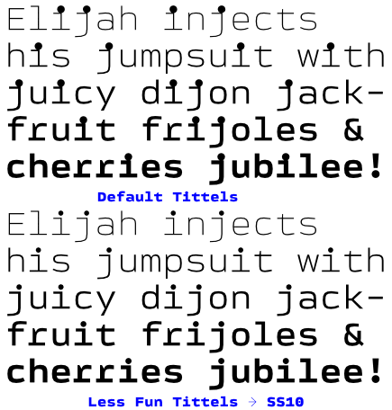
Most punctuation and symbols come in two forms: The default is thin, and it stays thin in every weight. This gives a effortlessly unique look to your text – especially in the bolder weights. But there’s also more traditional versions of these glyphs as well – ones that properly change and match the selected weight. This makes the texture a bit toned down in the bold weights. Sometimes this is a good thing.
…Enclosed Letters & Numbers
For years, pog printers and porcelain tile manufactures have been emailing – begging for letters inside squares & circles. Making their dreams come true and helping to streamline their design processes we are serving up four sets of A-Z & 0-9 encapsulated in shapes like little carbonited Han Solos.
Not only are there all base letters in circles & squares, it’s also possible to typeset any of the 400+ supported languages. Each set of enclosed letters has an additional 96 characters to typeset diacritics and unique letters that your language may require.


…Emojis
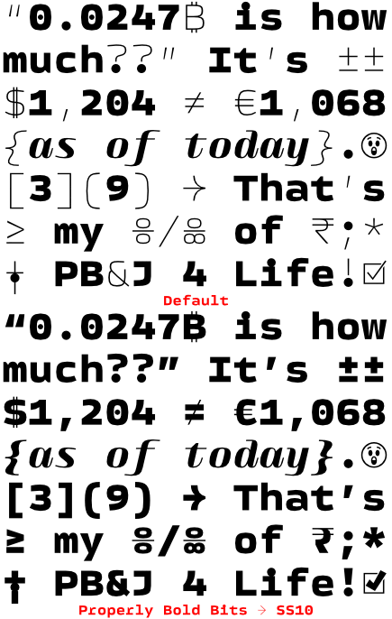
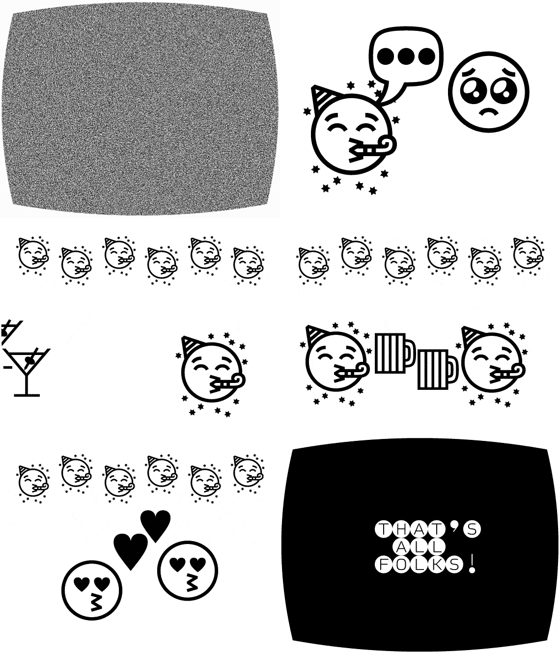
There are now over 300 ‘extras’ in each weight! These include a wide range of widely useful to super specific dingbats: 38 arrows, letters & numbers in circles & squares (both in black & white), all of Unicode’s gender symbols, and well as many shapes / check marks / hearts & more. Aside from these, there are tons of stylish emojis – currently 54 faces, drinks, icons, etc. to convey your thoughts without words.
…Arrows
This quiver overflowing with arrows! 76 arrows to be exact. Fat arrows, skinny arrows, arrows with big tails, arrows in multiple directions… you wanna point to something, you have tons o’ options. Each arrow comes in two versions: the default is always thin (regardless of the weight) & the other visually matches each weight.
Bonus: left & right arrows have extendable tails! Use any combo of hyphen, en dash, or em dash to make them longer automatically. (These use the calt feature, maybe TMI.)

The Family
There are 6 weights in upright and italic. Included in the full family pack is also two variable fonts for more weight options and less files.
