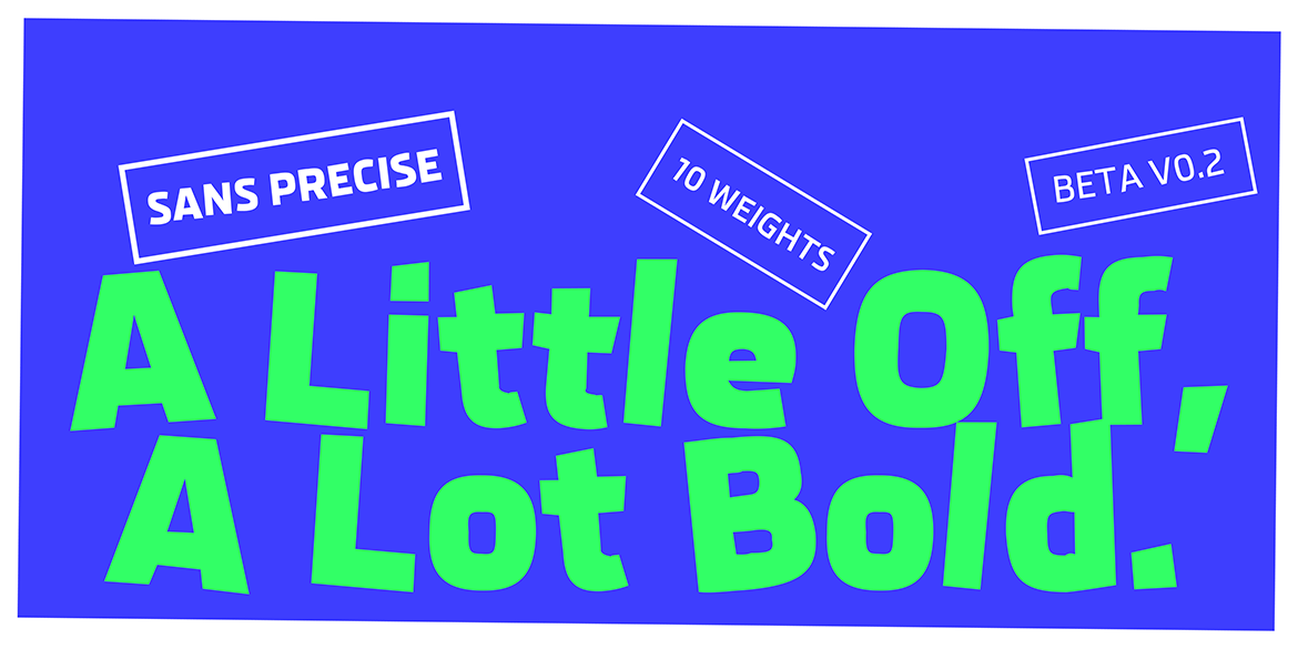
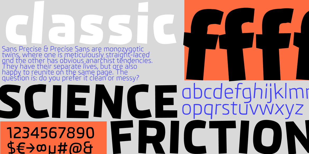

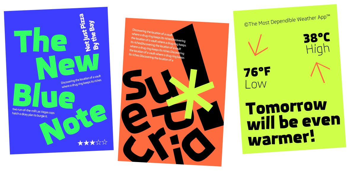
Sans Precise™ is the sleek rough digital font for your digital life. This modern family consists of ten fine-tuned irregular weights (& two italics) to color exactly as many pixels as needed. The squarish shapes are clearly not optimized for screen rendering but the design’s uniquely human details add personality & warmth to the letters and your typesetting – be it in apps, websites, or print.
Designed by: Rob Keller
Current Version: 0.2
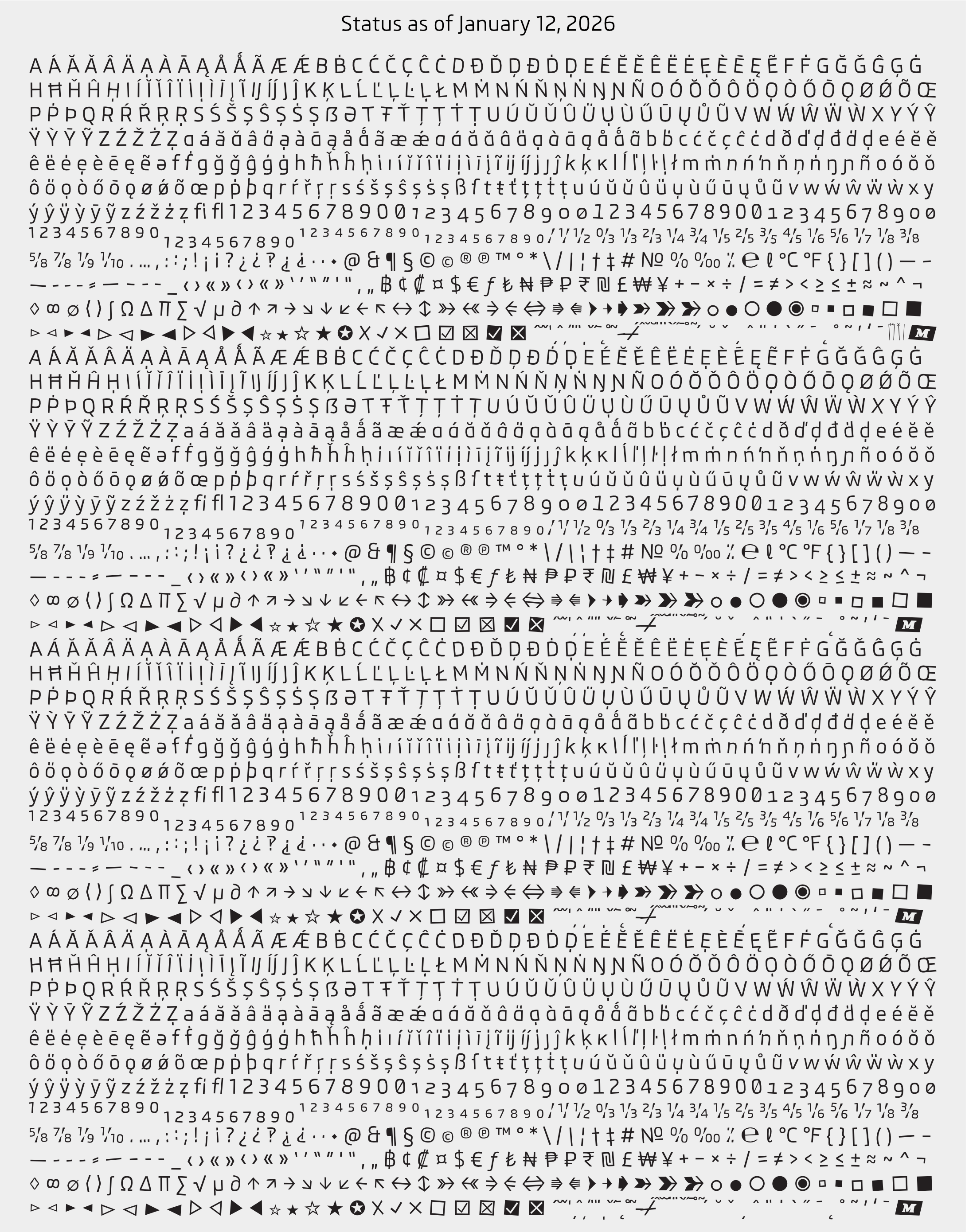
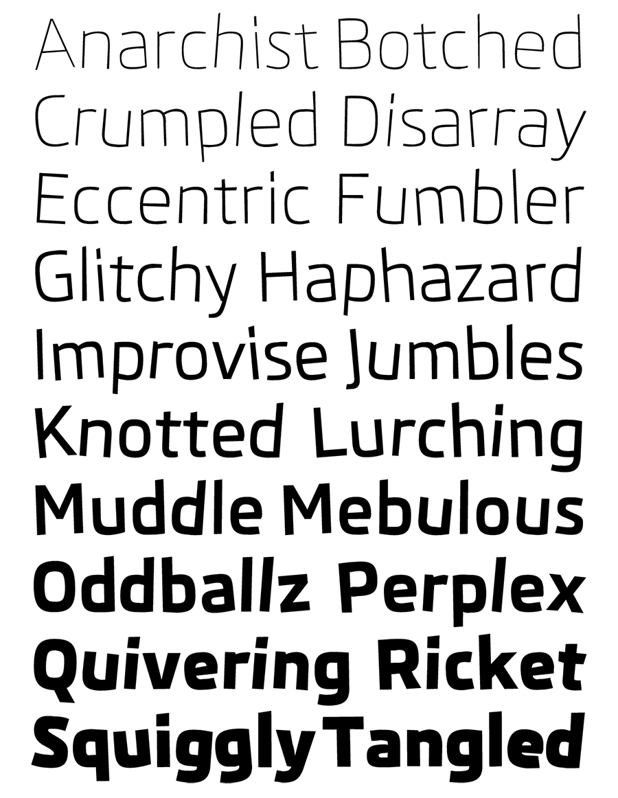
Current № of Styles: 10 weights
Planned № of Styles: 30 = 10 uprights + 20 italics
Current Scripts: Extended Latin
Planned Scripts: Latin, Greek, Cyrillic, Hebrew
№ of Characters: 2,733 & still growing
Licenses from: €60
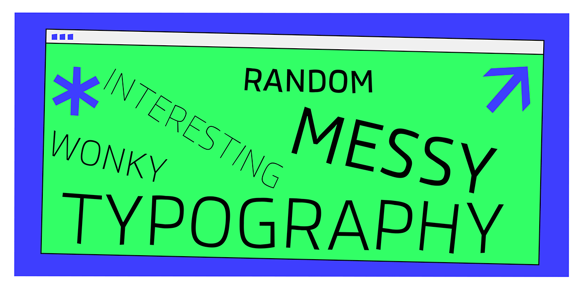
Fine-tuned Messy for peak performance interesting typography
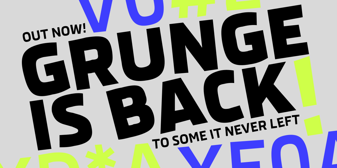
The origin of Sans Precise was a custom font we created for digital displays of one of Europe’s major car manufacturers. It was designed pixel-perfectly for their specific system to be super legible, clean, and distinctive. This new and improved messed up version has been completely redrawn without the constraints and limitations imposted by the car’s proprietary software. The result is an equally meticulous wonky design but with more less refinements, random details, features, and extras.

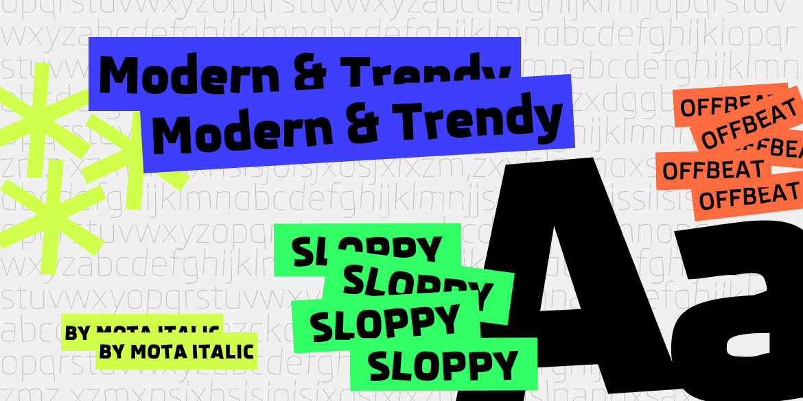
Clean Sloppy & modern trendy
Sans Precise doesn’t brings to mind adjectives like clean, modern, technical, futuristic, etc… While this was initial direction, we didn’t want to push the design into becoming heartless, geometric, or mechanical so we randomly screwed it up and gave it more life with randomized alternates and kinky outlines. The overall look and feel is definitely not techie, but also has a warmth thanks to many small details and customized features.


10 Weights!
The full Precise Sans family will soon come with 30 .OTF fonts: ten weights in upright, italics, and backslanted italics. This will allow for numerous ways to set up typographic hierarchies and differentiate text. License today you get all 10 weights: Extra Thin to Extra Bold. (You will of course get all 30 fonts later, plus a variable version.) Stay tuned for more!
Randomness
Some people strive for regularity and predictability in life. Sans Precise doesn’t. While it’s not totally unhinged, it is quite a bit crazier than average, mainstream fonts. If not done right, wobbily and distorted letters can look fake and cheap. Sans Precise is smarterer and wackier with its 4 versions of every character that are automatically randomly selected so your text looks extremely irregular.