29th December, 2011 by Mota Italic

Earlier this year Škoda Auto unveiled their completely revamped corporate identity. We were fortunate to play a small role in this rebranding by providing a set of custom typefaces for use in several different key areas. The two year process allowed us to work with not only the Czech Republic’s premier auto company, but also two incredible German design firms, an international ad agency, and a number of other creative individuals from all over the globe.

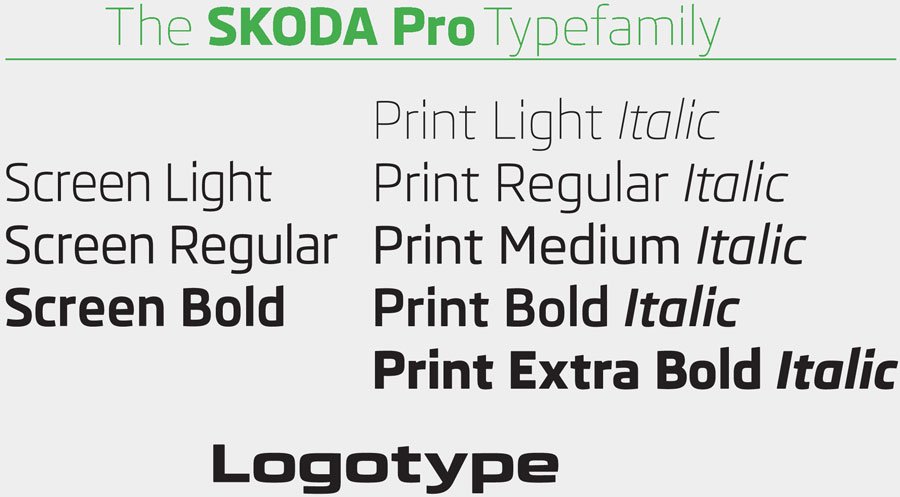
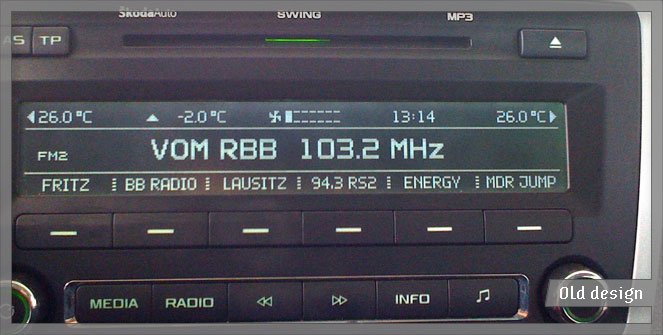
The initial brief called for three fonts to be used in the cars’ digital displays (instrument control panels, navigation system, radios, etc). The designs would be light, regular, and bold with some rather specific technical requirements: they were to be used in a wide range of pixel sizes, they needed to be optimized for several different rendering methods, and there were significant width restrictions. Keeping these specifications in mind – and factoring in the client’s aesthetic desires: sans serif, squarish, clean, legible, modern, and high-tech – we had some tight parameters in which to begin designing.


While in the middle of creating the screen fonts, there was talk of the upcoming corporate redesign. By this point, our new fonts were progressing nicely, so the decision was made to expand the family for wider use – this would become their primary corporate type family. Before, there had been at least 4 or 5 different families used for various applications, but now was the chance to unify their design style company-wide.

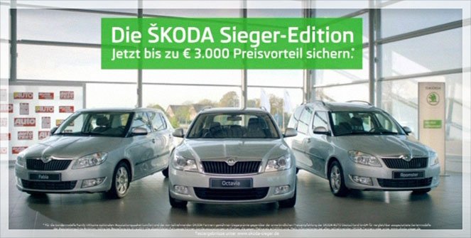
We modified the screen versions to optimize them more for print. Beginning with the regular weight, we lowered the x-height, lengthened the ascenders and descenders, added some details that wouldn’t show up on screen, increased the weight a bit, adjusted individual characters’ widths (no longer having the restrictions imposed by the screen software), completely re-spaced everything, and added kerning. The family was then expanded to include thin and extra bold styles giving it a total of five weights. Finally, matching italics for all were created. These refined print fonts form a key component to the new visual identity of all Škoda’s printed material; by now you should be able to see them in use by most of Škoda dealers/affiliates around the world.


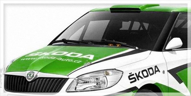
Finally, the smallest – but most immediately recognizable – component to the project was the logotype (only the letters; the symbol was designed by Syndicate). The five simple letters “Š K O D A” underwent more minute revisions and almost took more time than any of the other steps. They started as wider, bolder, more squared versions of the heavy print typeface; but, over the numerous iterations they crept further and further away from the original source. The logotype is now something of its own entity, but still feels like an appropriate part of the family.

My favorite sightings of the new type was the logo being plastered all over the Tour de France :)


- News
See more posts filed under: