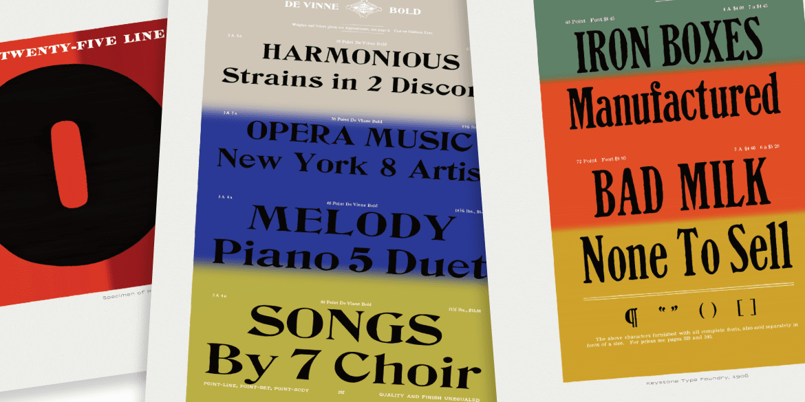
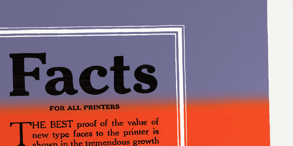
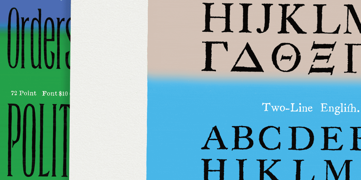
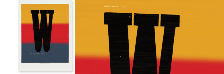
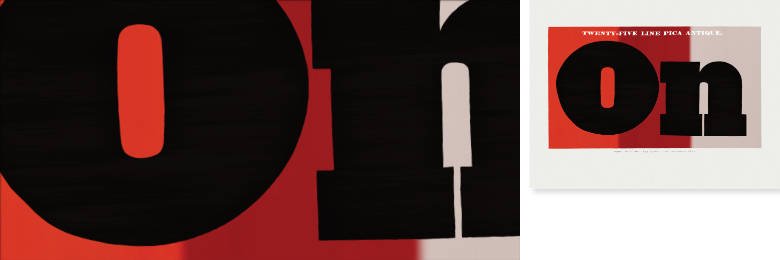
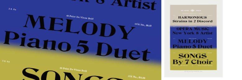
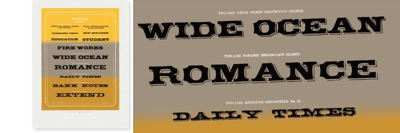
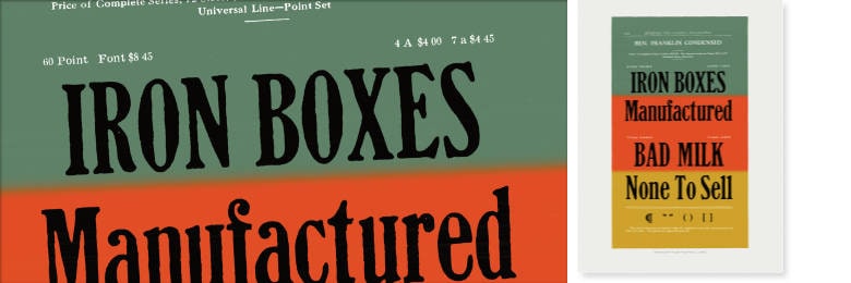
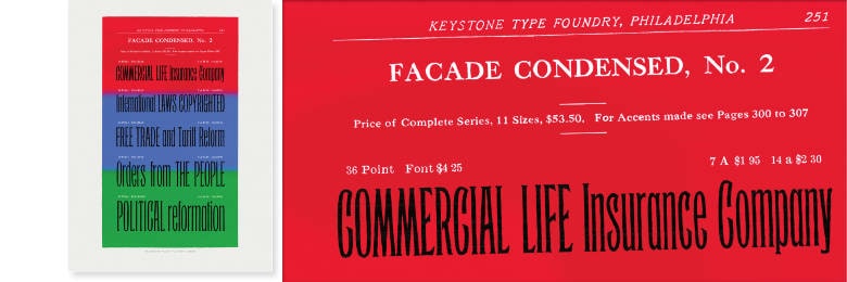
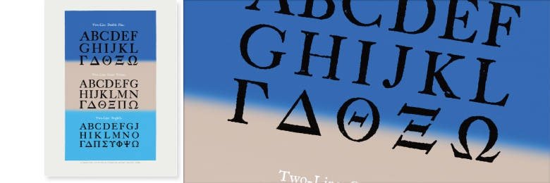
One does not typically compare typeface design with Rock ’n’ Roll… In fact, the legendary designer Matthew Carter once said: “watching me work is like watching a refrigerator make ice”. That is about as opposite to Rock ’n’ Roll as you can get. Yet this »Show Letters« print series merges antique type specimens with the aesthetic of vintage Rock/Blues/Rhythm & Blues posters to create exciting and beautiful mashups.
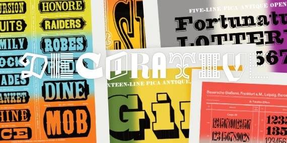
These type samples come from 100+ year old books that existed to sell wooden or metal fonts. Now in poster format, the layouts & letters are purely decorative and the chosen words become more important than the letterforms. The designs have been elevated from pure marketing ephemera to art pieces that make their own statements.
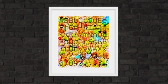
Since the original type specimen books are increasingly rare, expensive, and unobtainable for most, these prints bring some of the most interesting typographic designs to everyone. Recreated here are beautiful typographic layouts and Dadaesque texts to entertain and brighten up living & work spaces. Each page has been redrawn by hand to create imperfect renderings that give a unique human touch to cold, mechanical reproductions. Monochromatic pages have been brought to life with vibrant, tricolor backgrounds reminiscent of the split-fountain screen prints from mid-century music posters.
So whether you are a hardcore type nerd, or just someone looking for a striking and memorable new wall hanging, these typographic Show Letters are for you.
• 9 designs to choose from
• 30 × 40 cm (~11.8 × 15.75 in)
• Matte paper, 192gsm
• Museum-quality Giclée printing
• Printed & shipped from the USA or EU depending on the destination
#01 → NEW!!!
Morgan Press, 1964
#02
Specimen of Printing Types by Henry Caslon, 1841
#03
Cleveland Type Foundry, 1895
#04
Barnhart Brothers & Spindler, 1907
#05
Cincinnati Type Foundry, 1870
#06
Keystone Type Foundry, 1906
#07
Keystone Type Foundry, 1906
#08
Keystone Type Foundry, 1906
#09
A Specimen of Printing Types by William Caslon, 1785
