10th August, 2015 by Mota Italic
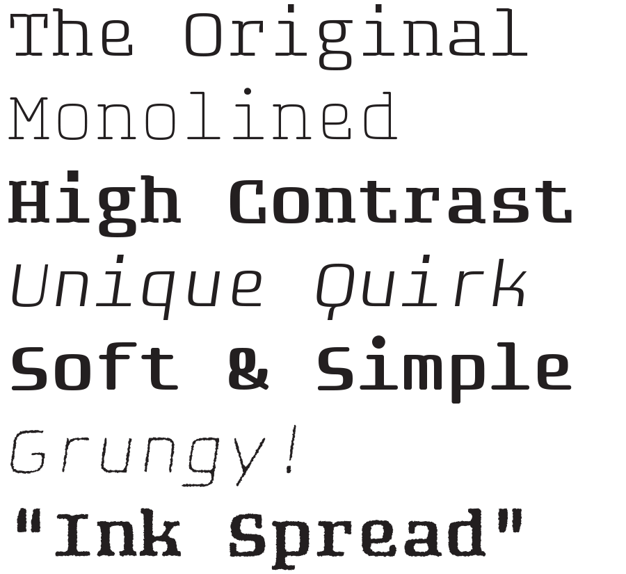
We are incredibly excited to announce the release of our long-overdue family Fip! This unique monospaced family began in the Mota Italic Gallery in Berlin as an exhibition to demonstrate the type design process. Titled “In Progress:”*, the show lasted for one month and consisted of Rob Keller sitting in the gallery every day designing this new type family from scratch. Every day or two, new prints were added to the walls along with commentary evaluating progress and explaining why specific decisions had been made.
The work was nearly complete at the end of the show, but as the deadline grew closer, the scope for the family ballooned, and so the deadline was pushed back. Fast forward two and a half years and Fip is now a refined and extensive super family.
Fip’s family contains a whopping 64 fonts. The four variations – Regular, Rounded, Sans, & Sans Rounded – all come with Italics and Rough versions.

Learn more about Fip here, and see the exhibition where it all began.
* The name Fip was derived from the exhibition title (über creatively) as “Font In Progress”. The hipster relationship may or may not have been intended.
- News
See more posts filed under: